
Natal Homage
collage greeting by J A Dixon
private collection
Natal Homage
collage greeting by J A Dixon
private collection
“Real trust does not need verification;
if you have to verify, it is not trust.”
– Charles H Green
Being part of a regional group invited to unveil a “fourth-quarter” creation in January is something that I’ve come to deeply appreciate. It’s getting difficult to remember any other way to conclude a year of creative activity. Because I’ve routinely written here about our New Year New Art tradition, I don’t want to overdo the point. To bypass the typical curatorial scrutiny and be entrusted with hanging something sight unseen is a gratification that every working artist should know.
Zeitgeist originated as part of a process that I began over a year ago, but it had taken a back seat to a couple of other ideas that got more attention at the time. All three had been sparked by the NYNA catalyst. The only restriction that comes with the invitation is that the artwork be completed after August. This time, I didn’t get rolling until after the Thanksgiving holiday.
I’d just returned from a trip to Pennsylvania. Long-postponed pilgrimages to Chadds Ford and Fallingwater finally had been realized. Visions from the Barnes Collection and the Philadelphia Museum of Art were spilling over within my inner sight. I decided to bring the third of the thumbnail concepts to fruition in a manner that would not have occurred to me in 2018. I wanted to create a highly energetic, maximalist piece without losing control of its compositional stability. A loose structure offered a starting point, but I had to alternate intuitive bursts of “Merz assembly” with rational decisions that would visually anchor the dynamism. In addition, coordinated “B-Roll” embellishments were prepared nearby in the studio and inserted at the final stage. The process would bring into greater focus a refined method of harnessing small-format spontaneity when working big.

look back
at early- and
late-stage views
of my newest
big-scale work

(click each
to enlarge)
My personal orientation to collage remains with smaller dimensions, although some may question the continued self-description as a “miniaturist.” The practice seems to be evolving toward more frequent oversized works, in which I usually embed at least one miniature element that could stand on its own. The annual New Year New Art showcase has provided beneficial opportunities for me to shift from a comfortable frame of reference and build a body of larger collage paintings.

Zeitgeist
collage painting on canvas by J A Dixon
36 x 20.25 inches
available for purchase
“This idea of having something that isn’t quite in focus, something that isn’t quite understood, is interesting. I think details that are over-plentiful, details that are very dense, are lifelike. They exist in natural environments. Forests have a huge amount of details, because they are not built on a human level, so they are impossible to analyze at first glance, and I think we can only recreate what nature has done already, so I don’t think that the idea of simplifying something is a good thing.”
— Édouard Lock
August and September provided a stretch of exceptionally dry weather that was a disappointment for farmers in the Bluegrass, but valued by our intrepid PAACK of regional artists who work out of doors. I was able to create three more satisfying landscape miniatures.
Those who have followed this sequence of descriptions realize it hasn’t been that long since I met the challenge of doing collage en plein air. It has evolved as a gradient progression of discoveries. I’ve learned to think of my application of paper ingredients as a density of “brushstrokes” rather than the placement of simple design elements into a composition.  The two-year process has brought my artwork from a crafted illustration with cleanly pasted elements to a more layered, painterly effect. I’m tending to work wet-on-wet, using sandpaper and blades to score and feather edges. The thickness of papers is torn into “veneers” with areas that can achieve a blended translucency, and I’m more routinely taking advantage of recycled tea-bag “skins” to add warmth, texture, or visual softness. I continue to use three different liquid adhesives — wheat paste, white glue, and polymer gel — which offer contrasting levels of stickiness and drying time. I saturate the paper for manipulations not available with dry material and then flatten the surface with a cloth or burnisher, depending on a desired level of dimensionality.
  Bits of printed text continue to appear as part of my treatment, providing subtle highlights or more overt suggestions of pattern. This growing vocabulary of techniques has given me more confidence to tackle scenes that might have looked too difficult not so long ago. Attempting to “paint” a pond fountain or a rocky outcrop with only paper would have seemed more daunting when I first started to do this.
None of it would be possible without the generosity of those who host our outings. With a spirit of hospitality, the diversity of two farms and a wonderful view of the Dix River were each made available to us for a day. I rely on a square viewing card to select my composition and the all-important place to sit.
")

A point of self-criticism: my plein-air “collage rig” had gradually crept into the forbidden zone of overkill, so I made an effort to lighten my load before the next PAACK venture.
My goal has been a self-imposed limitation of studio follow-through, equal to or less than the amount of time I spend at the original site. I was able to meet that comfortably with August Afternoon, for a 50/50 allocation. When completing Fountain and Shadow, I had to suspend my detailed labor on the central tree. I’d prefer to invest less time indoors and was able to do that with Reflection on an Outcrop (a more desirable 60/40 ratio). Having been studio oriented in my art practice, I always need to guard against allowing the concluding phase to upstage a vital plein-air impression. I’ll rely on memory as much as I do an iPhone photo taken on location. It’s also important to remind myself that, as much as I enjoy my “maximalist” propensity, the objective should be a creative interpretation instead of a literal rendering. It is, after all, a collage artwork.
Collage Madness, my joint exhibition with Connie Beale, is currently on display here in Danville, Kentucky at the Mahan Gallery of Boyle County Public Library. It has provided the first ideal opportunity to showcase my approach to plein air collage and I’ll explain my process to visitors at a Gallery Talk on Saturday afternoon, October 19th. I’ve covered a number of bases as an artist and designer, but I have to say that this has been one of the most personally rewarding projects I’ve begun. Perhaps many of you can be there to hear my remarks.

August Afternoon
plein air collage miniature by J A Dixon
7.25 x 7.125 inches
available for purchase

Fountain and Shadow
plein air collage miniature by J A Dixon
6 x 6.375 inches
available for purchase

Reflection on an Outcrop
plein air collage miniature by J A Dixon
6.375 x 6.625 inches
• S O L D
“While many modern-day album artworks tend to favor strict minimalism, The Beatles make a serious case for going bold and wacky without any type of restraint.”
— Nicole Singh
As promised, I’m devoting an entry to the project that kept me out of the collage studio for at least a dozen weeks. I shall beg your forgiveness at the outset for delving into the details of a digital process. Not only has this site kept a seven-year focus on traditional cut-and-glue techniques, but I haven’t indulged the applied-arts side of my multiple personality as a graphic artist. I’m going to depart from that now — perhaps just this once — because it’s been an extraordinary circumstance for me, and a few of you may find the description worthwhile. At any rate, I encourage everyone to read Patrick Roefflaer’s article for a story that is genuinely more interesting than mine!
Not so long ago, a prominent local musician and former brass band director took me aside at an exhibition opening. Based on her recognition of my fondness for collage, she asked me if I would take on a visual homage to the Sgt. Pepper’s album cover design. The purpose would be to mark the 30th production of the Great American Brass Band Festival, held each June in our hometown of Danville, Kentucky.  It had always been her dream to link the announcement of her retirement at the annual weekend of concerts to the classic album, with a medley of tunes arranged for brass instruments. Sadly, a severe health crisis had forced her early retirement before that could happen, but she preserved hope that a multi-discipline Beatles tribute for the festival’s upcoming milestone might happen in 2019.
I’d already designed nine posters during the festival’s lifespan. To create a tenth was tempting, and this idea had a barbed hook. It really snagged me. My previous experience offered no sense of proportion about the magnitude of time to which I was committing myself when I said, “Sure.” The first obstacle was whether we were allowed to do it at all. we soon discovered that an enormous number of entities had made a visual salute to the famous image over the past fifty years, and that it had already become a ritual of pop culture, in spite of the complexities involved. There’s even a website that shows over a hundred previous parodies. Before long, we had mutually decided that it might as well be our local festival’s turn to pay homage.
 The assignment was now in my lap, and I was overwhelmed with a desire to do it justice and exceed expectations. I found inspiration in filmmakers who I admired (like John Frankenheimer or Robert Altman), because their time-consuming approach would be required for what I’d bitten off. I wanted to bring the same passion, attention to detail, and collaborative leadership to my effort. I ended up shelving all other priorities and putting a ludicrous amount of time into the project, but not without the help of many partners. First and foremost was my wife, Dana, who jumped in head first to play a key part in nearly every aspect of the creative enterprise. After getting advice from an experienced model railroader, she began crafting a miniature flower garden to display the festival acronym for a mandatory foreground allusion. More than once, she would come back to the unfinished artifact to find that its spongy base had “spit out” some of the “flowers.”
The rest of it hinged on two important elements — whether we could pull together our own “Fab Four,” and then surround them with a crowd of numerous figures.  It was determined that the Beatles would be “represented” by the previous directors of the Advocate Brass Band, a Golden-Age-style band associated with every festival. Their initial formation to color a political rally in 1989 was a direct influence on the organizing of the annual event itself. This made perfect sense because the foursome would include the festival’s pair of co-founders and their band uniform jackets, although not psychedelic, would be an effective visual reference point. We immediately knew that some digital sleight of hand would be called for, since only two of the four were locally present.
 One was near a university town many counties away, and the fourth had moved to a distant state. It took lots of coordination to solve that equation, and we pulled it off with the crucial participation of my friend, photography pro Bill Griffin, who took time away from his day job of wealth management. In keeping with the guiding theme of “a little help from our friends,” getting all the ingredients for the poster art to coalesce would demand the magnanimous assistance of others — furnishing space, props, and standing in at our photo shoot, plus image research and acquisition.
At a certain point, I began to focus on researching the background “crowd of fans,” to honor the countless performers, organizers, sponsors, staff, and volunteers who made three decades of festivals possible. It became a daunting, complicated task of culling and selection. I realized that the poster would be the size of a picnic table if everyone who deserved to be on it were included. The original setup by Jann Haworth and Peter Blake was peopled with life-size, hand-tinted cut-outs that imposed a certain physical limitation, and it was fabricated within two weeks. A virtual approach was too open-ended for comfort. There was a limit to how methodical I could become in choosing ingredients for the montage of faces. The solution was to approach it more intuitively, as I would any of my “maximalist” works.

All collage art worthy of the name is irrational at some level, and one of the reasons the original Beatles art is so iconic is the sheer illogic of it. And so, for us, that idea led to a few incongruous personalities, such as Carrie Nation and Howdy Doody. The final assembly was challenging, painstaking, rewarding, and fun, all at the same time. After refining the list of candidates and compiling the source files, each master image had to be sillouetted, retouched, color balanced, and optimized for inclusion. It seemed like the rearranging would never end before every element of the composition appeared to “belong.” I shall confess that I do not possess a powerhouse workstation. The increasing quantity of digital layers in Photoshop had to be continuously merged to prevent the composite file from paralyzing my Macintosh. Even so, it would often exceed 500 MB in size. I tried to save and back up as often as feasible without breaking stride, but there were periodic freezes that would result in “three steps forward and two steps back.”
 There should be no misunderstanding, however. The marathon endeavor was punctuated by many fortunate, often astonishing developments. One of our “Fab Four” individuals made a vital connection with an outstanding photographer in Athens, Georgia, who went the extra yard in matching my parameters for an important superimposition of the black-suited Dr Foreman. He also shot an antique bass drum to add another convincing Sgt Pepper’s touch — the same one that appeared on the festival’s first poster in 1990, and it still had the original, hand-painted emblem! Dana took the lead in preparing the poster “mechanical” for offset production, as she always has done for Dixon Design. She also knocked one out of the park during the solicitation of bids. As a contribution to the landmark production, Mike Abbott of Thoroughbred Printing agreed to produce the job at cost, and spent an hour with the press operator, Dana, and me, making sure we were satisfied with the quality.
") Our closing duty was to devise a printable key for identifying all the individuals and design elements. My original idea of including a longer “blurb” for each line item quickly became far-fetched when producing the abbreviated version dragged on. By the time we declared it done, the “labor of love” vibe had been exhausted. There wasn’t much love left in the air, and I just wanted all of it to hit the street, which it has, of course, and the positive response has been even more than I anticipated.
Our closing duty was to devise a printable key for identifying all the individuals and design elements. My original idea of including a longer “blurb” for each line item quickly became far-fetched when producing the abbreviated version dragged on. By the time we declared it done, the “labor of love” vibe had been exhausted. There wasn’t much love left in the air, and I just wanted all of it to hit the street, which it has, of course, and the positive response has been even more than I anticipated.
This post is already far too long, so I won’t get started on my Eva Marie Saint story, but I need to explain why we included a picture of the creators, and then I’ll finish up on an appropriate collage note. I was adamant that I would not fall prey to the Hitchcock Urge. I had no interest in, nor justification for, inserting myself, since I was making so many brutal choices to leave others on the cutting room floor. Dana was in total agreement, but the team of people who helped with the proofing process took an opposing viewpoint. Their collective drum beat was that the final rendition must include us! You can see that we eventually waved the white flag and stuck a small portrait on top of the Bourbon barrel.
A tiny figure seated at a kitchen table was provided by the Great American Dollhouse Museum as a nod to the Shirley Temple doll in the original composition, which also featured a Madame Tussauds wax figure of Sonny Liston on the opposite side. I knew there had to be a way to include Kentucky’s own Muhammed Ali in our version. Rather than take unavailable time to solicit permission to use a photograph that might get buried in the sea of faces, I turned to my friend Robert Hugh Hunt, who kindly let us insert the extraordinary collage portrait from his 20th Century Icons series!
Oh, I get by with a little help from my friends!

30th GABBF Poster
digital homage by Dana and John A Dixon
24 x 36 inches
Purchase one now!
Online order page includes a printable key to identification,
plus a ‘special thank you’ to all our essential collaborators!
“The most interesting paradox of creativity: in order to be habitually creative, you have to know how to prepare to be creative, but good planning alone won’t make your efforts successful; it’s only after you let go of your plans that you can breathe life into your efforts.”
— Twyla Tharp“You take what you know, you take things you are comfortable with, and you throw them into a situation of new things, of things you are uncomfortable with, and, all of a sudden, new connections happen. And then your goal as a creative must be: of having the skill to carry it home without breaking it.”
— Christoph Niemann
Brandon Long is making a name for himself as an assemblage artist in Kentucky. He manages to juggle this with being a blogger, an active volunteer, and his full-time role as an outstanding family man. On top of that, he holds down a challenging, “multi-hat” position at our local Community Arts Center. This past autumn, his request to exhibit at their annual winter invitational arrived like clockwork: show the public an entirely new work, no jury evaluation, just put something at the leading edge of your creativity on display. There can’t be a single regional artist receiving that call who doesn’t value it as a rare opportunity.
I’d been thinking for much of last year about another immersion into larger works — not always a comfort zone for a self-described “miniaturist.” Add to that several months of recovery from a knee injury which limited my standing time. I reckoned I was overdue for a boost in the scale of my studio work. When it came time to plunge in, I realized it also was the perfect chance to reassess my current methodology. I wanted to explore a way of developing an abstract composition that was different for me. Could I combine and balance both a rational and non-rational process? By now, I had more than a decent foundation in each, but had never fused them in as mindful a manner as I considered possible.  It didn’t turn out to be complicated at all, and yet it was a new approach for me, after more than twelve years as a dedicated collage practitioner.
Deciding to make three works at horizontal, vertical, and square proportions, I began with thumbnail concepts in my journal, moving from tiny doodles, to color sketches, and from there to rough collage miniatures. The activity was deliberate, but I tried to hold it at an intuitive level. After that, I moved to the typical task of preparing the “stretchers,” although nothing would be fabricated from scratch. I found a nearly fifty-year-old, unpainted canvas in remarkable shape. I stretched Pellon® fabric over a discarded picture frame. I paid almost nothing at a flea market for a castoff “student-esque” painting that needed some reinforcement, its canvas re-stretched, plus lots of primer.  After sorting categories of available paper scrap into flat boxes, I was ready to explode into routine sessions of Merz assembly, with an occasional reference back to my preliminary ideas. When probing to the heart of intuition like this, a collage artist stumbles upon strange dynamics. For instance, there are times when you’ll ignore an emotion that says “this doesn’t belong,” only to press on and discover that it totally “works” with the next layering of ingredients. Perhaps this is more characteristic of collage maximalism than collage minimalism. I would accept that fully, but it’s fascinating to remain aware of the “joust” between whether to trust feelings or trust pure impulse, and to discern the difference. Finally, there came a point when I introduced the hard evaluation of a visual critique, before finishing with intentional refinements — and even that final stage allows for spontaneity.
It’s not always easy to know when a piece is done, and maybe it never really is. Eventually, an artist has to claim victory and sign the damn thing. I ended up delivering two works to the Center for the “New Year New Art” show, and let Brandon pick one that fit best. It was the square, the one I called Harmonic Squall.
Please give these four details your scrutiny. Let me know what you think, and, if you find yourself in the area, attend our opening reception this Friday evening. It’s always the first good party after New Year’s Eve!
 ~ collage on canvas by J A Dixon")
 ~ collage on canvas by J A Dixon")
 ~ collage on canvas by J A Dixon")
 ~ collage on canvas by J A Dixon")
four
details
from
Harmonic
Squall

Harmonic Squall
collage on recycled canvas by J A Dixon
26 x 26 inches
available for purchase
Earlier this month I had the privilege of attending a gallery talk by Kentucky artist Robert Hugh Hunt, as he outlined his ambitious “Twentieth-Century Icons” collage portrait project and described an attitude toward the medium that is profoundly thought provoking.

You may be aware of Robert from his long-running Hillbilly Voodoo collaboration with T R Flowers or the way he brings an individualistic mixed-media aspect to contemporary collage. Hunt and I have done our own collaborative works together and we share the experience of creating collage artwork in a geographic environment that often responds to the medium with a sense of bewilderment. Clearly, this circumstance is no impediment to the strong personal approach that runs through Robert’s body of work. He describes himself as a twentieth-century man, but his art is always fresh and intuitive. It springs from a deep cultural awareness that is inseparable from his creative identity.
Hunt told me that he thinks there is lot of negativity towards collage. “I hear people say that collage artists are only using something someone else has created,” he said. “The word appropriation is bandied about. This is true to a certain extent. Collage is a medium steeped in appropriation, and as such is delegated to the status of the red-headed stepchild of art. But to me collage or any medium has to transcend the material used to make it, to truly be art. It is the collage artist’s job to use the appropriated imagery, and, by changing and manipulating it, to relay his own message and to find his own voice.”
Katrien De Blauwer recently brought our attention to the same topic with a link to this page at WIDEWALLS, where Elena Martinique suggests that the term adoption is “more appropriate to describe the level of care one should take when using someone else’s creativity” as a point of takeoff. Many of us who pay attention have seen collage after collage that exploits a prominently featured “load-bearing” image, with trite or superficial treatments that rely almost solely on the power or interest of a photographer’s or illustrator’s invested creativity. Most of us probably started out this way, and it can be initially absolved in student work. Professional or serious amateur collage artists must hold themselves to a much higher standard.
Perhaps that is why I lean toward “maximalism” in my own work. I don’t know what I would say to other creative people if they called me on merely tweaking their intellectual property with a note of irony, humor, or cosmic wonder.  I have great respect for collage minimalists who bring a consistent level of innovation to work that actually transcends the component parts.
Robert Hugh Hunt moves from minimalism to maximalism with a particular voice that defies imitation. In the tradition of fine art collage, the unique instrumental sound of “Robbo” is heard above whatever compilation of raw ingredients he puts to use. But, for me, there is another dimension that is also present — an authenticity rooted in drawing that cannot be imposed with a contrived “outsider” style. I look forward with high anticipation to how he brings all of this capability to his emerging series of famous faces.
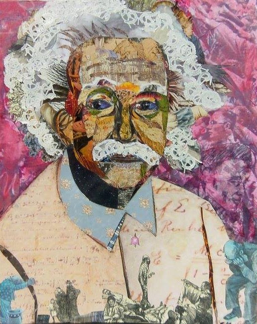

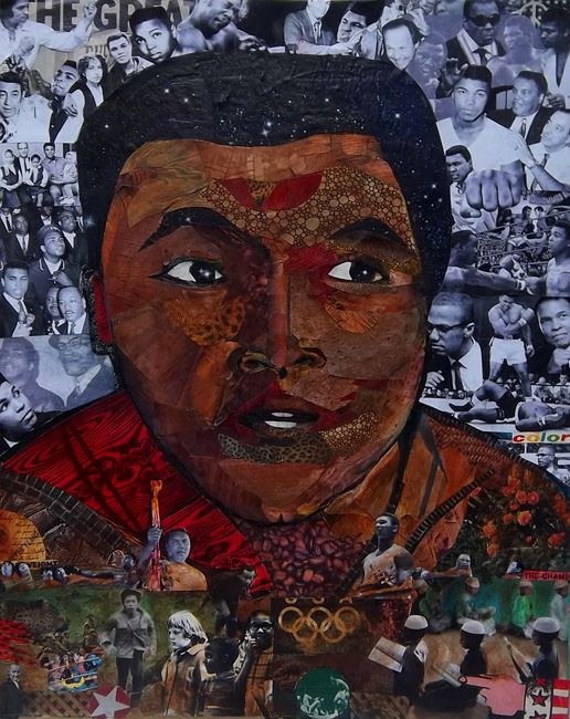

Einstein – Teddy – Ali – Anne Frank
mixed media collage portraits by R H Hunt
16 x 20 inches each, 2014-2017
(below) R H Hunt at the Community Arts Center with his
in-process portrait of the 14th Dalai Lama


Mama’s Story
monochromatic collage by R H Hunt

collaborative collage
from ‘Hillbilly Voodoo’ series
R H Hunt and T R Flowers


mixed media collage by R H Hunt
(click each to view larger)
“I love the abstract, delicate, profound, vague, voluptuously wordless sensation of living ecstatically.”
— Anaïs Nin
I have to admit that I am weary of seeing the output of collage artists who glean from pornographic content and assemble images that generally fail to rise above the source material. It is a lazy way to shock at best and a mere trafficking in human objectification at worst. That being said, I do have a sincere regard for erotic minimalism, present throughout the full century of collage as an expressive medium. Needless to say, contemporary artists have kept the tradition alive — especially in Europe — and the best examples require no additional verbal explanation.

Nicola Kloosterman | Netherlands

Franz Falckenhaus | Poland

Beatrice Squitti | Italy

Una Gildea | Ireland

Erin Case | Michigan, USA

Miriam Tölke | Germany

Wim Maes | Belgium

Deborah Stevenson | Maine, USA

Alexander D’Haese | Belgium

Waldemar Strempler | Germany

Katrien De Blauwer | Belgium

Kerstin Deinert | Germany

Jaroslav Škojec | Czech Republic
It would not be a mistake to put me in a category dedicated to “maximalism” in collage — the practice of adding more visual elements to achieve a balanced effect, in contrast to restricting a composition to a minimum of ingredients. Not that long ago I discovered the work of two maximalists when I happened upon an old blog post by fellow Kentucky collage artist Sharmon Davidson. I have never met the prolific Davidson, but it pleases me to find her concise survey of collage pioneers juxtaposed with examples of contemporary artists active in the medium. I have a high regard for collage artists who maintain a keen awareness of the history of mixed media. Her own work evokes for me the layerist tradition, and I especially like many of her miniatures. In addition to learning about Sharmon, her 2014 entry introduces me to Lance Letscher, a maximalist’s maximalist who also has been known to explore the spectrum’s opposite side with a minimalist approach. The widely exhibited Letscher is formerly a sculptor.

Sharmon Davidson
Her artwork emerges from the interplay of intention and intuition.

Lance Letcher
The spatial density of his designs exemplify a “maximalist” approach.
“I write because I don’t know what I think until I read what I say.”
— Flannery O’Connor
It looks as though I’m stepping into my fifth year writing about collage at this blogsite, and I hope that you’ve been with me for part of that enjoyable ride.
When I look back at my wish list for Year Four, I realize, not with any surprise, that my appetite for creating collage artwork has eclipsed a sometimes equally strong desire to delve verbally into the many interesting aspects of the medium. I would like to think that I met a few of the writing goals I set for myself last summer, and, of course, my ambitions to add to that list here in this post will be dutifully curbed. At any rate, I think that the best thing to do is to break this entry into a few parts that cover various and sundry topics on my mind.
The Social Network of Collage Artists
• For at least a couple of years I have wanted to write more about the influence of social media. Nearly every day I see a collage artist defeat the potential of a sharing platform with overexposure. Some may disagree and say, “the more, the merrier.”  That is not a point I care to debate, because there may be something else to highlight more important than whether or not the quality-vs-quantity consideration can fall to the wayside — the vital role of networking among artists. I am more convinced than ever that the cross-pollination and mutual support of online networks has been of significant benefit to those of us working in the medium. Crystal Neubauer has one of the more interesting blogsites by a collage artist. She touched on the topic of creative communities so well that I direct you to her short essay at ClothPaperScissors.com. Another collage artist I admire who has recently made an impression as a strong blogger is Melinda Tidwell. I like her process-oriented posts. Although more of a mixed-media artist rather than a conventional collage practitioner, the versatile Kathleen O‘Brien maintains a steady flow of what I consider “must-read” entries at her studio blogsite. Create your own list of frequent art-blog destinations and branch out to new sharing platforms (I just learned about some new artist blogs from Caterina Giglio and opened a new account at Instagram.). As the entire evolving array of networking sites weeds out the fads, imitators and clunky interfaces (finding it difficult to tolerate LinkedIn as a user), you will settle into a community of online cohorts who reinforce your daily challenges as a creative person. When you come to know that someone else is on “the same wavelength,” reach out and make contact as an authentic being behind the profile. There are rewards to be discovered!
Cheap Collage Tricks
• Collage artist Allan Bealy seems to be everywhere, but, trust me, he is no gadfly. He recently raised a topic that struck a nerve with many. There are a lot of cheap tricks appearing in the medium, and most of them are harmless, if unimaginative, but the temptation to exploit visual ingredients readily available in our culture to “objectify women” is perhaps the most repugnant.  Those of us who believe we are above that sort of thing need to think more deeply about how and why we use nudes in a collage. This suggests another potential self-assignment for my coming year — a “DON’T DO THIS” post illustrating the most prevalent cheap tricks in collage. (Not that there’s anything wrong with replacing a man’s head with a vulture to carry the banner of Dada during the art movement’s centennial year.) To be honest, I have nothing against a cliche, if it “works.” Isn’t that the reason something becomes a cliche in the first place? I say go for the cheap trick if you can score in the highest percentile (anyone who thinks it’s an easy thing to do is mistaken). I hope to post a follow-up look at the endurance of the surreal face in collage, so stay tuned. But let’s get back to Allan’s remonstrance. The woman as sex object can be traced back to long before the rise of Madison Avenue and Larry Flynt. Don’t bite the lure, folks. Everything one needs to dabble in this unworthy stunt abounds. Nevertheless, I long have been fascinated with the exemplars of erotic minimalism and their work in contemporary collage — those who transcend the cheap tricks to achieve a fine-art impression. Add another one to my wish list for Year Five of The Collage Miniaturist.
Priorities Get the Last Word
• My wife, Dana, and I managed to get two tickets to The Seer (a new documentary portrait of Kentuckian Wendell Berry, re-titled “Look & See” for Sundance Institute) before the Lexington screening sold out last night. 
 It is a significant film that will become more widely available into next year, and it has my highest recommendation. Does it have anything to do with collage? Nothing at all, except for everything under the sun. If you haven’t discovered the poet, novelist, essayist, and farmer-philosopher, I have accomplished one meaningful thing with this site by inviting your interest. It was fitting that I got out of the studio and spent time at our farm. It was very hot work up on the shed roof, but pleasant to be away from all the noise (traffic, sirens, and incessant political jousting). Connecting with our rural place offered an opportunity, as it always does, to put priorities back into alignment. There is a place in the documentary when Laura Dunn (the filmmaker in voice-over) explains to Berry her motivation and how she looks “to places where there is still a remnant of togetherness, or unity, or community, of connection to the land, and I study those, because I don’t come from a place — I come from divorce …”
“We all come from divorce!” her subject interrupts. “This is an age of divorce. Things that belong together have been taken apart. And you can’t put it all back together again. What you can do, is the only thing that you can do. You take two things that ought to be together and you put them together. Two things! Not all things.” It is his metaphor for the creative life, and a tremendously healing admonition to those of us with a tendency to become overwhelmed by the enormity of the world’s chaotic disintegration. Collage artists put things together to make something new, and often we are the ones who have taken apart discarded things to do it, but there is always a much larger phenomenon at work — one of discord vs harmony, wastefulness vs thrift, cynicism vs affection. When I return to the studio from a natural place that has responded to my care, I am in a better condition to ask myself, “To which side of the big equation are you making your contribution as an artist?”

Crystal Neubauer
Her blogging often touches on the complexity of a creative life.

Melinda Tidwell
Perhaps you will admire her solid abstractions as much as I do.

Kathleen O’Brien
Her art always nudges one toward a deeper sense of balance and wholeness.

Robert Hugh Hunt
Stay tuned for a continuation of my review of “the surreal face.”

Bene Rohlmann
Look ahead to my first discussion of erotic minimalism in collage.
“Ever have one of those collages where every time you add something, it just makes it more difficult to finish?”
– T R Flowers
What Terry Flowers alludes to in his recent question to collage artists is certainly an ever-present concern for a minimalist, but even a maximalist can find it difficult to discover the proper conclusion for a collage. Some say that the medium of collage has no rules. I think of it more as the rules changing in front of us until a balanced resolution takes shape, and then, perhaps arbitrarily, victory can be declared.

Unit Citation
collage miniature by J A Dixon
7.5 x 9.375 inches
Purchase this artwork!
“Schwitters subjected his bits of flotsam to an organizing principle resembling the vertical scaffolding of Analytic Cubism, thus transforming the diverse components into formal elements.”
— Nancy Spector
Color and composition may be the most common denominators of all visual art. Collage, by its nature, relies on a combination of separate, often disparate elements, and those two fundamentals generally play a more prominent role in the finished effect, but that does not make collage essentially a category of abstraction. A minimalist concept built on a provocative juxtaposition or image insertion can be a predominantly figurative or representational approach, even if symbolic or surreal ideas are introduced. On the other hand, collage artworks rooted in the seminal innovations of Kurt Schwitters pay primary tribute to a tradition of abstraction now more than a century old. Of course, the medium had other early pioneers, but it is difficult to imagine the trajectory that collage might have taken without his towering influence. Personally, I have no qualms about continuing to respectfully mine the rich vein of creative ore he helped to expose. Whether it proves to be a nonrenewable resource has yet to be shown.

Selective Fusion
collage on structured panel by J A Dixon
13.375 x 11.75 inches
not for sale