
Recent Landscapes
As I continue
“painting in papers”

LITTER-ally KENTUCKY
Also available as
giclée prints

A Change of Seen
When I took paper and
paste outside

Les Cheneaux Series
Inspired by the
northern waters
Recent Landscapes
As I continue
“painting in papers”
LITTER-ally KENTUCKY
Also available as
giclée prints
A Change of Seen
When I took paper and
paste outside
Les Cheneaux Series
Inspired by the
northern waters

Friday Meditation
collage catharsis by J A Dixon
paper scraps, litter, rosebush thorns
on black cover stock, 9 x 6 inches
“Collage artists put things together to make something new, and often we are the ones who have taken apart discarded things to do it, but there is always a much larger phenomenon at work — one of discord vs harmony, mechanism vs intuition, wastefulness vs thrift, cynicism vs affection.”
— from July 29, 2016
My deep exploration of collage began over 20 years ago with a nonrepresentational approach rooted in the MERZ and DADA traditions, but my recent concentration has been in pictorial collage, which I call “painting in papers.” Many pioneers of modern art collage considered themselves painters, and I increasingly anchor my intuitive orientation with that awareness. This miniature landscape was created in the studio from imagination and memory — recollections of a grim sky, but the sun breaks through for a few seconds to illuminate the trees. This is among the seen images that stick with me. Increasingly, these are the experiences that make me want to paint.
The Kentucky farmer-philosopher Wendell Berry tells us, “Things that belong together have been taken apart. And you can’t put it all back together again. What you can do, is the only thing that you can do. You take two things that ought to be together and you put them together. Two things! Not all things.” It is his metaphor for the creative life, and a tremendously healing admonition to those of us with a tendency to become overwhelmed by the enormity of the world’s chaotic disintegration. When I return to the studio from a natural place, I am in a better condition to put things together, with the enduring hope for a modest artistic breakthrough. And then to leave. To go somewhere small in the world and to fix something that is broken.

Breakthrough
imaginary collage miniature by J A Dixon
6.75 x 4.875 inches
“No, God chose those who by human standards are fools to shame the wise; He chose those who by human standards are weak to shame the strong, those who by human standards are common and contemptible — indeed those who count for nothing — to reduce to nothing all those that do count for something, so that no human being might feel boastful before God.”
— 1 Corinthians, 1:27-29“In the end we shall all of us be only what we have made of God. For nothing is real save his grace.”
— Cormac McCarthy, The Crossing
 This stagnant winter of bleak cold and rocky ice is taking its toll in skeletal breaks and frozen spirits. A mega-dose of sunset hues and autumn color seems in order. It might help see us through to an early thaw and the inevitable springtime. I shall do my part.
What is one to make of talent? We are all chosen in some way to magnify our individual gifts for the benefit of life, and to choose in return an apt recognition of due credit. If grace is humbly shared, does grace remain abundant? Perhaps that is the only question an artist need ponder.

Sassafras Shadows
collage landscape by J A Dixon
8 x 9.125 inches
“Fears about artmaking fall into two families: fears about yourself, and fears about your reception by others. In a general way, fears about yourself prevent you from doing your best work, while fears about your reception by others prevent you doing your own work.”
— Art & Fear, Bayles and Orland“Fear is the greatest obstacle to learning. But fear is your best friend. Fear is like fire. If you learn to control it, you let it work for you.”
— Mike Tyson
Are you suspicious of a creative impulse? Your intuition is worthy of trust. Are you afraid of what others might think? Your collage artwork will be distinctively yours, not theirs. If we have that settled, go forth and paste!

Blurry Thoughts and Prickly Fears
collage miniature by J A Dixon
6 x 7 inches
“If you’re doing a good job you should feel that it gets harder. If you think it’s getting easier, you ought to look out. I think it means you’re getting lazy.”
— Matthew Carter
My final collage of the calendar year might be a favorite for the whole cycle, even though the finish felt like a struggle. Although I spent a lot of time at this natural place before confronting my impression on the drawing board, bringing it around to a “finished look” transcended a plein air description. I don’t know why it’s hard for me to cross that line, but a fulfillment process often needs to maintain the upper hand. I can never easily bend paper to my will, but, if I ask nicely, it will cooperate to help me become an “agent” of the Creative Source.

Haven on the Knob
Marion County, Kentucky
collage landscape by J A Dixon
7.75 x 10.75 inches
private collection
![]()
Thanks for your interest in my collage landscapes. Click on each thumbnail to view a larger image. Click here to scroll the original blog posts. Many of my previously sold artworks can be ordered as fine prints.
View the LITTER-ALLY KENTUCKY collection, too!


 ~ NOT AVAILABLE ~ J A Dixon")


 ~ SOLD ~ J A Dixon")


![]()
Thanks for your interest in my “waterscapes.” Click on each thumbnail to view a larger image. Hover over thumbnails to view the availability of originals. Many of my previously sold artworks can be ordered as fine prints. Click here to scroll the original blog posts.
View the LITTER-ally KENTUCKY collection, too!


“That seems to me the great American danger we’re all in, that we’ll bargain away the experience of being alive for the appearance of it.”
— Mike Nichols

From the time that I began to exhibit collage, people have responded positively to art made from stuff that would otherwise be recycled or thrown away. They like the idea that anything cast off can be repurposed and infused with new meaning and a measure of beauty. Collage is ideally suited to individual response and offers a universal experience. Nearly everyone can understand and relate to cutting and pasting paper.
On first impression, people often think my landscapes are conventional paintings — until they move closer. At the same intimate distance the works were created, viewers find only paper ingredients, fragments of printing, and layers of torn edges. It’s been rewarding for me to witness this sense of discovery, a reaction similar to what I’ve experienced by exploring the potential of paper. This living connection with others doesn’t happen with a digital exchange. It fires my enthusiasm for representational collage as an artistic concentration.
“No, you never think you’ve made it. To be respected by my peers is the most I could ask for.”
— Freddy Cole
I broke into the collage world twenty years ago and eventually gained some recognition with contemporary practitioners for my fine art approach to the medium, just as social networks were taking hold. My recent emphasis has been in another direction, as those of you who follow this site are fully aware. I still aspire to “make it” in the realm of nonrepresentational collage, but that may not happen for a guy who “paints in papers” as a landscape artist.
I enjoy periodically coming back to the tradition of Merz, and here’s a lyrical piece that I created for tonight’s fundraising auction and random draw. The business of art should involve some community pro bono work, as with all professions. Yes, I’ve pontificated about this before. To help needy nonprofits appreciate the value of creative labor, I maintain this rule of thumb: keep donations modest, infrequent, and local.

Kaleido-Scraps
collage on stretched canvas
24 x 18 inches, in the Merz tradition
“At some point, the virtuosic construction of these works seems to fade in the mind, leaving in its wake only the images themselves: soft, somber, complicated skies worthy of Turner or Constable; rolling fields that would have attracted Thomas Hart Benton or Grant Wood.”
— Kevin Nance
A year after an update here about progress on my grant-supported body of new collage landscapes, I’m pleased to announce that this en plein air artwork will be revealed next month.
The exhibition will open on October 5 at the Woodford County Library in downtown Versailles, Kentucky, and continue through November during regular hours. The library will host an opening reception on Sunday, October 8, from 2pm until 4pm. I’ll give a gallery talk Thursday, October 12, at 6pm, and again on Saturday, November 11, at 2pm.
I’ve devoted much creative time and energy to this project over many months. Public funds have provided support and enabled me to bring a higher level of presentation to the most in-depth investigation that I’ve made into representational collage, ") but the endeavor could not have been possible without the hospitality of those who opened their rural places to my grateful scrutiny. Fortunately, only one person declined to grant permission for me to “paint in papers.” Everyone else was astonishingly trusting and helpful. Of course, they know who they are, and I can’t thank them enough.
but the endeavor could not have been possible without the hospitality of those who opened their rural places to my grateful scrutiny. Fortunately, only one person declined to grant permission for me to “paint in papers.” Everyone else was astonishingly trusting and helpful. Of course, they know who they are, and I can’t thank them enough.
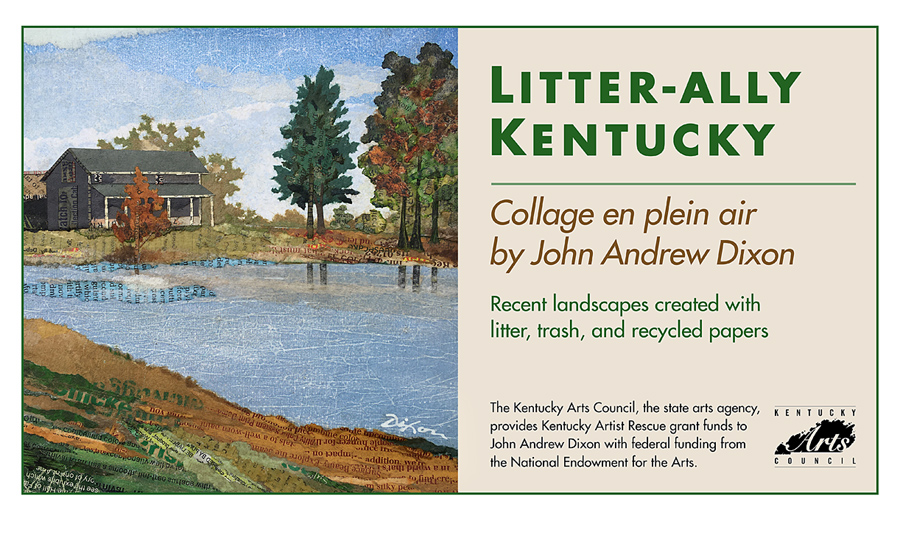
The artworks that I created at locations in six Central Kentucky counties are infused with fragments of litter accumulated along local streets and roadways. The concept of using collage art to bring awareness to the ongoing problem of littering was the theme of my application for support during the aftermath of lockdowns. I received a Kentucky Artist Rescue grant from the Kentucky Arts Council with federal funding from the National Endowment for the Arts.
Since I intend to have this show travel around a bit over the coming months, I want to acknowledge the individuals in Woodford County who offered my first opportunity: Karen Kasacavage and Tommy Dennison. Leave it to a pair of helpful librarians to get me out of the starting gate! Because part of my overall effort is to engage both children and adults during the show’s run, this will be an ideal setting to carry an unconventional message about achieving a cleaner environment in the Commonwealth. With this recent body of work, I’ve repurposed the products of our “toss-it” culture as interpretations of specific natural places. My hope is to bring awareness to the role of individuals in reducing consumer waste and to promote a more conscious stewardship of the land that surrounds us.
Each of the 16 artworks (ten verticals and six horizontals) is matted and framed in the “gallery style” within a 16×20-inch proportion. In order to allow a series of showings in different counties, the originals will not be available for purchase at this time. Instead, collector-quality glicée prints of all the landscapes on display will be offered through Fine Art Editions of Georgetown, Kentucky. You are invited to visit the exhibition and attend associated events. I also will have original collage artwork for sale across the street from the library at Art Space Versailles.
As LITTER-ALLY makes its journey around Kentucky, stop back here for more information, new developments, and to dig a bit deeper into my adventure creating collage landscapes en plein air.

High Bridge Vantage
Garrard County, Kentucky
collage en plein air by J A Dixon
10.9375 x 7.9375 inches
20 x 16 inches, framed
giclée print available