Archive for the ‘Watercolor’ Category

Tenth Chapter: Painting from nature with paper

Saturday, February 19th, 2022

“Follow the ways of natural creation, the becoming, the functioning of forms, then perhaps starting from nature you will achieve formations of your own, and one day you may even become like nature yourself and start creating.”
— Paul Klee
 

As I pushed toward the hanging date for Change of Seen last month, I pulled out an unfinished work. In 2020 it had been my hope to complete it as part of the Paint By Nature entry — an interpretation of an urban oak tree. Everything was done except for the tree itself, which I’d wanted to paste together in a burst of spontaneity. The “start” went into cold storage when I ran out of time for two submissions. Fast forward to January 2022. Now I had the ideal scenario. My tight deadline would not allow me to indulge any slowdown or second guess. Positive, unanticipated things often happen when I occasionally challenge myself to work under a severe constraint. The hesitant, rational mind is sidelined in favor of an intuitive response that is rooted in everything one has ever created. This can be the case with music, writing, or nearly any artistic format, but the phenomenon especially lends itself to painting.

Interestingly, I’ve always preferred watercolors to other paint mediums because of its unpredictability and the “happy accidents” that occur. I admire oils greatly, but they hold no attraction for me as I approach my 70s. I hadn’t expected to discover that “painting in papers” could captivate me so and knit a reverence for nature into my art. One of the primary appeals of collage is total flexibility. It’s almost impossible to make a blunder, if one stays “in the zone” without letting the intellect gain an upper hand. When others use words such as exacting or meticulous to describe what I do, it usually throws me, because I consider my approach as more instinctive. And yet, there is no denying the presence of “artisanship.” With any task at hand, craft is essential. It was drilled into me with rigor after I chose the path of applied design. (That the young are asked to dedicate themselves to a particular discipline and to ignore countless alternatives is a weird fact of life. Many of us spend decades unraveling it.) So, a certain precision is fused into my method, even when I’m racing the clock. One man’s chaos is another man’s perfectionism.

I’ve lived my adult life trying to spin creative gold in a studio of one sort or another. A supremacy of the natural world in my youth had been set aside as part of an itinerary toward the graphic arts profession. Reflecting on a long journey that leads to the ever-rolling “now,” I recognize that nature was always calling. It influenced my leaving big cities for a smaller community. It provided a firm foundation for my diet and a health-oriented lifestyle. It was an unfailing source for well-being when conditions seemed out of balance. Even so, an unsatisfied need remained elusive until I finally took paper and paste outdoors, where the potential for inspiration was out of arm’s reach. That I could respond with collage, and find it so rewarding, is something I hadn’t foreseen.

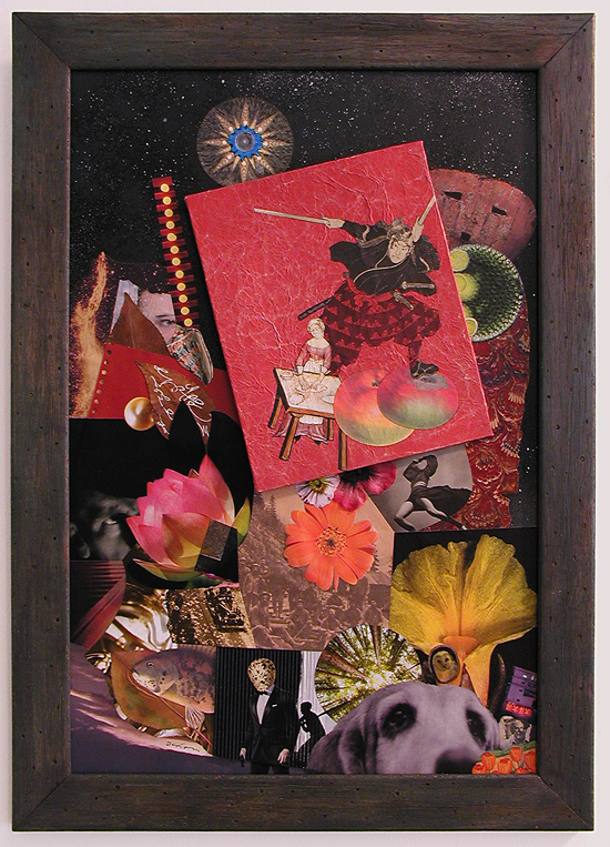
If you want to start with the first chapter, you can find that story here. It’s been almost five years of direct observation, and I’m itching to begin a new season of working en plein air. The broader point I’d like to make is how the experience also has invigorated the way I approach representational collage in the studio. It feels like it’s all been funneled into an evolving intuition. Working outside has transformed how I make visual decisions even when using photographic reference under pressure, as I did with Grand Chinkapin. After quickly preparing piles of printed scrap that seemed appropriate for tree foliage, I was able to explode those ingredients into place with a minimum of conscious thought — not unlike I try to do every time I take my collage kit on location. “Painting from nature with paper” has become a more integrated practice, inside or outside. Change of Seen shares this adventure with others.


Grand Chinkapin
collage with combined mediums by J A Dixon
0% / 100% — site to studio
11 x 7.75 inches + shadow-box frame
available for purchase

Does this have anything to do with collage?

Friday, September 30th, 2016

 
jadixon_waitingfordana
 

Waiting for Dana
combined mediums by J A Dixon
6.5 x 4.875 inches

My honest answer to the title question —
“We won’t know until I finish this post.”

During my annual “fishing retreat” in Les Cheneaux on Lake Huron, I convinced myself to make a small painting for the mate who holds our fort in Kentucky. It disturbed me to confront the idea that I had fallen woefully away from my practice of drawing or painting en plein air, so I found a spot to sit and scraped some rust off my lost habit. If a tradition of plein air collage exists, now or in the past, I so far have not discovered any evidence. One would think that the medium does not lend itself to it, but there is no fundamental reason why collage cannot be executed out of doors, or benefit from direct observation of nature or the built environment. If we are to think as the artists who “invented” it, collage is another variation of painting. And painting, as we know, is not about visual replication, but about capturing what the artist “sees” — in the fullest sense of the word.

As smiling fortune would have it, I had the opportunity to view a presentation of Painted Land at the Lake Superior State University Arts Center (in nearby Sault Ste. Marie) as a part of my visit to the Upper Peninsula. Proceeds from the screening of the new documentary helped benefit the Lake Superior Watershed Conservancy. The subject of the film is the Group of Seven, the twentieth-century artists who took the Canadian consciousness by storm when they rattled the national establishment with the first widely seen modern-art landscapes. The filmmakers successfully proved that the iconic paintings now revered by Canadians were created by the pioneering artists when they arduously discovered wilderness locations, and were not constructed from imagination, as many had previously believed. On top of that, most of these unspoiled sites in the vicinity of Lake Superior have the potential to remain so, if preserved and protected from development.

The breaking of my plein air dry spell, combined with a heightened awareness of how some of North America’s most daring artists actually made their works, has overwhelmed me with new ideas about ways to invigorate my approach to collage and its relationship to the seen image. I don’t know where these experiences will lead me, but those who follow my journey here no doubt will be the first to find out. Until then, thanks again for visiting.

 
“The most important thing a painter can do is
find a good place to sit.”
– J.E.H. MacDonald


A Kentucky Collaboration

Monday, August 24th, 2015

“I’ve collaborated with many artists over the years but never on a project of this size. The two pieces were to be 24″ x 24″ on structured panels. What made this collaboration successful was the interplay between the two artists. We both sent numerous pictures of our starts in progress and were able to play off the ideas and techniques the other was using, in this we created a true pair of collages instead of two separate pieces.”
— Robert Hugh Hunt
 

Collaboration between collage artists is a widespread, dynamic development within a medium that has shown extraordinary vitality after its centennial milestone in 2012. This very well may be part of a broader phenomenon, due in no small way to the explosion of social media and a greater networking among artists of all kinds. I was not surprised when, earlier this year, here in my home state, the Kentucky Artisan Center at Berea announced a major exhibition called It Takes Two: Collaborations by Kentucky Artisans.

In response to this opportunity, I decided to contact Robert Hugh Hunt, an artist from Richmond, Kentucky whose work I had come to respect after we made a connection through Facebook. Both of us were aware of our geographic proximity, but had not previously met in person, nor had we collaborated remotely on a casual project. Appreciating each other’s prior work is no guarantee that two artists will enjoy the collaborative process or value the creative end result. Only by risking a joint venture will both artists find out if they actually are “on the same wavelength.” I am pleased to report that the results of my teamwork with Robert exceeded our optimistic expectations, and that one of the two pieces we created was selected for the “Takes Two” show.

As artists, Robert and I both work regularly with combined mediums, but we chose collage as the foundation of our approach because we recognize how ideally suited it is for collaboration. There was no inclination to think small. We each fabricated larger dimensional panels and created a “start” for the other — to establish the background and organize the two-dimensional space with found material and other recycled/repurposed elements. collage collaboration ~ the start by Robert Hugh Hunt for Kentucky Sovereign ~ collage on structured panelAfter meeting for the first time (with spouses, over lunch at a delightful new Cuban eatery halfway between our studios), we exchanged the unfinished works to complete the compositions with additional ingredients and renderings. Robert’s recognized practice of layering his cut-and-paste collage artworks with mixed-media additions had already caught my attention, and his expressed aim to do the same within our collaboration inspired me to include a hand-rendered element as a focal point in my “finish,” which we titled Kentucky Sovereign. Robert’s finish, Kentucky Madonna, features multiple mixed-media treatments on top of my background shapes. The effect helps to integrate our respective techniques and to bond the artworks as a “true pair,” to use Robert’s phrase.

For my start, I began with a section of an Iraqi newspaper brought home by a member of the Kentucky National Guard. Robert made use of clippings from a 1940s-era newspaper that he got from fellow collage artist Ted Tollefson. collage collaboration ~ the start by John Andrew Dixon for Kentucky Madonna ~ collage on structured panelOur range of “merz-strokes” was unfettered, but we shared a desire to “Kentuckify” our choices, although neither of us knew exactly what we meant by that. Other ingredients include magazine scraps, printed papers, antique maps, used packaging, illustrations from discarded books, mesh bag material, tissue, fabric, plastic clasps, wood, gummed labels, metal, emptied tea-bags, produce stickers, foil, wallpaper, digital printouts, a paper doily, and more (with a modest assemblage aspect thrown in for good measure). As with any collaboration, the challenge is to discover a way to enhance the start in a complimentary manner and also to bring one’s personal approach to the finish. Our decision to avoid isolation was a good one. Images exchanged during development kept the creative energy in flux and maintained a visual cord (a common chord?) between the surfaces as they evolved separately. It was a positive experience for both of us and boosted our enthusiasm to continue as active collaborators.

Thanks, Robbo!
 

finish by John Andrew Dixon for Kentucky Sovereign ~ a collaboration with R H Hunt ~ collage on structured panel

Kentucky Sovereign
a collaboration by R H Hunt and J A Dixon
collage on structured panel, 24 x 24 inches
(start by Hunt, finish by Dixon)
selected for It Takes Two: Collaborations by Kentucky Artisans
available for purchase

finish by Robert Hugh Hunt for Kentucky Modonna ~ a collaboration with John Andrew Dixon ~ collage on structured panel

Kentucky Madonna
a collaboration by J A Dixon and R H Hunt
collage on structured panel, 24 x 24 inches
(start by Dixon, finish by Hunt)
available for purchase

A universal antidote . . .

Saturday, January 17th, 2015

“Self-consciousness is the enemy of all art, be it
acting, writing, painting, or living itself, which is
the greatest art of all.”
— Ray Bradbury

I was honored, but also thrilled, to accept my third invitation for the “New Year New Art” exhibition at our local Community Arts Center, one of the outstanding cultural institutions in Central Kentucky. The extraordinary thing about this annual show is a freedom to display, The Barretts ~ a portrait by John Andrew Dixonwithout juried appraisal, one or two pieces for which one has passion. The only restriction is that the work not be over four months old. I decided to create something around the holidays specifically for the opportunity, and, because I had just completed a difficult portrait commission in watercolor and pencil, a more personal form of expression was a welcome idea. I had used an illustrative, “news-magazine-cover” style that always has had great appeal to me, but that over the years has challenged my self confidence and repeatedly has put my perfectionist tendencies to a stress test. Fortunately, I have discovered a universal antidote for all that — collage.

For the January exhibition I wanted to do something fresh, to surprise myself, but also, as most artists prefer, to create something that would please others, that would excite an individual’s subjective response. Mixed-media collage is a medium that people find both provocative and delightful, and to which I am strongly committed, but that should be no surprise to anyone who follows this site. As a working designer and graphic artist, I return to collage on a nearly daily basis as fuel for my creative life and a potent solvent for that side of myself which continually flirts with self doubt if something might not turn out exactly as I imagine it should. All that nonsense fades away when I incite the spontaneity of this magnificent medium.

Of course, I remain captivated by the ability to make something of value from material that otherwise would be thrown away or recycled. I enjoy creating artwork that has bold visual appeal from across a room, but that also provides a depth of interest at close observation, with many stimulating details within an intimate viewing distance. “Matthew’s Touchonic Lodge” is primarily an abstract composition, and I salute two collage artists whose work I admire with my title and embedded allusions. “Apparition Rising” uses ingredients that are more whimsical, but perhaps slightly “spooky” at the same time. A phrase from a song that I like sparked the genesis of its assembly. Both are significantly larger than my typical miniature, more dimensional than a standard flat surface, and, as with all my designs, I worked intuitively with color, contrast, and the activation of space. In addition, I continue to push the effect of collage as a stand-alone treatment that does not demand the protective glass barrier. Please let me know what you think of these new works.
 

Dixon_TouchonicLodge

Matthew’s Touchonic Lodge
mixed-media collage by J A Dixon
22.5 x 20 inches, December 2014
title source: homage to artists M Rose and C Touchon
Purchase this artwork!

Dixon_ApparitionRising

Apparition Rising
mixed-media collage by J A Dixon
19.5 x 27.5 inches, December 2014
title source: from the song “Ghost Town” by J Brasfield
also available for purchase

Day Fulfilled

Friday, July 19th, 2013

This is a small mixed-media-plus-collage landscape. I hand-crafted the frame from weathered Japanese redwood — recycled slats from a fatally damaged patio chair I could not bring myself to throw away. The work currently hangs in the Mahan Gallery at Boyle County Public Library, as part of a “SummerScape” exhibition, which lasts until August 29th. One of the most extraordinary things about having my home studio in downtown Danville is having our library right across the street.

I began with scrunched-up paper and scraps of vellum, applying numerous layers of a thin “acrylic milk,” tinting it with various drops of concentrated liquid watercolors, and adding white tissue along the way to evolve the clouds. The process is a slow manifestation and allows for multiple mid-course decisions as the translucency is gradually built. To be honest, I have not created many artworks using this technique, so please let me know what you think.


Day Fulfilled
mixed media + collage
by J A Dixon
13.5 x 10.5 inches
Available for purchase

Gardenshapes ~ art by Kathleen O’Brien

Saturday, July 28th, 2012

“Beauty should be shared, for it enhances our joys.
To explore its mystery is to venture towards the sublime.”
―Joseph Cornell


I hesitate to use a sports term to begin this review, but, since the Summer Olympics opened last night, I’ll set my disinclination aside to state emphatically that artist Kathleen O’Brien is at the top of her game!

Gardenshapes —an exhibition of her mixed-media collage finishing its run in the main gallery of Danville’s Community Arts Center— has ample proof to support my claim. I made one more return visit yesterday to experience the diverse subtleties of her singular creations.

Inspired by birds and flowers, and exploring the garden as a metaphor, this collection of artworks represents everything that has captivated me for years about Kathleen’s approach. These works have clearly grown out of how she thoughtfully observes and attunes with nature. They also literally contain and preserve natural ingredients. But in contrast to collage that maintains its focus on formal or intellectual juxtapositions, Kathleen’s art always nudges one toward a deeper sense of wholeness and the inner complexity of our balanced existence as both organic and spiritual beings. Without question, she has made a personal commitment to creating art as a mystical practice, and, on a communal level, to providing nature-inspired beauty as a source of healing in a fractured world.

With the strong presence of these intangible dimensions, Kathleen’s art is always esoteric, and yet she manages to make the work accessible to all with her choice of subject matter and allegiance to traditional drawing. At the same time, she can delight the eye of a fellow artist with her methodology, aesthetic choices, and pictorial skill. I’m not ashamed to admit that much of Kathleen’s symbolic virtuosity is beyond my ken, but I appreciate that it’s all in play at the intuitive level. Being near the prolific output of her creative life is simply uplifting, and that’s because all the facets of her art —whether conscious or subliminal— unify as a total perception to nourish the mind, heart, and soul.

Getting back to the show, I was initially struck by the five largest pieces (28 x 36 inches), beautifully presented against white in deep gallery-style frames of natural wood. This “look” is familiar to those who know Kathleen’s art, and enhances the work’s identity as an unique artifact, preserved behind glass, like a rare botanical or zoological specimen. They are titled with reference to the garden theme. In contrast, a separate piece (24 x 30 inches) is presented with its surface exposed in the manner of an easel painting. It looks equally at home, released from behind the glass, expertly varnished in a way that does not distract. Its name is Heaven & Earth, Yin & Yang, Dark & Light, Birds & Trees, Flowers & Bees. My eyebrows lifted as I began to read the lengthy title, but was pleased with the closing rhyme as I finished. This artist always has a quiet surprise in store. Each of the large works is visually distinctive, but very much a cohesive part of a series unified by her long dedication to compositional abstraction, to a consistent theory of color, and to diligent mark making.

The large piece titled Garden for Queen Anne’s Lace is marked by a cellular pattern resembling microscopic tissue, which, while remaining highly abstract, transforms itself into a flower garden, with an interesting emphasis on each “drop of Queen’s blood” that, when closely examined, becomes a dance of circles, squares, and triangles —a dynamic that exemplifies Kathleen’s knack for taking the observer/participant through layers of meaning. The design also incorporates the application of illustrated postage stamps. Kathleen is never far removed from a devotion to cultural references and ephemera, and her Joseph Cornell influences are ever present. A fine example of this are four pieces dedicated to bird-species (16 x 20 inches) that combine found printed patterns with her typical labor of liquid media. Nests are created with random shards and colorful scraps. Dried and painted star-like blossoms effectively merge the organic, symbolic, and celestial. In Kathleen’s collage there are many allusions to language, both literal and archetypal, and here we discover many fragments of the printed word, as well as her “trademark” calligraphy. I was particularly drawn to Garden for Blue Grosbeaks, a strong arrangement of symmetrical and asymmetrical elements that carries out more of her evident investigation into fundamental shapes —circle, square, and triangle. These compositions are anything but static, a characteristic of Kathleen’s art built on a myriad of ways in which she provokes eye movement by simulating the dynamic patterns of nature, often with the application of actual plants and minerals. A perfect case in point is 9 Bird Eggs (30 x 30 inches), with its nimble use of botanicals most artists would overlook as raw material, through which she creates a variety of rhythms within a formal, 3×3 grid structure.

I should mention that Kathleen’s control of what I call “implied viewing distance” is masterful. Enjoying her watercolor effects and hidden treasures up close is inevitably a satisfying experience, as is true with much of current small-scale mixed media collage, but her pieces also can be savored at a distance. I found myself continually studying a work from across the room and then, taking off my eye-wear, sticking my nose near the glass to examine fine detail. Whether from this point of view or from half a block away, Kathleen’s distinctive impression is always recognizable, an enviable accomplishment for any artist. For example, both Royal Lily Garden and Staple Garden contain brushwork that only can be achieved by someone who is continuously handling liquid on a tool and is fully at ease with her surface. On the other hand, she uses this micro-fluency to create the intended multi-layered depth of her macro-composition, and yet I was constantly invited to step back into the intimacy of the picture plane, much as one feels when standing back to admire a flower garden, while being compelled to converge at hand’s length, only to spy a miniature surprise —a dutiful pollinator or tiny feat of nature’s diversity within repetition.

With my fixation on the bigger paintings, it was too easy to neglect the smaller items, so I had to instruct myself to visually isolate and appreciate several other works. Two of these were within squares, and each have treatments not as pronounced elsewhere in the exhibition. Feathers uses paper itself as a dimensional medium, and The Blessing of Rain features a darker atmospheric background —a shimmering chalk texture that makes me wish Kathleen would more intensively explore the potential of pastel effects. In addition, there are three bird portraits (9 x 12 inches), with coatings of what appeared to be beeswax, which recall for me the investigations of 19th-century naturalists. My favorite is Garden for Eastern Bluebirds, with its deft pencil work and luscious color palette. Kathleen pushes her highly capable layering beyond technique to create a sense of time distortion, an interplay of wildlife and cultural antiquity that makes certain the work is much more than a lovely rendering of birds. Throughout this outstanding show are many such allusions to natural and human-made cycles that fuse the worlds of growing things and a striving race that has always responded with symbolic culture to seek a balanced place in the scheme of life.

Indeed, Kathleen O’Brien has found her place. With a home studio close to nature, and a creative passion that distills her observations and meditations through heart, head, and hand, she is a gold-medal artist of the soul.

© 2012, John Andrew Dixon

Garden for Eastern Bluebirds and Garden for Scarlet Tanagers
by Kathleen O’Brien