Archive for the ‘Homage’ Category

a dry shoal and “Vacation Merz”

Wednesday, January 31st, 2024

Looking back to when I was in Upper Michigan last year… In addition to making collage landscapes outside, I exploited whatever paper fragments were at hand in the cabin. The result was this experiment in color, form, and counterpoint. Those familiar with the history of collage as a modern art will understand why I think of it as “Vacation Merz.”
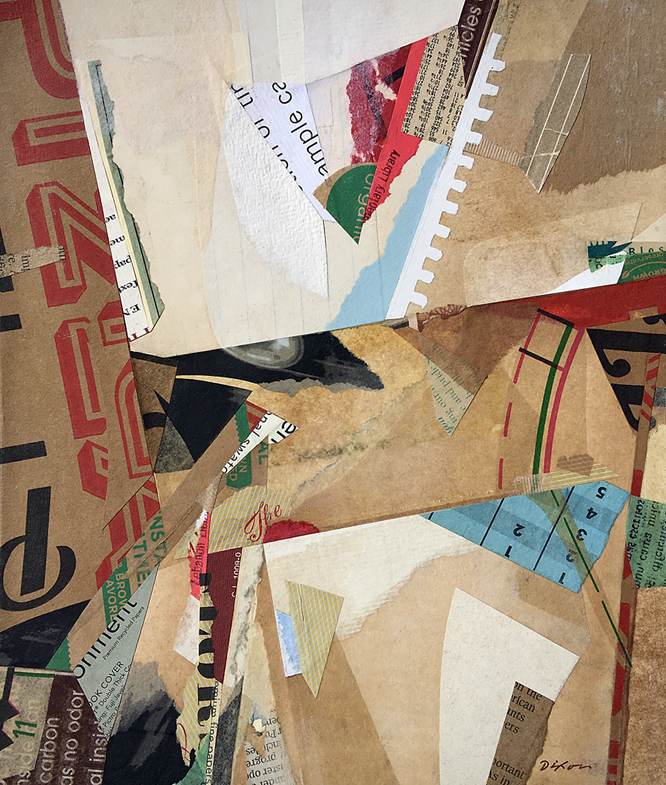
 

Untitled (dry shoal)
collage experiment by J A Dixon
9.3125 x 11 inches
available for purchase

Final Line

Tuesday, August 18th, 2020

As the full impact of navigating a declaration of pandemic struck everyone in early 2020, there was an activity that offered the sense of continuity many of us needed and a behavior that provided the social distancing all of us were expected to fulfill — a new season of creating artwork en plein air which allowed us to experience nature directly as an individual. In retrospect, I found it to be a profound source of consolation in a period of unprecedented disruption.

The first PAACK “art out” that I joined this year was a day at Perryville Battlefield, considered one of the most pristine sites where a Civil War conflict took place. There was a distinct awkwardness in the air when we met at the gathering point, but everybody soon shrugged it off and dispersed to scout locations. I found an appealing view of a hilltop and tree line off Oscar Bradley Road. A marker designated the location as where the final line of Union troops overlooked a strategic crossroads. I took a softer, more abstract approach with torn paper than I previously had. Perhaps it was something to do with a clear impression of being on hallowed ground. I left with a solid interim piece of work and strong feelings that went beyond artistic gratification. It didn’t take much follow through in the studio to complete this one to my satisfaction.
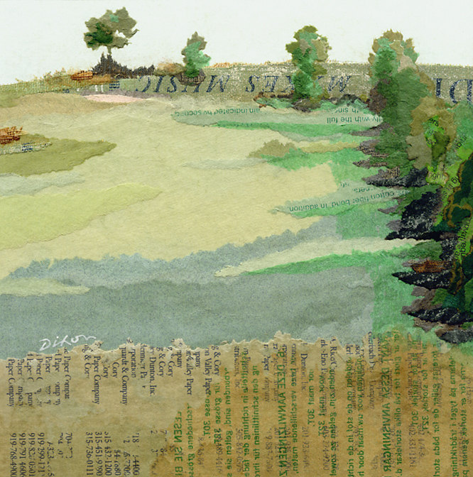
 
 
Final Line ~ plein air collage miniature by J A Dixon

Final Line
plein air collage miniature by J A Dixon
65% /35% — site to studio
7 x 7.0625 inches
available for purchase

Forgot to Look for America (diptych 69)

Wednesday, July 22nd, 2020


Forgot to Look for America (diptych 69)
collage miniatures by J A Dixon
1.9375 x 1.9375 inches each
left square | right square
available for purchase
 
< back to the comprehensive page of collage diptychs

Good Ol’ Boy Dada

Monday, January 27th, 2020

“When Schwitters made the first collage by literally picking up a piece of rubbish, a sweet wrapper, a bus ticket and a piece of wood, that was pure invention.”
— Sir Peter Blake
 

For the many who revere his art, there’s a distinct Kurt Schwitters for each of us — rebellious creator, fearless performer, relentless out-of-the-boxer, proto-beatnik, or visionary theorist. In combination with his towering individualism, he was, by reports from those who knew him, affable, witty, optimistic, entertaining, and a practical joker. This is the Kurt who would be a pleasure to “hang” with, who others in the internment camp on the Isle of Man would hear each morning, barking like a dog. In our local Bluegrass culture, there is a phrase for such a character. Around these parts, he likely would’ve been known as a “good ol’ boy.”
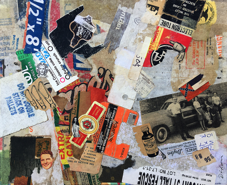
In response to the international call by Ric Kasini Kadour to build a Schwitters’ Army collection at MERZ Gallery, the two pieces I created pay tribute to this particular K.S. Both were fashioned from street debris and highway litter accumulated from my immediate vicinity. One of them was mailed to Sanquhar, Scotland. I haven’t decided what to do with “part 2.” Perhaps the series will continue.

In 2016, I wrote the following in my published essay on a hundred years of Dada: “Those of us who create collage art may not always describe our works as a tribute to the enduring, inclusive concepts of Merz, but that is precisely what they are, and we are indebted to that legacy.” As one who has never wearies of exploring the far-reaching innovations of K.S., I am content to describe myself unabashedly as a working “Merzologist.”

Schwitters may or may not have been the original artist to embed found detritus in collage, but certainly he was the first to fully master a modern-art version of the medium when it emerged at the close of the Great War. Embracing every conceivable source ingredient, he would codify the new visual vocabulary, give it an umbrella name, and bequeath the methodology to unborn generations. He may have sensed that the window of opportunity for him to preside over such a grand human venture was closing. He never got to take by storm the art world of 1950s New York — something eminently suited to his personality. His work and writings have had to speak for themselves.
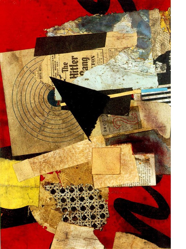
For me, the seminal creations that launched what we know as Merz can never be separated from the man himself — the one who directed subtle, irreverent jabs toward a gang of thugs who hijacked his culture, until it was impossible to stay put, and then, after facing further persecution in Norway with his son, reckoned that an icebreaker just might evade Nazi torpedoes long enough for them to reach the coast of Scotland. Probably that dauntless, wry, “Good Ol’ Boy” side of him was satisfied to leave us with this simple thumbnail declaration:

“My name is Kurt Schwitters.
I am an artist and I nail my pictures together.”
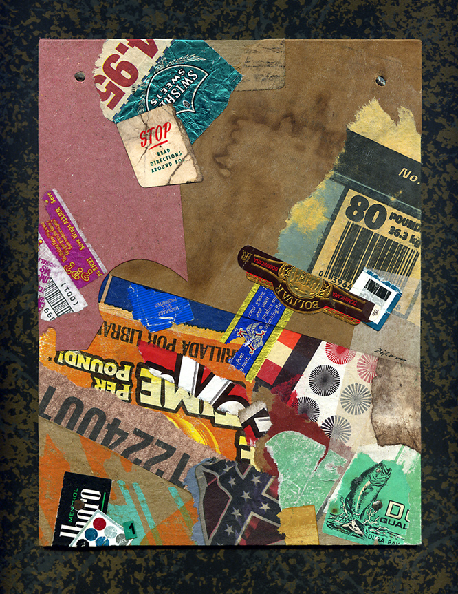


Good Ol’ Boy Dada, part 1
collage artifact by J A Dixon
7 x 9.25 inches


Good Ol’ Boy Dada, part 2
collage artifact by J A Dixon
7 x 9.25 inches

Spontaneity and adaptation

Saturday, July 27th, 2019

“I never plotted anything out. I don’t believe in storyboarding. I think you have a very dull-looking movie. You have to take advantage of the moment. I’m the kind of person that loves what we call the fog of war. That when things are going, and opportunities present themselves, you use them, you know, and there’s a fluidity that occurs that way. Now, I’ll go to all the locations. I know what I’m going to shoot, and where I’m going to shoot it, but I’m always ready to change. I’m always ready to adapt to the situation as it develops, and I think that there’s a certain organic quality that occurs then.”
— John Milius
 

The incomparable Milius was obviously talking about his approach to crafting a film, but I find his description entirely appropriate when discussing the art of collage. There must be a balance of careful research, discernment, and preparation — to set in readiness the potential ingredients — combined with a difficult-to-articulate sense of walking into the studio with absolutely no idea what will happen next, or how one might adjust the wheel to a different point on the compass. He puts it into words as well as anyone. If current movies — or any art form based on visual montage — look more contrived than ever, all the clues we need to know why are in that quotation.
 

Aggravated Dissent
collage on pasteboard by J A Dixon
7.5 x 11.5 inches
 
Purchase this artwork.

With a whole bunch o’ help from my friends . . .

Wednesday, May 22nd, 2019

“While many modern-day album artworks tend to favor strict minimalism, The Beatles make a serious case for going bold and wacky without any type of restraint.”
— Nicole Singh
 

As promised, I’m devoting an entry to the project that kept me out of the collage studio for at least a dozen weeks. I shall beg your forgiveness at the outset for delving into the details of a digital process. Not only has this site kept a seven-year focus on traditional cut-and-glue techniques, but I haven’t indulged the applied-arts side of my multiple personality as a graphic artist. I’m going to depart from that now — perhaps just this once — because it’s been an extraordinary circumstance for me, and a few of you may find the description worthwhile. At any rate, I encourage everyone to read Patrick Roefflaer’s article for a story that is genuinely more interesting than mine!

Not so long ago, a prominent local musician and former brass band director took me aside at an exhibition opening. Based on her recognition of my fondness for collage, she asked me if I would take on a visual homage to the Sgt. Pepper’s album cover design. The purpose would be to mark the 30th production of the Great American Brass Band Festival, held each June in our hometown of Danville, Kentucky. It had always been her dream to link the announcement of her retirement at the annual weekend of concerts to the classic album, with a medley of tunes arranged for brass instruments. Sadly, a severe health crisis had forced her early retirement before that could happen, but she preserved hope that a multi-discipline Beatles tribute for the festival’s upcoming milestone might happen in 2019.

I’d already designed nine posters during the festival’s lifespan. To create a tenth was tempting, and this idea had a barbed hook. It really snagged me. My previous experience offered no sense of proportion about the magnitude of time to which I was committing myself when I said, “Sure.” The first obstacle was whether we were allowed to do it at all. we soon discovered that an enormous number of entities had made a visual salute to the famous image over the past fifty years, and that it had already become a ritual of pop culture, in spite of the complexities involved. There’s even a website that shows over a hundred previous parodies. Before long, we had mutually decided that it might as well be our local festival’s turn to pay homage.

The assignment was now in my lap, and I was overwhelmed with a desire to do it justice and exceed expectations. I found inspiration in filmmakers who I admired (like John Frankenheimer or Robert Altman), because their time-consuming approach would be required for what I’d bitten off. I wanted to bring the same passion, attention to detail, and collaborative leadership to my effort. I ended up shelving all other priorities and putting a ludicrous amount of time into the project, but not without the help of many partners. First and foremost was my wife, Dana, who jumped in head first to play a key part in nearly every aspect of the creative enterprise. After getting advice from an experienced model railroader, she began crafting a miniature flower garden to display the festival acronym for a mandatory foreground allusion. More than once, she would come back to the unfinished artifact to find that its spongy base had “spit out” some of the “flowers.”

The rest of it hinged on two important elements — whether we could pull together our own “Fab Four,” and then surround them with a crowd of numerous figures. It was determined that the Beatles would be “represented” by the previous directors of the Advocate Brass Band, a Golden-Age-style band associated with every festival. Their initial formation to color a political rally in 1989 was a direct influence on the organizing of the annual event itself. This made perfect sense because the foursome would include the festival’s pair of co-founders and their band uniform jackets, although not psychedelic, would be an effective visual reference point. We immediately knew that some digital sleight of hand would be called for, since only two of the four were locally present. One was near a university town many counties away, and the fourth had moved to a distant state. It took lots of coordination to solve that equation, and we pulled it off with the crucial participation of my friend, photography pro Bill Griffin, who took time away from his day job of wealth management. In keeping with the guiding theme of “a little help from our friends,” getting all the ingredients for the poster art to coalesce would demand the magnanimous assistance of others — furnishing space, props, and standing in at our photo shoot, plus image research and acquisition.

At a certain point, I began to focus on researching the background “crowd of fans,” to honor the countless performers, organizers, sponsors, staff, and volunteers who made three decades of festivals possible. It became a daunting, complicated task of culling and selection. I realized that the poster would be the size of a picnic table if everyone who deserved to be on it were included. The original setup by Jann Haworth and Peter Blake was peopled with life-size, hand-tinted cut-outs that imposed a certain physical limitation, and it was fabricated within two weeks. A virtual approach was too open-ended for comfort. There was a limit to how methodical I could become in choosing ingredients for the montage of faces. The solution was to approach it more intuitively, as I would any of my “maximalist” works.

All collage art worthy of the name is irrational at some level, and one of the reasons the original Beatles art is so iconic is the sheer illogic of it. And so, for us, that idea led to a few incongruous personalities, such as Carrie Nation and Howdy Doody. The final assembly was challenging, painstaking, rewarding, and fun, all at the same time. After refining the list of candidates and compiling the source files, each master image had to be sillouetted, retouched, color balanced, and optimized for inclusion. It seemed like the rearranging would never end before every element of the composition appeared to “belong.” I shall confess that I do not possess a powerhouse workstation. The increasing quantity of digital layers in Photoshop had to be continuously merged to prevent the composite file from paralyzing my Macintosh. Even so, it would often exceed 500 MB in size. I tried to save and back up as often as feasible without breaking stride, but there were periodic freezes that would result in “three steps forward and two steps back.”

There should be no misunderstanding, however. The marathon endeavor was punctuated by many fortunate, often astonishing developments. One of our “Fab Four” individuals made a vital connection with an outstanding photographer in Athens, Georgia, who went the extra yard in matching my parameters for an important superimposition of the black-suited Dr Foreman. He also shot an antique bass drum to add another convincing Sgt Pepper’s touch — the same one that appeared on the festival’s first poster in 1990, and it still had the original, hand-painted emblem! Dana took the lead in preparing the poster “mechanical” for offset production, as she always has done for Dixon Design. She also knocked one out of the park during the solicitation of bids. As a contribution to the landmark production, Mike Abbott of Thoroughbred Printing agreed to produce the job at cost, and spent an hour with the press operator, Dana, and me, making sure we were satisfied with the quality.

Our closing duty was to devise a printable key for identifying all the individuals and design elements. My original idea of including a longer “blurb” for each line item quickly became far-fetched when producing the abbreviated version dragged on. By the time we declared it done, the “labor of love” vibe had been exhausted. There wasn’t much love left in the air, and I just wanted all of it to hit the street, which it has, of course, and the positive response has been even more than I anticipated.

This post is already far too long, so I won’t get started on my Eva Marie Saint story, but I need to explain why we included a picture of the creators, and then I’ll finish up on an appropriate collage note. I was adamant that I would not fall prey to the Hitchcock Urge. I had no interest in, nor justification for, inserting myself, since I was making so many brutal choices to leave others on the cutting room floor. Dana was in total agreement, but the team of people who helped with the proofing process took an opposing viewpoint. Their collective drum beat was that the final rendition must include us! You can see that we eventually waved the white flag and stuck a small portrait on top of the Bourbon barrel.

A tiny figure seated at a kitchen table was provided by the Great American Dollhouse Museum as a nod to the Shirley Temple doll in the original composition, which also featured a Madame Tussauds wax figure of Sonny Liston on the opposite side. I knew there had to be a way to include Kentucky’s own Muhammed Ali in our version. Rather than take unavailable time to solicit permission to use a photograph that might get buried in the sea of faces, I turned to my friend Robert Hugh Hunt, who kindly let us insert the extraordinary collage portrait from his 20th Century Icons series!

Oh, I get by with a little help from my friends!
 

30th GABBF Poster
digital homage by Dana and John A Dixon
24 x 36 inches
Purchase one now! 
 
Online order page includes a printable key to identification, 
plus a ‘special thank you’ to all our essential collaborators!

Precursors have precursors

Tuesday, August 21st, 2018

“We do not analyze works of art because we want to imitate them or because we distrust them.”
— Paul Klee
 

The other day the world learned about an unpublished Ernest Hemingway short story. If there had not been a Mark Twain first, would literature know Hemingway’s writings at all? Could there have been an Isaac Asimov, Stan Lee, or Gene Wolfe without a Verne or Burroughs? The J.K. Rowling body of work without an Austen or Tolkien? Similarly, all of today’s rock music can be linked to direct influences — to bands such as Ramones, Led Zeppelin or the Beatles, which, of course, had their own precursors. Would jazz exist in its current form without the innovations of Armstrong and all those who inspired him? Imagine a contemporary musician saying, “I really haven’t paid attention to any music that was recorded before I started to play.” And yet, not infrequently, collage artists will boast that they have little use for art history (all the breakthroughs of bygone creators who dug the swimming pools in which they now frolic).

It is argued that modern artists were the first to decide that visual art would be about art, rather than subject matter. Nonsense. Art has always been about art, because it always has been structured on prior foundations. The idea that any artist can burst on the scene as an original is absurd. Nobody who comes out of early childhood with any level of awareness has not built an inventory of perceptions — countless images from the culture around them. Each of these individual influences involved creative activity based on another bank of stimuli, and so forth, back to the first proto-human who picked up a piece of charcoal to make interesting marks on a stone (and was probably knocked on the head by another who judged the action as irrelevant to group survival).

Perhaps I have belabored my point. Perhaps it is a point that anyone who reads this would not need emphasized in the first place. Isn’t it obvious to us that no art form is more about all these churning influences from untold visual decision makers — painters, printers, illustrators, photographers, designers — than the medium of collage itself? So, let us all continue to study the collage artworks of the explorers who came before us, to trace the direct lineage of their concepts and techniques, to recognize that valuable inheritance in the work of our peers, as well as in the composition taking shape on the surface before us, and then, fully informed, to push confidently into the second century of collage.
 

Tranquil Ode (to Merz) ~ collage homage by John Andrew Dixon ~ Danville, Kentucky ~ Kentucky Crafted Mixed Media Artist

Tranquil Ode (to Merz)
collage homage by J A Dixon
9.5 x 11.875 inches
 
Purchase this artwork.

Mr. Kraler’s Distress

Monday, April 23rd, 2018

“I don’t think of all the misery, but of the beauty that still remains.”
— Anne Frank
 

It has been a distinct pleasure to perform in the company of some accomplished dramatic artists. I felt like a novice throughout our local production of The Diary of Anne Frank. There were times when the angst of my character, Mr. Kraler, spilled over into my off-stage being. So, naturally, I fell back on my own art and made a collage miniature as a creative catharsis. After a bit of sadness when the Secret Annex set was struck, I found myself eager to spend more time in the studio.
 
Mr. Kraler’s Distress ~ collage miniature by John Andrew Dixon ~ Danville, Kentucky

Mr. Kraler’s Distress
collage miniature by J A Dixon
8.25 x 9.375 inches
collection of the artist

Star Baby Feline

Saturday, February 3rd, 2018

 
Star Baby Feline ~ collage miniature by J A Dixon ~ a salute to the 70th birthday of Burton Cummings

Star Baby Feline
collage miniature by J A Dixon
4.25 x 4.25 inches
private collection

a salute to the 70th birthday of Burton Cummings

Much more about JUXTAPOSE . . .

Monday, February 29th, 2016

Friend and fellow collage artist Kathleen O’Brien is in the midst of her countdown to a big solo show in April. She asked me to do a favor and share a guest review as part of her final promotions for JUXTAPOSE before Drawn to the Earth requires her full concentration. As excited as I am about the group exhibition in Danville, it was a tougher post to write than I first anticipated. Collage is not the easiest art form on which to expound, perhaps because it relies on the “logic” of irrational choices.

At any rate, my dedicating a blogsite to that very topic was nobody else’s idea, so I best not complain to those of you kind enough to visit here. Would I rather be making art? Of course. Even so, I cannot constrain my enthusiasm for all things collage. Here’s my take on a great show. Be forewarned: If you’re looking for some criticism, you won’t find it!


I’ll admit it. I can’t get enough of JUXTAPOSE. The current exhibition of collage and assemblage is at the Community Arts Center until April 2nd. That’s not exactly the most humble thing to say, considering it features a dozen works by yours truly, so I won’t pretend that I can offer an unbiased review. Program director Brandon Long has organized a finely curated, must-see destination that brings together over a thousand examples of the two associated mediums (literally, but I’ll explain that in a moment). This is an unprecedented group show for the Bluegrass-based artists involved, and I am thrilled to be exhibiting side-by-side with Kathleen O’Brien, Teri Dryden, Robert Hugh Hunt, Meg Higgins, Connie Beale, Cynthia Carr, and many others. No doubt my enthusiasm has something to do with its location less than a city block from my studio, which bestows the luxury of repeated immersions, and there is over a month left in the duration!

There are more participants than I can profile individually, and far too many artworks to highlight. The best example of this is a room devoted to three complete year-long series of collage-a-day works by O’Brien, Long, and Nan Martindale. Combined with almost one hundred seventy of Robert Hugh Hunt’s provocative collage collaborations, the magnitude of miniature artworks presented in a single space could be overwhelming. As an exhibition designer, Long uses geometric grids, browsing boxes, and two flat-screen displays to make the huge collection comprehensible for viewers. O’Brien’s sensitive, meticulously layered collection of daily two-sided postcards is a journey to which I surrender with pleasure each time I visit, but only after a jolting romp through Hunt’s rarely exhibited Hillbilly Voodoo series with T R Flowers.

An opportunity to view works by six outstanding Louisville-based artists is worth the trip to Danville. Several major works by Meg Higgins captured my first impression. Two enormous pieces composed with transparent elements sandwiched between Plexiglas are suspended between the vestibule and grand gallery. I was equally impressed by a smaller collage on wood panel, Japanese Peony Goes to Italy, with its exquisite East-West flavor. Brad Devlin’s solid but clever exploitation of found objects yields bold abstractions that simultaneously maintain a strong environmental essence. His Open Sunday is also physically more complex than it first appears, and this allows the artisanship of his assemblage to become a secondary experience deserving of scrutiny. Masters of juxtaposition who reinforce the theme of the exhibition as well as anyone taking part, Patrick Donley, Lisa Austin and Brandon Bass each define a distinctive individual style. Approach to composition, color considerations, and a playful choice of ingredients form undercurrents that tie their pieces together, and Long knows how to modulate the walls in a way that makes groupings of their work satisfying to study. Although she has recently gained attention for her paintings, there are at least seven panels by Teri Dryden from a handsome body of work created from discarded books. Her Monteith’s Marrakesh exemplifies how her investigation successfully transcended the source material. Personally, I hope she rotates to collage again for another dynamic round of re-purposing cast-off items.

detail from Reliquia ~ collage on framed panel by John A. DixonIn addition to displaying a pair of shadow boxes, my only surrealist assemblage, and six favorite collage miniatures, JUXTAPOSE provides an opportunity to exhibit Bull’s-eye Nosegay for the first time, which I created for the Target Practice Project initiated by L T Holmes. Also, I did two larger collage artworks especially for this show. Each makes more than a fleeting nod to artists who I admire. What is it about Cherry Balm that causes me to think I just might be “tipping my beret” to the inimitable Matthew Rose? Reliquia is my tribute to the late Fred Otnes, a giant within the medium who has been a force in my consciousness since adolescence. Pearallelograms was held over from the previous exhibition at the institution, but the crowning delight for me may well be the presence of Kentucky Madonna, last year’s “finish” by Robert Hugh Hunt to my “start.” The collaborative piece is a companion to one currently hanging with the IT TAKES TWO exhibition of collaborations at the Kentucky Artisan Center in Berea. Robert and I can’t ask for more than to know that both are now available for public observation (unless someone wants to give them a good home).

I am no art historian, but I can’t help but be mindful of the pioneering artists who laid a hundred-year foundation for the sweeping diversity of this exhibition. The creative innovations of Picasso, Braque, Duchamp, Schwitters, Höch, Cornell, Johnson, and Kolář reverberate throughout the building. In many respects, all contemporary collage/assemblage is a tacit homage to these seminal influences, but that is never the only thing at work nor the only phenomena to be perceived when one indulges an exhibition of this scope. Most artists are striving for a personal means of expression informed by those who have made their enduring mark on a medium. I am convinced, more than ever, that what distinguishes contemporary collage/assemblage artists is their keen connection to the mundane “stuff” of culture and the inner need to bring a measure of order and harmony from the sheer volume of material produced by our throw-away society, with its chaotic effect on our sensibilities — to create value where none exists, or to find wonder, meaning, significance, and beauty where none can be expected.
 

Japanese Peony Goes to Italy ~ Meg Higgins, Louisville, Kentucky

Japanese Peony Goes to Italy
Meg Higgins
collage on wood panel

Open Sunday ~ B Devlin

Open Sunday
Brad Devlin
assemblage, found objects

Strength ~ P Donley

Strength
Patrick Donley
mixed-media on wood

Bird’s Eye View ~ L Austin

Bird’s Eye View
Lisa Austin
collage

Monteith’s Marrakesh ~ T Dryden

Monteith’s Marrakesh
Teri Dryden
collage from discarded books on panel

Cherry Balm ~ John Andrew Dixon, collage artist, Danville, Kentucky

Cherry Balm
John Andrew Dixon
collage on canvas
available for purchase

Reliquia ~ John Andrew Dixon, collage artist, Danville, Kentucky

Reliquia
John Andrew Dixon
collage on framed panel

•  S O L D

Spot Checker

Monday, February 22nd, 2016

“I force myself to contradict myself in order to avoid conforming to my own taste.”
— Marcel Duchamp

The generous invitation to create new works for JUXTAPOSE had me thinking about constructing my first surrealist assemblage, but I had no specific concept in mind. I had some ruined wood frames, ornate in style, and started cutting them with a mitre saw to form a Swiss cross. To be honest, I didn’t want to use that symbol, so it was easy to “cancel” the idea by rotating it 45 degrees, and now I had an X to “mark the spot.” Dead end? There had to be more to it than that. I shifted my attention to completing a collage, and I must have unwittingly assigned the problem to my subconscious, because I awoke after a night’s sleep with the total solution in my head. How can one explain something like that (or Dada, for that matter)?

A few words of caution, however: Don’t actually plug it in.
 
Dixon_SpotChecker

Spot Checker
assemblage by J A Dixon
30 x 30 inches (+ “tail”)
available for purchase