Archive for the ‘Morgue’ Category

Haus of Categories

Monday, January 22nd, 2018

“As an art of its time, collage art — its imagery, its techniques, its attitude — speaks to our confrontation with a fractured multifarious image of the world in an age of information overload. The activities of sifting, sorting, organizing and prioritizing has become the basis and the goal of artistic activity in this hummingbird era of ADHD”
— Cecil Touchon

“A light bulb in the socket is worth two in the pocket.”
— Bill Wolf
 

Categorization is integral to the practice of collage. It is part and parcel of the ongoing acquisition, storage, and retrieval of compositional ingredients. I doubt if there is a dedicated collage artist out there who does not possess a particular method of processing the studio material that results in a work of art. We do relish the hunt, and, to some degree, we enjoy accumulation for its own sake, but, more than that, we like to be able to find our stuff when we want to use it.

Not long ago, Allan Bealy brought an article about the library of Vito Acconci to my attention. Like many artists, I devised a method of classification early in life and refined it over the years, and I found benefits in developing a “morgue” according to my own “creative code” rather than adopting a predetermined system. In whatever way we catalog it, we must be able to access the ingredients we need without impeding a flow of intuitive spontaneity. My studio repository began as a few “youthful” files of tear sheets that simply caught my eye as catalytic images. With the demands of professionalism, it grew into an illustrator’s resource that spared me many a trip to the public library. It mushroomed over time and finally evolved into a collage artist’s stash, with many subdivisions (such as antiquity, language, creatures, environments, attire, icons, themes, botanicals, patterns, vintage, surreal, and cosmic).

Individualized categories also help me to organize self-perceptions of what I make, even if these “sets” or “series” make limited sense to others. Although crafting personal greeting cards continues at a significantly reduced rate, I can now look back on the life-long activity as a key practice in my transition from applied to fine arts. It has had a strong influence on how I codify work that typically begins with intuition and ultimately ends with inclusion within some sort of idiosyncratic classification.

Please examine seven images recently created for my outgoing cards (with their designated categories). Some are considered hybrids (for lack of a better term). Those with an interest can find more at The Collage Miniaturist with this link and its associated archive.

Long live John’s Haus of Cards!

collage greeting card by John’s Haus of Cards!

BodoMason
collage greeting card by J A Dixon
series Omega/Pi hybrid, collection of W Bates

collage greeting card by John’s Haus of Cards!

Eagle Nest Goddess
collage greeting card by J A Dixon
series Pi, collection of J Hellyer

collage greeting card by John’s Haus of Cards!

Existunt
collage greeting card by J A Dixon
series Omega, collection of R W Breidenbach

collage greeting card by John’s Haus of Cards!

G is for Gray
collage greeting card by J A Dixon
series Omega/Pi hybrid, collection of G Zeitz

collage greeting card by John’s Haus of Cards!

Nurse Saw It
collage greeting card by J A Dixon
series Pi, collection of R K Hower
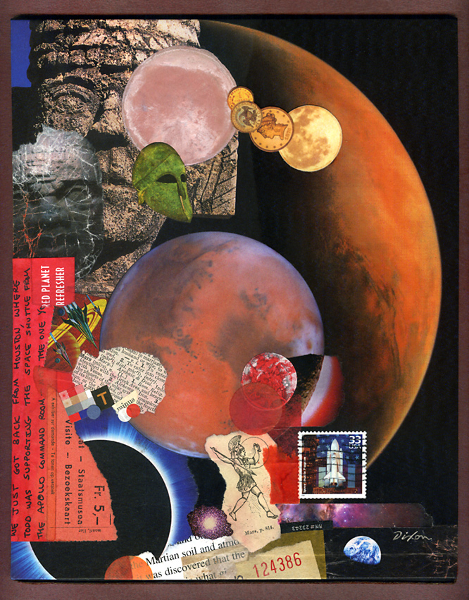
collage greeting card by John’s Haus of Cards!

IcogNeato
collage greeting card by J A Dixon
series Omega, collection of J M Hoover

collage greeting card by John’s Haus of Cards!

O Lovely Perch
collage greeting card by J A Dixon
series Omega, collection of W W Barefoot

Wetland

Monday, January 15th, 2018

“When you take risks you learn that there will be times when you succeed and there will be times when you fail, and both are equally important.”
— Ellen DeGeneres
 

Although it was created in the studio, my new collage landscape titled ‘Wetland’ benefits from a summer of plein-air activity. My “painting with paper” out of doors has opened a rewarding area of investigation for my work as a collage artist. I’m pleased to share this piece with the art-viewing community at my first invitational exhibition of the year, the annual New Year New Art show at our Community Arts Center, just a biscuit toss from my home base in downtown Danville, Kentucky. This event has been a fortifying tradition for regional artists, because we can complete our year of work at a risk-taking level, and still know that the result will get a prominent public display. An artist working outside a metropolitan center could not ask for greater support from a local institution.

Based on an excellent photograph by a longtime pal, this artwork was created as an entry for a contemporary landscape show, but the juror rejected it for unknown reasons. I kept it handy for a pair of upcoming open studio events (my participation in the Central Kentucky ARTTOUR and Gallery Hop Stop). Plenty of praise ensued, but nobody took it home, so I decided to make additional refinements, leading up to the deadline for the January exhibition. A full makeover was unnecessary, as the in-process image above indicates. However, I was not entirely pleased with the vegetation at the waterline, above the dark shadow that spans the composition. In this case, less was not more. Additional ‘foliage’ was needed. I also thought that the lower right corner was too abstract. The desired sense of realism would profit from a more detailed foreground. Late-season ironweed, a favorite of mine, seemed a suitable choice. That led intuitively to a few closing decisions in the sky reflection and distant terrain. stash of premium paper samplesNearly all of the ingredients were infused with wheat paste and press firmly onto the evolving surface with polymer gel. After thorough drying, selected areas were lightly sanded and the total surface evenly daubed with a flat sealant.

It is very satisfying to work with a palette of elegant papers, and I am fortunate to have them. Some of you may remember (especially those with a background connected in some way to the graphic arts) the pre-internet days of a more diversified paper industry. Numerous mills and distributors slugged it out in a highly competitive market. Inkjet printing was still on the horizon and multi-color offset printing was expensive. Printing on colored stock was a cost-effective way to get more color into published material. Paper producers went out of their way to demonstrate creative ways to use colored paper and many of us who specified paper for printing projects were lavished with promotional samples. Decades later, I still have a stash from that era, and I rely on it now for my plein-air miniatures and studio landscapes. A piece such as ‘Wetland’ puts this hoard to good use; it would not look the same with scrapbook or construction paper. The richness of premium papers manufactured for fine printing were accented with fragments of dulled foil, tissue, scraps of found packaging, and fragments of typography. After all, it’s meant to be a collage artwork!

The opening reception for NYNA is this Friday evening, 5 to 8 pm. Perhaps I shall see you there to discuss ‘Wetland’ in person.
 
Wetland ~ collage landscape by John Andrew Dixon, Danville, Kentucky

Wetland
collage landscape by J A Dixon
21.25 x 19.25 inches
on structured panel, framed
available for purchase

Star of Commonwealth ~ through the glass

Saturday, August 12th, 2017

“Impossible is just a big word thrown around by small men who find it easier to live in the world they’ve been given than to explore the power they have to change it. Impossible is not a fact. It’s an opinion. Impossible is not a declaration. It’s a dare. Impossible is potential. Impossible is temporary. Impossible is nothing.”
— Muhammad Ali
 

Let us take “our telescope” and look more closely at the Star. My strong appreciation of fine-art collage is second to none, but there is something equally as satisfying when one is called upon to create an “artifact” that pays tribute to a unique historical or personal legacy. I think that I managed to compile enough ingredients to do justice to the theme of the current exhibition — Kentucky’s 225th birthday celebration.

If anyone asks, “Where is he or she? Why did you not include this or that?” the answer might be as simple as an absence of “stuff.” The reason for that is my firm reluctance to use anything but original source material that would otherwise be destined for the recycling bin or landfill. I cannot bring myself to go online to search for, print, and use digital imagery, even though nearly anything can be “acquired” in that format these days. For me, art is always about constraint. Or, as the late Martin Landau put it, “It’s not about comfort, it’s about discovery.”

Please click on the images below to zoom in on Star of Commonwealth.
 

detail from ‘Star of Commonwealth’ by John Andrew Dixon, Danville, Kentucky

How can a collage artist go wrong, relying on images of
Kentucky’s two most widely recognized and revered native sons?
For me, Frederick Douglass is the figure who links them best.

detail from ‘Star of Commonwealth’ by John Andrew Dixon, Danville, Kentucky

One of my organizing factors was to confine the more intense colors to the
‘floating’ star and to use the plank surfaces to carry a more historical tone.

detail from ‘Star of Commonwealth’ by John Andrew Dixon, Danville, Kentucky

Kentucky has one of the greatest multitude of counties for any state in the union.
Woefully inefficient, or one of the better examples of self-government close to
the people? You can decide. I just like how colorful it makes an antique map.
At any rate, the frontier’s exploding population pushed Dan’l toward the sunset.

detail from ‘Star of Commonwealth’ by John Andrew Dixon, Danville, Kentucky

One of my favorite zones involves a visual juxtaposition of worship, whiskey,
constitution, thoroughbreds, coal mining, confederate leader, battle flag, and a
reference to human slavery. Only the history of Kentucky could contain all that.

I Must Have Kentucky ~ all the details

Sunday, April 2nd, 2017

“I think to lose Kentucky is nearly the same as to lose the whole game. Kentucky gone, we cannot hold Missouri, nor Maryland. These all against us, and the job on our hands is too large for us. We would as well consent to separation at once, including the surrender of this capitol.”
— Abraham Lincoln, 1861
 

I am constantly experimenting, because I find it difficult to pluck a coherent idea from a “cold start,” and so I cultivate a habit of collage experimentation to preserve a state of receptivity and to invite the uncanny “synchronicities” from which a more rational concept can be refined. More often than not, there are no distinct memories associated with the genesis of an idea. It is unusual, therefore, to have a clear recollection of the creative lineage for I Must Have Kentucky, currently on display as part of 225: Artists Celebrate Kentucky’s History.

I was stumped about how to respond when a call to artists from curator Gwen Heffner announced an exhibition to observe Kentucky’s 225th birthday. I thought about the history of my own town (Danville, the first capital of the state), about the The Kentucky Documentary Photographic Project, about the story of tobacco growing families in Kentucky, and about the great Kentucky abolitionists. There were so many fascinating subjects, but none of them sparked a visual flame in my imagination. When I shared my befuddlement with Dana, my “partner in all things,” she suggested I consider doing something with Star of Abraham, an artifact I made in 2009 for the bicentennial of the 16th president’s birth. Star of Abraham ~ John Andrew DixonThe bulk of my collected Lincoln images had been exploited to cover a salvaged metal star. To produce a collage tribute to the martyred leader with a folk-art quality seemed a technique appropriate to the occasion, and it was still in my studio, generating little interest from visitors. I liked the notion of using it as a “found object” in a larger assemblage, but there needed to be more to it than that. The solution finally hit me on a drive to our family farm, when I turned off the radio and focused on the rolling “knobs” that surrounded me: Lincoln’s famous declaration about his home state during the Civil War!

I got down a flurry of thumbnail concepts in my journal when I arrived at my destination. It was barely necessary to ever look at them again, because the development toward a final idea took on a momentum of its own. I realized I could enlarge my Lincoln theme with additional artisanship to include the importance of Kentucky in his strategic thinking. A design took shape in my sketches, and I searched my stash for images that would do justice to the “brother against brother, family against family” character of the conflict in a state that gave birth to the presidents of each warring side.

The expanded mixed-media construction is created from recycled materials — found ingredients include salvaged wood and metal, plus discarded books, magazines, maps, and mailed promotions. My lettering is hand painted with acrylics. John Andrew Dixon at the Kentucky Artisan Center, Berea, KentuckyObviously, the dimensional star represents Abraham Lincoln. The five horizontal bands signify the final years of his life and the impact his decisions had on Kentucky and the United States during that time. Among the individuals featured are Kentucky native Jefferson Davis, Lincoln’s rival in war, and Senator Stephen A. Douglas, his rival in peace, plus Lexington native Mary Todd, her sons Willie and Robert, Munfordville native Simon B. Buckner, Frederick Douglass, U.S. Grant, Clara Barton, John Hunt Morgan, and others. Also represented: soldiers, their ladies, Kentucky coal miners, and the decisive Battle of Perryville.

The artwork commemorates our Commonwealth during 1860 to 1864, the most tumultuous period in its history. At the center of those pivotal years is the towering figure of its most illustrious native son, who encapsulated the significance of the border state to the cause of national unity when he reputedly declared:

“I hope to have God on my side, but I must have Kentucky”.
 

detail from ‘I Must Have Kentucky’ by John Andrew Dixon, Danville, Kentucky

I secured the existing ‘Star of Abraham’ to a construction of five salvaged
wood planks, which alternates hand-painted lettering with my typical collage
treatment. My Lincoln artifact had finally found a fitting context.

detail from ‘I Must Have Kentucky’ by John Andrew Dixon, Danville, Kentucky

I long have found interesting that Kentucky had given birth to both
presidential leaders in the national conflict, and I devoted a section of my
composition to that inexplicable fact.

detail from ‘I Must Have Kentucky’ by John Andrew Dixon, Danville, Kentucky

Border-state Kentuckians were divided when war broke out. Munfordville
native Simon B. Buckner attempted to enforce its neutrality before accepting
a Confederate commission. He led troops at the strategic Battle of Perryville
in 1862, and later became a scandal-plagued governor of the Commonwealth.

detail from ‘I Must Have Kentucky’ by John Andrew Dixon, Danville, Kentucky

One of my favorite spots in the piece: Lincoln’s boy Willie, U.S. Grant, a young
Frederick Douglass as a free man next to a slaveholder’s advertisement,
a superb wood engraving of combat, Clara Barton, Samuel Colt, and an image
of the Commander in Chief that indicates his unusual height.

Thanks for reading such a long entry. I invite you to register and comment here. Let me know what you think. If anything bugs you, constructive criticism is encouraged!

Spencer Gulf

Monday, April 25th, 2016

“The Japanese word yugen means ‘aesthetically mysterious.’ We don’t have a word like this to describe art in the Western art world. Yugen as a concept worries some because it describes an intangible. It says ‘awe’ and ‘mystery’ can also be qualitative aesthetics, and the beauty of this is that though yugen is a Japanese word what it describes is universal in reach. Though a refined concept, it is an everyman’s word because it describes perfectly a good deal of the art the entire world makes to achieve personal and cultural satisfaction. In a time when we are 1% and 99% sensitive, let us indeed remember that the art mainstream, the academic discourse, the intellectual game of art about art, the ivory tower is only 1% of why the world makes art.”
— Randall Morris
 

For the second consecutive year, I had the opportunity to create a collage as prize art for the preeminent single-shot rifle match held in Kentucky. Visitors to this blogsite know my ongoing fascination with collage as an ideal medium for total spontaneity. Of course, it also lends itself perfectly to a planned, thematic solution for specific appeal.

I discovered enough ingredients in my stash of papers to cover the Australian topic, but also to entertain a desired level of synchronicity to encompass a few distinctive characteristics of the event. In addition to my personal enjoyment, I am always pleased to see the positive response to collage as art. It has to be more than the element of the unexpected, although, admittedly, collage is never what people anticipate in these situations. I think it may be the particular combination of accessibility, interactivity, and “mystery” so inherent in the medium. I suppose there is more to said about that, but we shall save it for another day.
 

Spencer Gulf ~ J A Dixon

Spencer Gulf
collage miniature by J A Dixon
7 x 9.5 inches
prize art for The Great .310 Australian Cadet Martini Match of 2016
awarded to D Simpson

Assignment: Mars

Monday, December 22nd, 2014

“I would do ‘John Carter’ again tomorrow. I’m very proud of ‘John Carter.’ Box office doesn’t validate me as a person, or as an actor.”
— Taylor Kitsch

One of the more exciting developments for any artist is the request for original artwork based on an interesting theme. Whether it is for personal or commercial purposes, the medium of collage is ideally suited for commissions, and the process can make use of visual ingredients provided by the client, if the artist sees fit to embed them. It probably goes without saying that the applied arts can be a tricky affair for some fine artists. It is important to sort out the contrasts between meeting customer expectations and following one’s own creative direction. There is also a range of differences among the types of projects that might benefit from a collage assignment, including packaging or label graphics, book cover or editorial illustration, product design, or the straightforward commissioning of a fine-art work. Clear communication up front is always the best approach, and there is nothing wrong with declining a job if client objective and artist satisfaction cannot be fulfilled at the same time.

Today’s example was created for the buyer’s presentation as a gift to an engineer closely involved in Martian exploration. When the client described the intended recipient’s passion for the subject, I swallowed hard, but my initial trepidation soon faded as the process took on a life and momentum of its own (as, thankfully, it always does for me). I shall admit, however, that it may take a little time before I replenish my red-planet stash.
 

Dixon_AssignmentMars

Assignment: Mars
collage miniature on panel by J A Dixon
8 x 10 inches
private collection

“Oh, the Places You’ll Go”

Friday, June 20th, 2014

“Art is the only way to run away without leaving home.”
— Twyla Tharp

Places to go, ways to travel, and flights of fancy . . . A series of local exhibitions at the Boyle County Public Library’s Mahan Gallery has been an effective catalyst for me to create new pieces based on unifying themes. I have recently experienced mixed emotions about the ubiquity of vintage material in contemporary collage, but the topic of this show had me hunting through my morgue of old postcards and other relics to produce a pair of artworks on canvas. Yes, we all dig the instant “gravitas” of using old stuff, but will art historians say we copped out, if we do not accept the challenge of working with ingredients from our own present-day culture? I am just musing about the state of the medium, not any artist in particular. I see a hundred or more collage artworks posted online each week that rely exclusively on 20th-century material, and much of it seems stuck in a bygone avant-garde style. It is important for all of us to keep in mind that the Dada artists so widely emulated worked with material from their own time. Perhaps the opportune approach is to blend it all together, past and present. As post-centennial collage artists, we also owe each other a bit more constructive criticism than I currently observe. As the details below illustrate, I have absolutely nothing against using vintage material. I think that artists such as Hope Kroll or Fred Free or Matthew Rose (to offer only three examples) are creating some of the more exceptional work in the medium. On the other hand, there are many who seem to be using it as a crutch, over-relying on the antique impression of the ingredient material itself, rather than the juxtapositional synergy or overall aesthetic effect.

As the artworks for “Places” also demonstrate, I continue my effort to liberate a collage from the traditional glass barrier. To do so, it is necessary to find a proper level of protective sealant to balance visual appeal and durability. I prefer to avoid an overly polymerized impression with a finished surface. Because I primarily work with found material, I have had to learn which ingredients can handle direct exposure (for an effect similar to the painted surface). Nevertheless, some are simply too fragile and will always require a safe abode under glass.


left: Here and There (detail)
right: Now and Then (detail)
two collage artworks on canvas by J A Dixon
12 x 12 x 1.5 inches each
available for purchase

this thing we all do . . .

Wednesday, November 20th, 2013

In response to an assertion that his environmental works are impossible to visually document—

James Turrell: “Well, someone has to make up for all the work that photographs better than it is.”
 

Mr. Turrell’s recent quip brings to the forefront a distinct feature of representing or documenting one’s artwork. Does it really look like the image being included with a call for entries, posted at an online marketplace, or shared on a social network? Of course, the photographing of artwork to enhance its appeal did not begin with digital devices or the World Wide Web. Most of us are familiar with the curator’s disclaimer that reserves their right to reject artwork which arrives substantially different than visually represented when proposed. Even non-artists know how easy it is to boost the contrast or color saturation of a digital image. Setting apart from our discussion works that are essentially digital from the outset, it is important for anyone working in the medium of traditional collage to squarely meet this challenge: How do we properly interpret the visual experience of seeing our artwork firsthand?

Needless to say, faithfully photographing or scanning conventional artwork is something that professionals face every day, but how can it ever be an exact science? What is the “true” appearance of anything? As the three examples below demonstrate, one of my recent collage artworks photographed differently under three different lighting conditions, before it was delivered. The more neutral version is closer to how it might “typically” appear, but perhaps the most faithful rendition would be an image made in the setting for which the piece was commissioned, under the unique lighting conditions of that particular environment, and then subsequently balanced for a reasonable match to the naked eye.

I review nearly a hundred collage artworks a day, as my eye passes over numerous online displays each week. What percentage of these creations actually look like the corresponding digital image? We all know what it’s like to see something and think, “I wonder if it really looks like that.” On the other hand, we also know what it’s like to scan a piece and think, “Wow. That looks better than I expected.”

All that any of us can do is establish a level of integrity about representing work to others. For those who routinely cheat or push an ethical boundary? Rest assured; the habit will eventually come back to haunt their studios.

And now, a few words about today’s collage example. I must first express my appreciation to Lee and David Simpson for the commission that resulted in this thing we all do, a mixed media and collage artwork on canvas. To infuse the composition with images that represent aspects of significance to their lives, this piece was personalized by using the clients’ own artifacts and memorabilia, as well as additional ingredients carefully selected from my morgue. Creating works with special meaning to those for which they were intended has always been some of the most fulfilling time I have spent as an artist.


this thing we all do (three different digitals)
collage with combined mediums on canvas by J A Dixon
15.75 x 27.75 inches (22.50 x 34.50 inches, framed)
collection of L and D Simpson

this thing we all do (detail)
collage with combined mediums on canvas by J A Dixon
(photographed and digitally balanced to match original)
 

Star of Abraham

Monday, February 18th, 2013

“However long and varied the background of pasted materials in folk art, none of these developments was considered a major artistic movement. It was the creative artists of the twentieth century, Pablo Picasso and Georges Braque, who applied materials as a new and valid means of expression. With these artists and their work the word ‘collage’ was first applied and became associated with the movement. Thus was born an art form that has become part of the contemporary milieu and, indelibly, a major historical art movement.”
— Dona Z Meilach and Elvie Ten Hoor

My wife and I recently went to see Lincoln, the Spielberg picture with Daniel Day-Lewis in the title role. It got me thinking again about the work I created for the bicentennial of the 16th president’s birth, the celebration of which was a fairly big deal here in his native state. I had made the decision to exploit the bulk of my collected Lincoln images to totally cover a metal star. To produce a collage tribute to the martyred leader with a folk-art approach seemed to me a technique appropriate to the occasion. The “artifact” is still waiting for a home. Happy Presidents Day to all.
 

Star of Abraham
collage artifact by J A Dixon
22 x 22 inches

Left Field Corner

Tuesday, January 15th, 2013

Degas: “Voilà! I have this great idea for a poem.”
Mallarmé: “Alors mon ami, poems are made out of
words, not ideas.”

It has been said that ingredients make the collage. One could argue that case. But what of the comprehensive whole? Does the effect of the artwork not rely on the compositional relationships and the interest of juxtapositions? Of course. But what could be expressed without the ingredients? What would a painting be without the paint? Do you know a collage artist who does not take special care with the selection of the physical components and does not thoughtfully compile, sort, edit, and re-edit before the process of assembly takes place? Some may emphasize the pictorial or symbolic qualities, while others may focus more on abstract or aesthetic attributes. Many give great attention to the sourcing or provenance, with personal criteria that must be met in service to a sought-after look or personal style. Others zero in on the transitory nature of ingredients, independent of representational aspects, with a keen regard for age, condition, and the sense of impermanence. But the bottom line for all— something a perceptive friend recently pointed out to me— is that each and every ingredient caught the artist’s eye in some significant, personal way, in some manner that gave glimpse to its ultimate visual potential. That was when I realized how most of my ingredients had run a long gauntlet of multiple scrutinies: First it was acquired and saved for some reason. Then it was retrieved from its repository for some reason (often years later). Then it was grouped with other worthy candidates for some reason. And then finally it was used in a work. It found a new purpose for which it was not originally intended, a place where it belonged, when other items were set aside (perhaps to win a role in another collage, or to eventually fall out of favor). It’s hard to disagree with the idea that the culminating gestalt of a collage determines its level of success, the degree to which it becomes more than the sum of its parts. Ah… but how we relish those parts!
 

Left Field Corner ~ J A Dixon

Left Field Corner
collage miniature by J A Dixon
5.5 x 5.5 inches
collection of R K Hower

Moon Blues

Friday, August 31st, 2012

“Structures can be understood and qualities felt in a single, balanced perception of order. Art attempts to discern order relations in nature. Data are set out in terms of recreated sensed forms; and the felt order is expressed in sensible structures exhibiting properties of harmony, rhythm, and proportion.”
—Gyorgy Kepes

What is it about seeing two full moons balanced on the first and last day of the month that compels me to create a collage with subjective connotations? The wonder of the celestial (and the potential for visual juxtapositions of the macro- and micro-cosmic) has long held me in its spell.

It is advantageous for a collage artist to have a well-organized “morgue” of categorized scrap readily available, in order to quickly assemble ingredient elements when a creative concept takes hold. It frees one to follow the germ of an idea with associative intuition. To tell the truth, I would not know any other way to successfully approach this type of collage. Having to hunt for an image is a spontaneity killer. One’s collection of pieces and parts should be based on one’s unique way of making connections. As with most artists, I began to save images in my youth, according to a personal and natural sense of classification. Over the years, the collection has been subjected to periodic refinement and culling, although I cannot bring myself to cut off the acquisitions for good, even though I know I shall never compose all the artworks that lay fallow in those file cabinets. There are, of course, other ways to catalyze and create a collage, and I shall talk about them at a future instance.

R.I.P. ~ Mission Commander Armstrong . . .
 

Moon Blues by J A Dixon

Moon Blues
collage miniature by J A Dixon
5 x 7 inches

•  S O L D