Archive for the ‘M Glaser’ Category

Glaser’s “Ten Things I Have Learned”

Sunday, June 28th, 2020

You can only work for people whom you like.

If you have a choice, never have a job.

Some people are toxic.
Avoid them.

The good is the enemy
of the great.

Less is not necessarily more.

Style is not to be trusted.

How you live changes
your brain.

Doubt is better than
certainty.

On aging: It doesn’t matter.

Tell the truth.

Milton Glaser
1929 – 2020

Dada and the Surreal Face in Contemporary Collage

Sunday, June 12th, 2016

“Nobody knows, and it is now too late to discover, who invented that most succinct of all art movement names.”
— Robert Hughes

“Style is not to be trusted.”
— Milton Glaser
 

As most of you know, 2016 marks the centennial of the art movement known as Dada. Although credit for originating collage is customarily granted to the Cubists, nobody shaped the emerging medium as powerfully as early 20th-Century Dadaists and their successors, the Surrealists. Very few traditions or conceptual approaches in contemporary collage have not navigated the tributaries they established, in spite of the fact that each of these artistic “schools of thought” had a relatively short apex. Much continues to be said and written about the catalytic Hugo Ball and the seismic effect after he opened Zurich’s Cabaret Voltaire with Emmy Hennings in February, 1916. Most of the work still being created under the banner of collage has not escaped the hundred-year shadow of inherent sensibilities unleashed on modern art by those who first uttered “Dada!” — spontaneity, chance, irreverence, consternation, and, perhaps foremost, a rejectionist posture. Without a doubt, most collage artists of our time would disagree with Ball’s exhortation to “burn all libraries and allow to remain only that which everyone knows by heart.” Nevertheless, they might indeed relate to his conclusion that “this humiliating age has not succeeded in winning our respect.”

Warsaw-based designer/educator and blogger Annę Kłos describes Dada as a world view, that by its very nature could not be homogeneous, and that the seminal Merz of Kurt Schwitters was manifest within the context of internal incompatibilities. For the most part, however, many artists now tend to lump together the Dadaists, and emulate their visual and intellectual departures as an encompassing genre at best and a mere “style” at worst. — Time out. — This is when I grab myself by the scruff of the neck to keep from going off on an unnecessary tangent. My purpose is to share an ongoing fascination with how Dada continues to influence those of us working in the medium today. Permit me to highlight one particular “subject” that shows no sign of diminishing — the enduring exploration of the Surreal Face. René Magritte’s Le fils de l’homme immediately comes to mind (or his much earlier cover image for André Breton’s Qu’est-ce que le surréalisme?). One must follow their roots to Dada, and to the photomontages of Raoul Hausmann and Hannah Höch, (or her The Strong Guys, or his Tatlin at Home). For me, nothing exemplifies the unsettling, elusive qualities of the Dada phenomenon better than when a contemporary collage virtuoso captures that inexpressible twist of incongruity and aesthetic finesse with a surreal take on the human head. Just when I think there is nothing more to be tapped, I appreciate anew how inexhaustible this “renewable resource” can be.
 

Flore Kunst
From her extraordinary “sketchbook” (Page 1).

Katrien De Blauwer
From her Loin Series. Does anyone else do more with less?

Charles Wilkin
“For me clarity and relief is found solely through the process itself.”

Peggy Despres
The prolific Peggy Pop will find the sweet spot.

Pascal Verzijl
Never Saw It Coming (Did Dadaists see digital collage coming?)

Matthew Rose
My Advice (What would I actually give to get his advice?)

a surreal face by J Stezaker

John Stezaker
“It sometimes feels like I am cutting though flesh.”

Drawing out the unfulfilled possibility

Saturday, May 2nd, 2015

“I am a great believer in the primacy of drawing as a means of engaging the world and understanding what you’re looking at.”
– Milton Glaser

“Why do you make collage artwork when you can draw?” People who broach the subject rarely come at it quite so directly, but even if they did, the question would not be any easier to answer. To begin with, I do indeed draw, and have since the dawn of memory, and I bring that ability to my work as an illustrator, portrait artist, watercolorist, and wood engraver. My enthusiasm for collage is rooted in something else — an impulse not entirely clear to me. I am grateful for all my talents, but I was educated and trained as a designer, and the practice has done more than enable me to create a life as an independent creative professional. It has become embedded in my consciousness. Decades of visual decisions have informed my responsive intuition. Collage is part design experimentation, part painterly expression, part artisanship, and part meditation. It is always a probing beyond expectations, an exploration of potentials, a harnessing of associations in flux. It can be the result of self assignment, but the most exciting effects often grow out of ritual. For me, it is never disconnected from what is taking form in my current journal. Not true artist’s sketchbooks (much as I have always hope they would evolve toward), they inevitably become a record of verbal and visual thoughts or non-thoughts. Some of my journal experiments combine techniques and mediums in ways that have not yet found manifestation outside their covers. Perhaps some day the question will be: “Why do you also draw in your collage artwork?”
 

Untitled (necklace) ~ another journal experiment by J A Dixon

Untitled (necklace)
journal experiment by J A Dixon
9.5 x 6.25 inches

G A B B F

Saturday, May 31st, 2014

“Design is moving an existing condition to a preferred one.”
— Milton Glaser

I attended the first Great American Brass Band Festival in 1990 with my wife and partner, Dana, the same summer that we relocated our home-based design business to Danville, Kentucky. Big portions of the previous year had been spent apart, as I developed business contacts in Central Kentucky while she held the fort at our studio in Dayton, Ohio. That inaugural Festival was an opportunity to spend time together in downtown Danville, and the ambiance of that weekend supported all that we were discovering about our new home community. We have been devoted fans of the Festival ever since, and it is now impossible for us to imagine a June in Danville without world-class brass music within walking distance. After that first Festival, my capabilities as a graphic designer and lettering artist came to the attention of the organizers. I have since worked closely with them on establishing the visual identity of the event and creating designs for nine commemorative posters.

The 25th Great American Brass Band Festival will be held next weekend, and I shall be signing posters at the kick-off Gallery Hop Stop. Coming up with a suitable theme for this year’s poster was a challenge. We recognized that the milestone 25th Festival demanded a visual approach that would pay bold tribute to its heritage. No single aspect would do that, so I built a montage of images to salute the key elements of the Festival: the musicians, the parade, the picnic, the patriotism, the balloons, the fireworks, and the long history of enthusiasm for brass. With a quarter century of photography on file, it was a tough editing task. The result is a colorful, celebratory design intended to bring a smile to the face of every fan of the event.

The visual montage and the traditional collage are close cousins, and both techniques inform the other in my work as a fine and applied artist. The blurred boundary between graphic illustration and fine-art collage — conventional and digital — is an intriguing subject that I shall explore from time to time at this site. Please stop back here again (and do drop in at the Community Arts Center on Thursday evening, 5:30 to 7 pm, if you are in the Danville area).

Celebrating 25 Years
commemorative poster design by J A Dixon
available for purchase

Maximalism and Minimalism in Collage, part 5

Tuesday, August 20th, 2013

“I have devoted myself to the technique of cut-paper collage.”
— Hope Kroll

Mysterious and spooky? Could it be possible that I am examining an art collection in the Addams mansion? No. The essence is far too rarefied for that. Do I instead find myself at a museum of lost Victorian curiosities? No. The effect is much too audacious for that. Perhaps you already have guessed my desirable plight. Yes, dear reader, I am slowly steeping in the sublime virtuosity of a Hope Kroll collage.

Known to many as the “paper surgeon,” the artwork of Hope Kroll would be astonishing enough for her extraordinarily meticulous “scissorship,” but she has clearly decided to put her demanding technique into service for eloquent visual statements that intrigue both the mind and eye. As Cecil Touchon points out, this would be outstanding enough, but she does not stop there. In most of her collage assemblies, she also introduces a signature three-dimensionality to heighten the surreal impression. A maximalist at heart, the prolific artist would certainly agree with Milton Glaser that “Less in not necessarily more.” Somehow she manages, time after time, to achieve unified outcomes from highly complex compositions, while at the same time evoking a powerful atmosphere that first entices, then engrosses, and finally beguiles the observer. I occasionally find her work a bit unsettling, but never unsavory, and always aesthetically exquisite. Like a fine bouillabaisse, her creations delight multiple senses.

Sample a few of her delicious recipes below and “hope,” as I do, that she continues to make many more.
 

Reconfiguration
Hope Kroll, 2003

Grooming
Hope Kroll, 2006

The Way Children Learn
Hope Kroll, 2010

Science And Faith
Hope Kroll, 2008

Thought Process
Hope Kroll, 2009

Ghost in the Machine
Hope Kroll, 2012

Fallen Body

Monday, June 24th, 2013

“Less is not necessarily more.”
— Milton Glaser

A profusion of collage artwork has recently come to my attention that makes use of only two or three elements. When this type of minimalist approach is successful, the result can be quite arresting to the eye and mind. More often than not, it looks uninteresting or unfinished to me. It may come as no surprise that I am more of a maximalist, preferring to build a layering of ingredients that transcends the intrinsic quality of the found material. I suppose that I have been more influenced by Schwitters than Cornell. Although there is nothing inherently unappealing to me about “sparsity,” admiring those who employ the methodology with skill, I have found myself pulled toward “density’ for the past few years. Some artists may think that if one hasn’t achieved a solution with fewer than a dozen parts, the essence of the piece has escaped. I appreciate that viewpoint, and respect those who consistently meet the challenge of limitation. For me, the working surface calls out for more, until a balance of “visual polyphony” takes form, and the dynamic aspects of color, shape, composition, and symbolic communication have resolved themselves as a distinctive, unified whole.
 

Fallen Body
collage artifact by J A Dixon
7.5 x 10.5 inches
available for purchase

But is it art?

Sunday, August 26th, 2012

“With the institutionalization of belief, art becomes an instrument of social enhancement instead of what it is— a basic instinct of the human species.”
—Milton Glaser

For more than a century or two, the distinction between the illustrator and the artist has been an ongoing debate. Is there a significant difference, or is it primarily an artificial disparity? Most would agree that there is a contrast of intent— the applied artist subordinates certain aspects of personal expression for a commercial or social objective, and the fine artist is accountable only to the creative self. But what about the illustrator who is handed no constraints by the client, or the fine artist with a market-driven agenda? Like most things, shades of gray preside and one is left to place each instance on a spectrum, or to disregard all attempts to categorize the creative impulse in the first place. I’ll admit that I’ve always been more impressed with the very best of illustration, vintage or current, than with run-of-the-mill fine art, but who am I to judge what is “very best” or “run-of-the-mill?” Regardless of what critics, academics, or connoisseurs may think, the phenomenon of “to each his own” will always play a major role in the world of art. On top of that, public taste, analytical opinion, and the viewpoint of art historians can change radically over time. Thomas Bewick, Alphonse Mucha, Henri Toulouse-Latrec, Jessie Willcox Smith, Adolphe Jean-Marie Mouron, Jessie Marion King, N.C. Wyeth, Charles Rennie Mackintosh, Elenore Abbott, Charles Marion Russell, and Norman Rockwell are examples to consider (to name only a few from the past). Who knows how those in the future will classify Betye Saar, Al Hirschfeld, Bob Peak, Brad Holland, Gary Larson, Jack Unruh, Jean-Michel Folon, James McMullan, or Milton Glaser?

So, you may now ask, since you’ve been kind enough to read this far, what’s the point of all this name dropping and what does it have to do with collage? I suppose that I’m inviting you also to think about what causes an artwork to have an “illustrative look,” separate from the circumstances of its creation. Perhaps the variance between the fine and applied arts has as much to do with appearance as with motivation. I’m interested in your viewpoint, dear reader, and I hope you share it here with your comment. Are there effects a fine artist must always strive to elicit with a collage, if it is to be perceived as art, or methods that should be guarded against, to avoid the verdict of illustration? If a collage is used for editorial purposes, for promotion, or packaging, does that automatically make it an illustration or a graphic design? If a collage is composed for optimum appeal to the perceptions of a particular type of buyer (or a prospective collector who responds to nostalgia, a period look, or the bizarre), does that disqualify it as fine art?
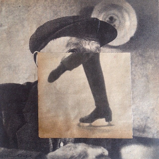
 

Festive Tones by J A Dixon

Festive Tones
collage miniature by J A Dixon
6 x 6 inches

•  S O L D