Archive for the ‘Exhibitions’ Category

Realms of Wonder ~ art by Kathleen O’Brien

Tuesday, April 16th, 2013

The primary reason that I look forward with great anticipation to this Friday’s LexArts Hop is because Kathleen O’Brien has a new solo exhibition. The opening reception for Realms of Wonder at the M.S.Rezny Studio & Gallery is from 5 to 8 pm, and it is certain to be one of the highlights of the evening. It was no surprise when a local Marketing Maven recently exposed herself as a Kathleen O’Brien “groupie,” and I suspect that there are far more than two of us. It’s not at all baffling to find oneself totally captivated by her visionary art.

Kathleen’s artwork clearly grows out of how she thoughtfully observes and attunes with the world of nature. It also literally contains and preserves natural ingredients. But in contrast to collage that maintains its focus on formal or intellectual juxtapositions, Kathleen’s art always nudges one toward a deeper sense of wholeness and the inner complexity of our balanced existence as both organic and spiritual beings. Without question, she has made a personal commitment to creating art as a mystical practice, and, on a communal level, to providing nature-inspired beauty as a source of healing in a fractured world. With the strong presence of these intangible dimensions, Kathleen’s art is always esoteric, and yet she manages to make the work accessible to all with her choice of subject matter and allegiance to traditional drawing. At the same time, she can delight the eye of a fellow artist with her methodology, aesthetic choices, and pictorial skill. I’m not ashamed to admit that much of Kathleen’s symbolic virtuosity is beyond my ken, but I appreciate that it’s all in play at the intuitive level. Being near the prolific output of her creative life is simply uplifting, and that’s because all the facets of her art —whether conscious or subliminal— unify as a total perception to nourish the mind, heart, and soul.
 

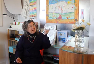
Here is a video of Kathleen in the studio discussing her art.
Find out more about the artist at her website or blog.

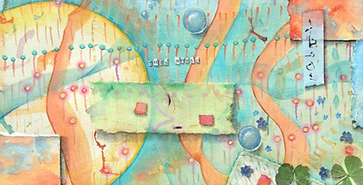
3 Worlds (detail, This World)
mixed-media collage, © Kathleen O’Brien
22 x 15 inches

An exhibition in Durango.

Saturday, January 12th, 2013

My appreciation to Cecil Touchon for including one of my works in a collage exhibition at the Durango Art Center. Cecil has said, in his typically understated manner, “I just grabbed some things off the walls at the archives, with the thought of techniques used as examples for the upcoming workshop, which is sold out already … and I also wanted to show the international nature of the collection.” He often refers to the International Museum of Collage, Assemblage and Construction, but not to his impressive labor as a preservationist and his effort to raise the profile of the medium during its centennial year.

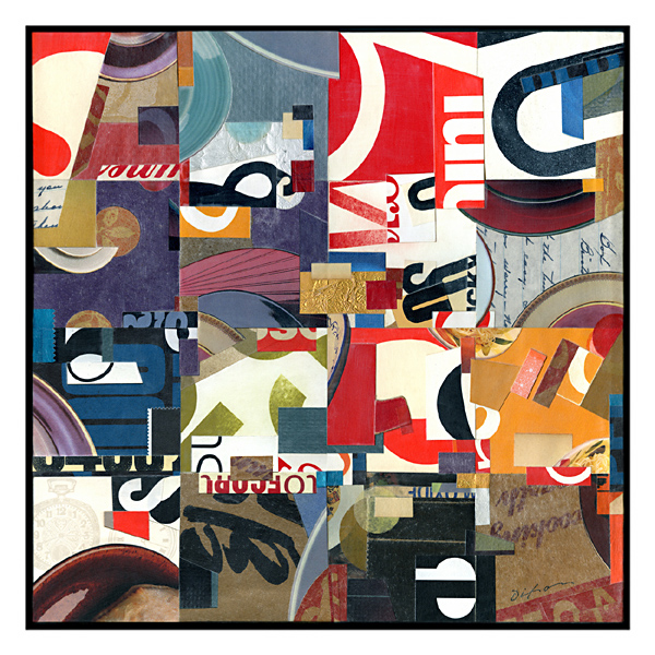
Plate Touchonics ~ J A Dixon

Plate Touchonics
collage on canvas
by J A Dixon
12 x 12 inches
collection of the
Ontological Museum

Diamonds in the Rough ~ details

Wednesday, January 9th, 2013

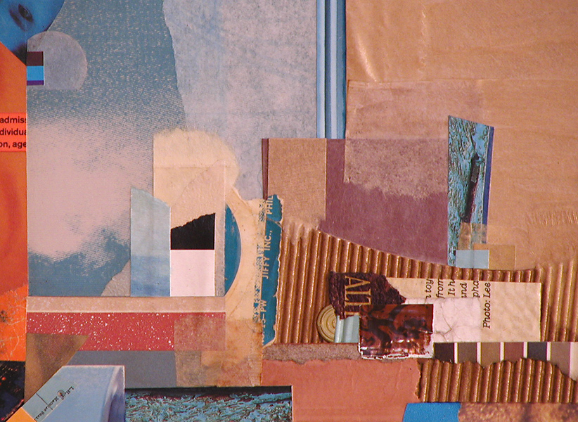
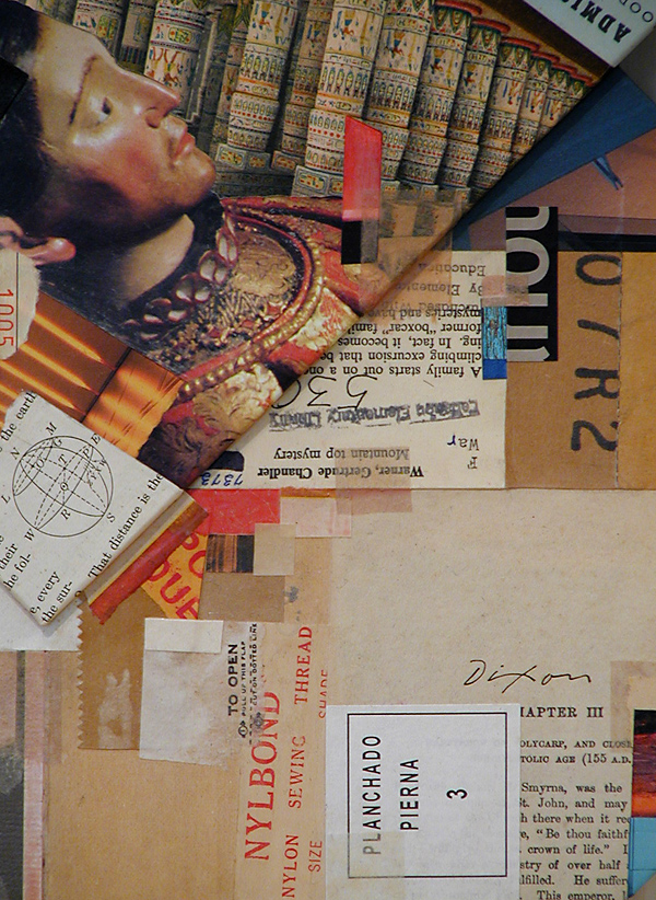
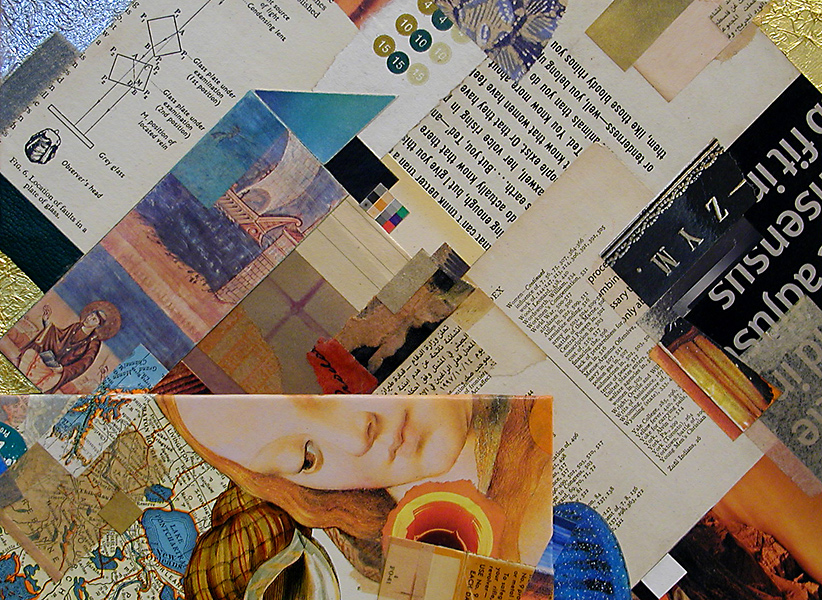
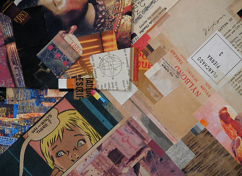
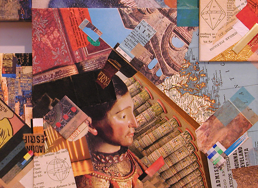
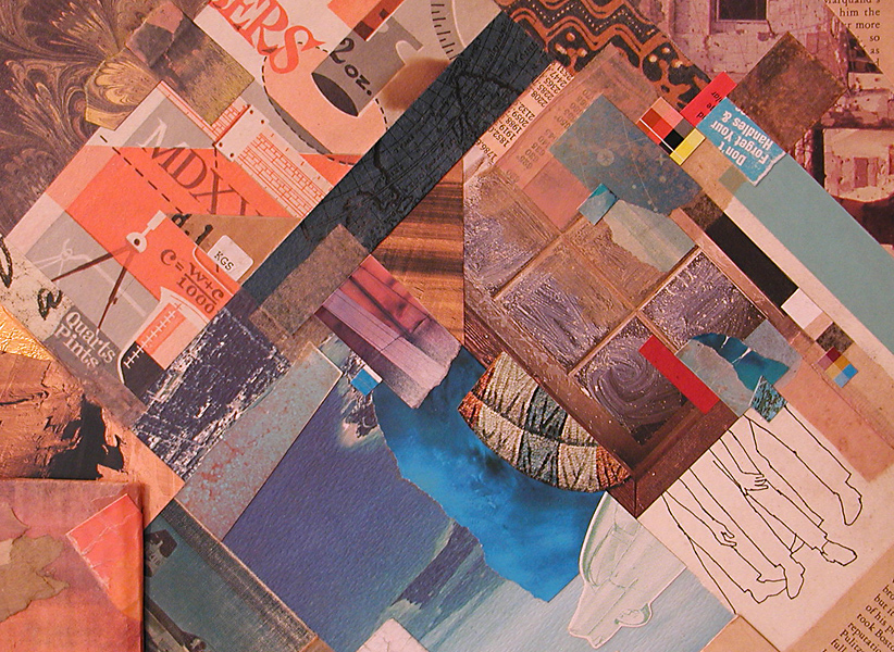
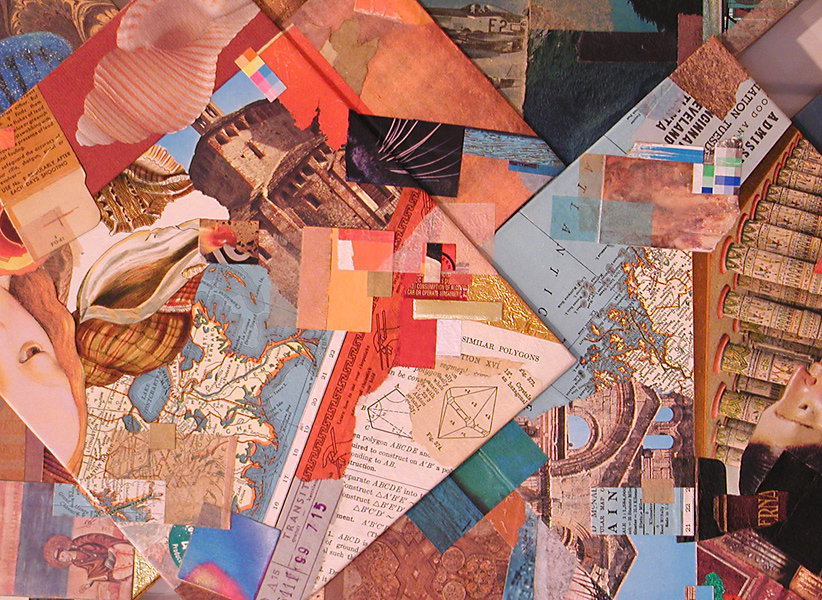
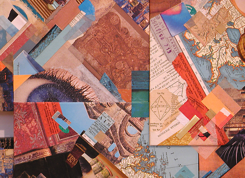
Collage for me is always an intimate viewing experience. You may find me with spectacles off and nose pressed near to the surface of any example within the medium. The scale of Diamonds in the Rough enhances the contrast between an up-close scrutiny and a step-back regard for the entire effect. With a large piece like this, I also enjoy visually cropping areas to create a series of virtual collage miniatures.
 

This micro view accentuates the ingredient elements, as in a collage miniature.
Visually, larger works are less ingredient centric, but still rely on their qualities.

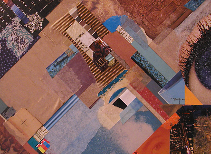
I think my imagination would never tire of working with diagonals.
What is it about the diamond or the triangle that engages my mind’s eye?

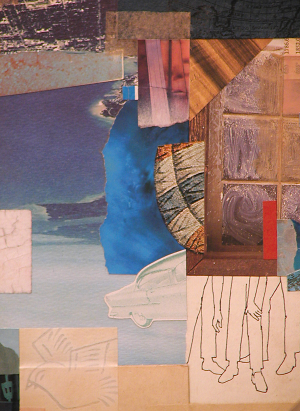
This is one of my favorite areas within the total artwork.
Oddly, the legs and hands resonate with the Tapley drawing in the exhibition.

The composition’s focal center projects from the surrounding forms.
It differs energetically from the outer areas of structural perpendicularity.

To regularly bestow a new purpose on found material . . .
Without fear of contradiction, one could say that I am hooked.

The essence of collage is the contrast of the mundane and sublime.
At any rate, this is often how I perceive it.

WH—WHO’S THERE? (Look closely: Milt Caniff, that’s who.)
Somebody saw this as an homage to Roy, but Kurt used comics first.

A collage can rest divertingly upon layers of symbolic meaning.
Or it can be simply the harmonious resolution of aesthetic factors.

The dynamics of complementarity. (Is that a real word?)
More than one astute eye discovered my warm-cool “horizon.”

Composing with shape, color, contrast, rhythm, dimension.
At times, it need be about nothing more than that.

This image isolates a microcosm of the whole effect.
Are my larger works just a aggregation of collage miniatures?

Thanks for looking. Let me know what you think. Constructive criticism is encouraged at this site. To be honest, the medium of collage needs a bit more of it.

First exhibition of 2013

Saturday, January 5th, 2013

“What makes a painting meaningful is the spectacle of the ordinary content living together with the equally important life of the picture plane and the unity of the whole surface.”
— Gillian Pederson Krag

It pleases me to say that my most recent large-scale artwork will be on display and available for purchase as part of an invitational exhibition now hanging in my hometown.

NEW YEAR NEW ART ~ Community Arts Center, Danville, Kentucky
January 2 to 26, 2013 ~ Reception: January 10, 6–8 pm

The invitation to participate is an honor for two reasons. It is always good for one to know that local people appreciate collage, especially the more esoteric kind. Even more humbling is to be included among some truly outstanding Kentucky artists, such as Sheldon Tapley, Helene Steene, Kathleen O’Brien, and Marianna McDonald. I’m looking forward to the reception this Thursday. Mayor Steven Connelly of nearby Berea will speak on the powerful effect the arts can have on local economies. According to Programming Director Brandon Long, the intention is to showcase “fresh, new art that has the kind of excitement and energy of artists who know their work will go on display.” Many of the diverse works were created specifically for the exhibition, and that includes mine. Everything accepted had to have been executed since September.

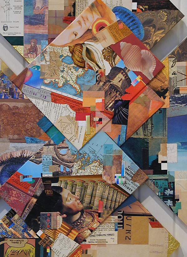
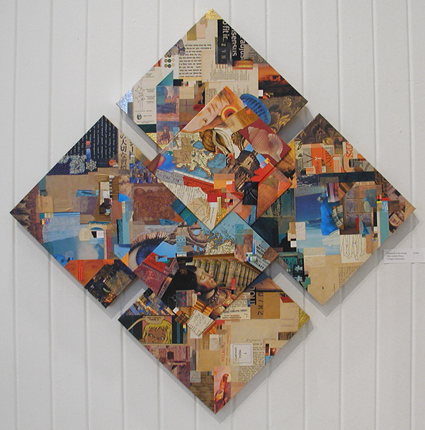
Diamonds in the Rough is a composite of panels and stretchers. It is my latest effort to free collage from behind glass and approach the medium in a manner similar to the painted surface that stands on its own. I also departed from my typical rectilinear format, yet sought to maintain the type of perpendicularity that I frequently exploit for a unified structure. As usual, the color balance of found material plays a vital role in my overall composition. The lineage of the collage miniature is strong here. In fact, nearly everything I do to produce a major work comes from what I have learned from the small-format approach. This recognition is not meant in any way to devalue the miniature. I would hope that you have come to know my penchant well enough by now to appreciate that.

The next entry will include some detail crops and perhaps a few remarks about the process, too.
 
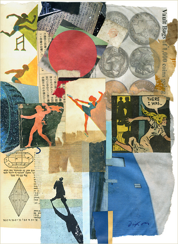
Diamonds in the Rough ~ J A Dixon

Diamonds in the Rough
collage construction by J A Dixon
36 x 36 inches
available for purchase

There I Was

Saturday, December 8th, 2012

“He spread flour and water over the paper, then moved and shuffled and manipulated his scraps of paper around in the paste…. Finally, he removed the excess paste with a damp rag, leaving some like an overglaze in places where he wanted to veil or mute a part of the color.”
— Charlotte Weidler

It has been more than a year since I had the humbling opportunity to study dozens of Kurt Schwitters originals at the Berkeley Art Museum. I read the description by the art historian Charlotte Weidler that same day, but I only recently decided to experiment with the paste method she observed. I have always worked with a variety of adhesives, and I often combine more than one in a single collage, never hesitating to literally mix them together (white glue + acrylic varnish, for example). I was impressed with how good some of Kurt’s compositions had held together after 70 to 80 years. I dug out a small package of paper-hanger’s wheat paste acquired in the 1970s, with the new intention of using it to produce a collage on canvas that would stand on its own as an object when finished. Although I expected to coat the final surface later with gel medium, for my first piece based on using the same adhesive as the pioneering artist, I was mainly interested in how wheat paste would affect my process.

The artwork is undone, but I share one of my separate experiments below. I could not be more pleased with the results of this approach. The paste dries slowly. This allows for repositioning, easy removal of excess, and it cures to a flat, velvety finish. I am especially pleased with how conducive it is to manipulating coated paper torn from magazines, an ingredient I am quite fond of. I lightly sand the reverse side, adding a bit of white glue to the paste for good measure, and, using this hand-pasting technique, I have never found “mag scrap” more easy to work with. It may not seem like a big deal to those who attend diverse workshops and demonstrations, but, as a self-taught collage artist, it feels like a significant breakthrough to me.

Now, the only question that remains is one of durability. The seminal works of K.S. show every sign of lasting a century in decent shape, but I am no museum expert, nor have I been as fixated on archival longevity as some collage artists I know. I expect my creations to age, perhaps in unexpected ways. This reminds me of an online discussion not long ago about using elements taken from newspapers. Many collage artists may share my expectation that a newsprint ingredient will simply mature as nature sees fit, adding a certain “wabi-sabi” aspect to a work of art that relies on found material. Who knows what Picasso or Braque thought about the nature of impermanence when each created their first collage with that famous wood-grain paper found in a store? Or, for that matter, what Schwitters himself thought when— with seemingly little regard for acid-free niceties —he built the enduring concepts of Merz on the detritus of ordinary life?
 

There I Was by J A Dixon

There I Was
collage experiment by J A Dixon
8.75 x 11.5 inches, not for sale

Kurt Schwitters: Color and Collage

Sunday, September 23rd, 2012


“The language of Merz now finds acceptance, and today there is scarcely an artist working with materials other than paint who does not refer to Schwitters in some way.”
—Gwendolen Webster

“I could see no reason why used tram tickets, bits of driftwood, buttons, and old junk from attics and rubbish heaps should not serve well as materials for paintings; they suited the purpose just as well as factory-made paints.”
—Kurt Schwitters

Last November I had the good fortune to find myself close enough to Berkeley, California to attend Kurt Schwitters: Color and Collage, the first U.S. museum exhibition in 25 years to focus exclusively on his towering work. I was able to spend as much time as I wanted (at the Berkeley Art Museum & Pacific Film Archive), studying about 80 examples of his collage and assemblage. It was an experience that is almost impossible for me to describe. I suppose that I should at least try.K S, date unknown

KS has been a powerful influence on my personal artistic journey, for good or ill. When I first learned of this exhibition, it seemed beyond my Kentucky reach, but circumstances conspired to place me in the Bay Area on the day after Thanksgiving. During the trip west, I began to greatly anticipate what I knew would constitute more than a singular research event for me. It felt like a pilgrimage, or a potential culmination of sorts, that might “release” me in some meaningful way. My notion could not have been more off target. Hours of arms-length appreciation and up-close inspection served only to solidify my bond with the German innovator. Seeing masterpiece after masterpiece would crystallize a deep awareness that one need not ever shy away from drawing water from the well of this man’s insights, any more than a musician might hold at a distance Wagner, Stravinsky, or Ellington. Should I be concerned a critic may judge my works as derivative of his? Should a mathematician fear being described as an imitator of Einstein? Should a naturalist worry that others might say, “He thinks too much like Darwin”?

The works were superbly organized in a space that allowed for the full range of observation. The guiding concept of the exhibition was the idea that the artist always considered himself a painter. As Clare Elliott writes, “His practices of painting and collage were so intertwined that it is often difficult to determine if paint was applied to paper before or after it was pasted onto the surface, or mixed into the paste itself.” I doubt if KS, a trained painter, made any distinction. We must remind ourselves that there was no clear sense of collage as a separate medium, in the way we understand it today. It was more about his drive to radically expand the choices involved in how one creates a painting to include any material from the surrounding environment of mundane existence.

The rooms were dotted with descriptive panels that presented some of the most incisive remarks I had ever read about Schwitters. Sadly, the catalog edited by Isabel Schulz had already sold out. (Now available for $200 from Amazon, it was being offered for $40 when the show opened.) On top of it all, I did an inordinate amount of note taking and dared to strike up conversations with strangers viewing the show— something I recall never having done before at a museum. Needless to say at this point, it was a pinnacle experience for me. I finally understood that to entertain the hope of moving beyond an artistic influence of this magnitude, I needed to internalize it as fully as possible to discover my own points of departure. I needed to understand how Merz was fundamentally different than Dada, how KS became a revolutionary without being a rejectionist, and how strongly he must have believed in his initiating a spirit of unification that would encompass artistic methods and approaches not even “invented” yet.


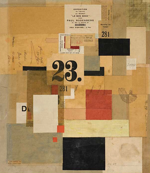
Mz 601 by Kurt Schwitters

Mz 601
collage by Kurt Schwitters, 1923
paint and paper on cardboard
15 x 17 inches, Sprengel Museum, Hanover

A Book About Death

Wednesday, August 22nd, 2012

“Ray didn’t talk about it, he just did it. That’s why you don’t find art magazines lying around quoting the art philosophy of Ray Johnson.”
—Toby Spiselman

Ray Johnson, the original “most famous unknown artist in the world,” produced his A Book About Death during the years 1963 to 1965. The pages were randomly mailed and offered for sale. Complete copies were compiled by a rare few. Johnson was a significant bridge between the groundbreaking work of Schwitters, the sensibilities of Cornell, and the emergence of what would become the most widely recognizable features of Pop Art. He was highly influential in the Mail Art, Installation Art, and Performance Art movements, as well as late 20th-century neo-Dadaist trends. Paris-based Matthew Rose has actively aroused a worldwide interest and vitality that perpetuates the legacy of A Book About Death, including a 2010 incarnation (in which I made a small contribution). The full history can be studied at this site.
 
ABAD 2010 by J A Dixon

ABAD 2010
collage miniature by J A Dixon
6 x 4 inches, not for sale

Gardenshapes ~ art by Kathleen O’Brien

Saturday, July 28th, 2012

“Beauty should be shared, for it enhances our joys.
To explore its mystery is to venture towards the sublime.”
―Joseph Cornell


I hesitate to use a sports term to begin this review, but, since the Summer Olympics opened last night, I’ll set my disinclination aside to state emphatically that artist Kathleen O’Brien is at the top of her game!

Gardenshapes —an exhibition of her mixed-media collage finishing its run in the main gallery of Danville’s Community Arts Center— has ample proof to support my claim. I made one more return visit yesterday to experience the diverse subtleties of her singular creations.

Inspired by birds and flowers, and exploring the garden as a metaphor, this collection of artworks represents everything that has captivated me for years about Kathleen’s approach. These works have clearly grown out of how she thoughtfully observes and attunes with nature. They also literally contain and preserve natural ingredients. But in contrast to collage that maintains its focus on formal or intellectual juxtapositions, Kathleen’s art always nudges one toward a deeper sense of wholeness and the inner complexity of our balanced existence as both organic and spiritual beings. Without question, she has made a personal commitment to creating art as a mystical practice, and, on a communal level, to providing nature-inspired beauty as a source of healing in a fractured world.

With the strong presence of these intangible dimensions, Kathleen’s art is always esoteric, and yet she manages to make the work accessible to all with her choice of subject matter and allegiance to traditional drawing. At the same time, she can delight the eye of a fellow artist with her methodology, aesthetic choices, and pictorial skill. I’m not ashamed to admit that much of Kathleen’s symbolic virtuosity is beyond my ken, but I appreciate that it’s all in play at the intuitive level. Being near the prolific output of her creative life is simply uplifting, and that’s because all the facets of her art —whether conscious or subliminal— unify as a total perception to nourish the mind, heart, and soul.

Getting back to the show, I was initially struck by the five largest pieces (28 x 36 inches), beautifully presented against white in deep gallery-style frames of natural wood. This “look” is familiar to those who know Kathleen’s art, and enhances the work’s identity as an unique artifact, preserved behind glass, like a rare botanical or zoological specimen. They are titled with reference to the garden theme. In contrast, a separate piece (24 x 30 inches) is presented with its surface exposed in the manner of an easel painting. It looks equally at home, released from behind the glass, expertly varnished in a way that does not distract. Its name is Heaven & Earth, Yin & Yang, Dark & Light, Birds & Trees, Flowers & Bees. My eyebrows lifted as I began to read the lengthy title, but was pleased with the closing rhyme as I finished. This artist always has a quiet surprise in store. Each of the large works is visually distinctive, but very much a cohesive part of a series unified by her long dedication to compositional abstraction, to a consistent theory of color, and to diligent mark making.

The large piece titled Garden for Queen Anne’s Lace is marked by a cellular pattern resembling microscopic tissue, which, while remaining highly abstract, transforms itself into a flower garden, with an interesting emphasis on each “drop of Queen’s blood” that, when closely examined, becomes a dance of circles, squares, and triangles —a dynamic that exemplifies Kathleen’s knack for taking the observer/participant through layers of meaning. The design also incorporates the application of illustrated postage stamps. Kathleen is never far removed from a devotion to cultural references and ephemera, and her Joseph Cornell influences are ever present. A fine example of this are four pieces dedicated to bird-species (16 x 20 inches) that combine found printed patterns with her typical labor of liquid media. Nests are created with random shards and colorful scraps. Dried and painted star-like blossoms effectively merge the organic, symbolic, and celestial. In Kathleen’s collage there are many allusions to language, both literal and archetypal, and here we discover many fragments of the printed word, as well as her “trademark” calligraphy. I was particularly drawn to Garden for Blue Grosbeaks, a strong arrangement of symmetrical and asymmetrical elements that carries out more of her evident investigation into fundamental shapes —circle, square, and triangle. These compositions are anything but static, a characteristic of Kathleen’s art built on a myriad of ways in which she provokes eye movement by simulating the dynamic patterns of nature, often with the application of actual plants and minerals. A perfect case in point is 9 Bird Eggs (30 x 30 inches), with its nimble use of botanicals most artists would overlook as raw material, through which she creates a variety of rhythms within a formal, 3×3 grid structure.

I should mention that Kathleen’s control of what I call “implied viewing distance” is masterful. Enjoying her watercolor effects and hidden treasures up close is inevitably a satisfying experience, as is true with much of current small-scale mixed media collage, but her pieces also can be savored at a distance. I found myself continually studying a work from across the room and then, taking off my eye-wear, sticking my nose near the glass to examine fine detail. Whether from this point of view or from half a block away, Kathleen’s distinctive impression is always recognizable, an enviable accomplishment for any artist. For example, both Royal Lily Garden and Staple Garden contain brushwork that only can be achieved by someone who is continuously handling liquid on a tool and is fully at ease with her surface. On the other hand, she uses this micro-fluency to create the intended multi-layered depth of her macro-composition, and yet I was constantly invited to step back into the intimacy of the picture plane, much as one feels when standing back to admire a flower garden, while being compelled to converge at hand’s length, only to spy a miniature surprise —a dutiful pollinator or tiny feat of nature’s diversity within repetition.

With my fixation on the bigger paintings, it was too easy to neglect the smaller items, so I had to instruct myself to visually isolate and appreciate several other works. Two of these were within squares, and each have treatments not as pronounced elsewhere in the exhibition. Feathers uses paper itself as a dimensional medium, and The Blessing of Rain features a darker atmospheric background —a shimmering chalk texture that makes me wish Kathleen would more intensively explore the potential of pastel effects. In addition, there are three bird portraits (9 x 12 inches), with coatings of what appeared to be beeswax, which recall for me the investigations of 19th-century naturalists. My favorite is Garden for Eastern Bluebirds, with its deft pencil work and luscious color palette. Kathleen pushes her highly capable layering beyond technique to create a sense of time distortion, an interplay of wildlife and cultural antiquity that makes certain the work is much more than a lovely rendering of birds. Throughout this outstanding show are many such allusions to natural and human-made cycles that fuse the worlds of growing things and a striving race that has always responded with symbolic culture to seek a balanced place in the scheme of life.

Indeed, Kathleen O’Brien has found her place. With a home studio close to nature, and a creative passion that distills her observations and meditations through heart, head, and hand, she is a gold-medal artist of the soul.

© 2012, John Andrew Dixon
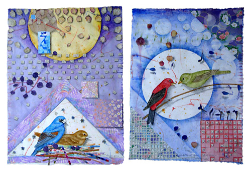
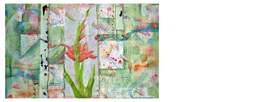
Garden for Eastern Bluebirds and Garden for Scarlet Tanagers
by Kathleen O’Brien