Archive for the ‘Details’ Category

Good Morning, Mrs. Bradshaw

Friday, September 2nd, 2016

“I have never let my schooling interfere with my education.”
— Mark Twain
 

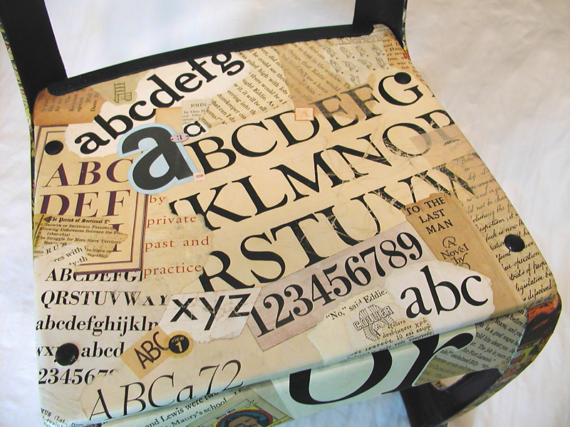
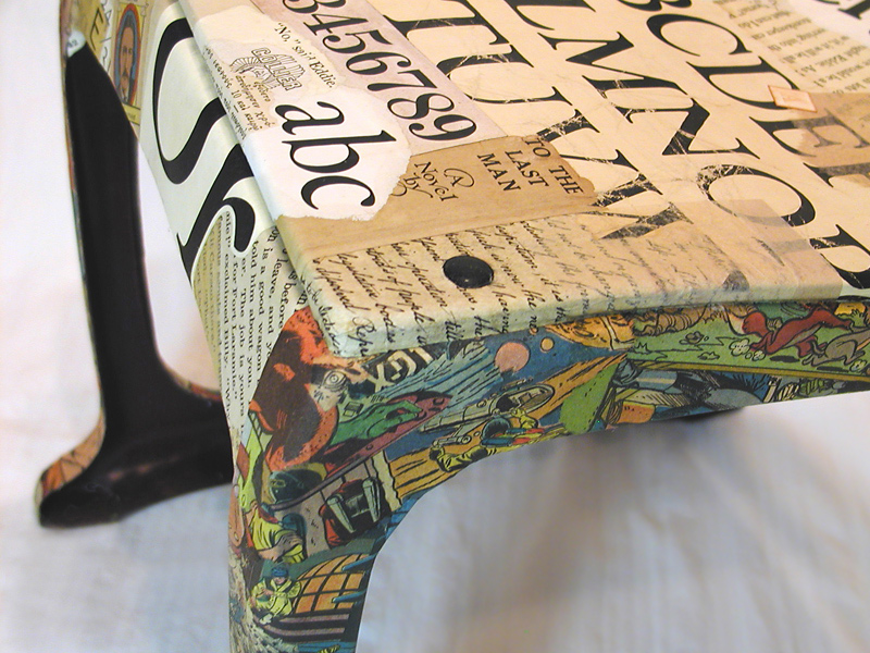
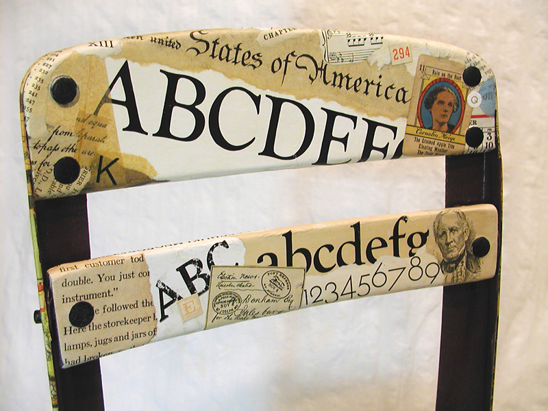
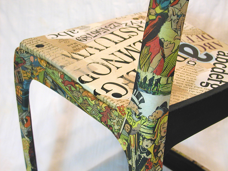
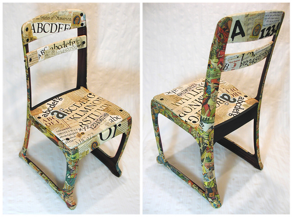
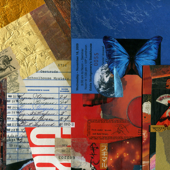
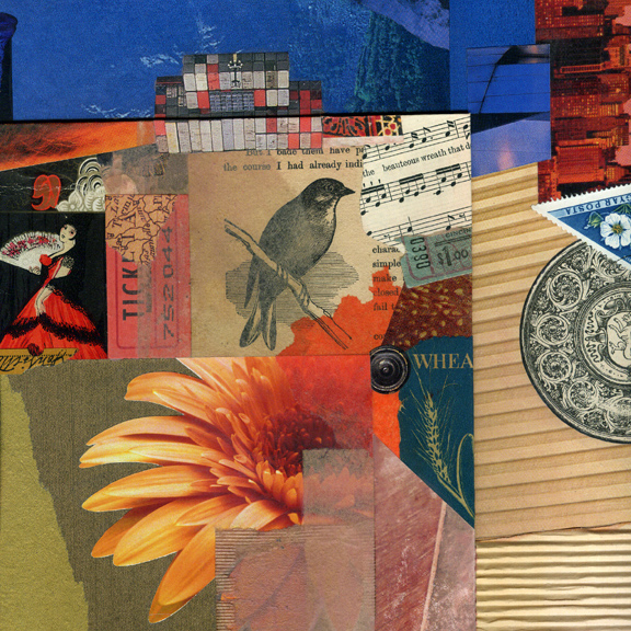
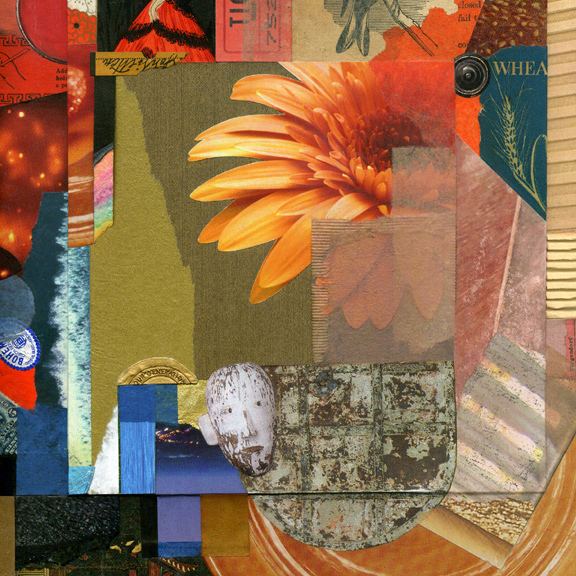
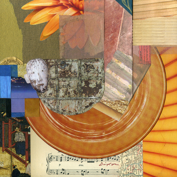
My latest three-dimensional work, Good Morning, Mrs. Bradshaw, has been accepted for the new exhibition in the Kentucky Artisan Center at BereaHAVE A SEAT: Chairs by Kentucky Artisans. Gwen Heffner wears many hats at the Center, and she keeps coming up with strong ideas to showcase regional talent. She is not only an outstanding curator, but has become a significant catalyst for high-level artisanship in the Commonwealth. Her semi-annual calls for entry compel creative people across Kentucky to accept challenges they might not otherwise consider.

I chose the medium of collage to repurpose a child’s classroom chair that came into my possession as I debated with myself about whether this was a show I should enter. I was provoked to explore a time, not so long ago, when there was a well-understood line between what pupils should read and what they should not. Its vintage design took my imagination back to the earliest years of my public school education, with its sharp contrast between scholastic prescriptions and my personal interests.

“Dos and don’ts” have always been a part of the classroom, but times have changed. Nowadays, a youngster can find superhero stories and graphic novels in the school library. The goal was to capture what I remember as the tension that came with meeting an expectation of obedience to assignments, but always preferring to devote my attention to playful escapes. I decided to “resurface” the object with found material and mixed media — alphabetical specimens, printed text, game cards, book illustrations, calendar images, songbook fragments — plus colorful scrap from comic books and the Sunday funnies.
 

Good Morning, Mrs. Bradshaw
repurposed vintage classroom chair by J A Dixon
12 x 25 x 14 inches

details from Pearallelograms

Sunday, January 17th, 2016

“The artist is a collector of things imaginary or real. He accumulates things with the same enthusiasm that a little boy stuffs his pockets. The scrap heap and the museum are embraced with equal curiosity.”
— Paul Rand
 

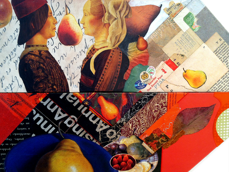
One of my first large-scale collage concepts was an artwork I called Pearallel Universe. When it was purchased by a regional health care system to hang in a new patient facility, I temporarily set aside the “visual pun.” After creating Pearental Discretion last year, I continued to accumulate images in anticipation of another takeoff on the pear theme. I also had been looking to break out of the conventional rectilinear format by exploring thumbnail concepts with polygonal shapes. When the parallelogram repeatedly occurred in my tiny sketches, the two ideas merged, unsurprisingly, as Pearallelograms.

This latest collage construction is another attempt to liberate collage from the typical “framed-behind-glass” approach, to recapture the medium’s painterly roots with an exposed surface that can stand on its own, and to introduce a more three-dimensional context that presents the end result as an “artifact.” I would hope that I had a bit of success at meeting these objectives. So far, the piece has been well received.

In what is becoming a ritual post-mortem for bigger collage artworks, I have repeatedly cropped the composition to explore and internalize aspects that may not have been apparent to me during creative formation. It is something I recommend to fortify intuition. To be honest, I would rather not be thinking consciously about the design dynamics in process, but I can only maintain that orientation by imposing a rational critique on my work after the fact. This sometimes leads to the closing refinement of an unfinished piece. More importantly, it also provides a stronger foundation for spontaneity in the future.
 

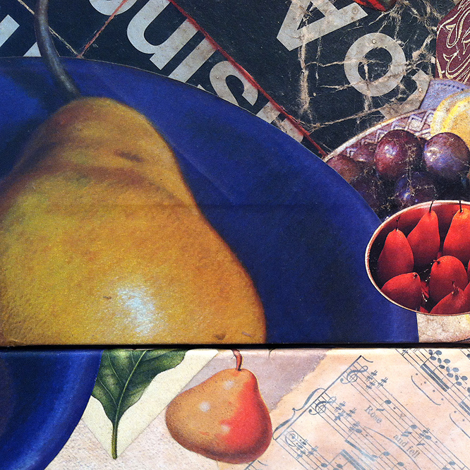
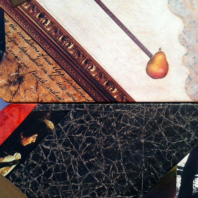
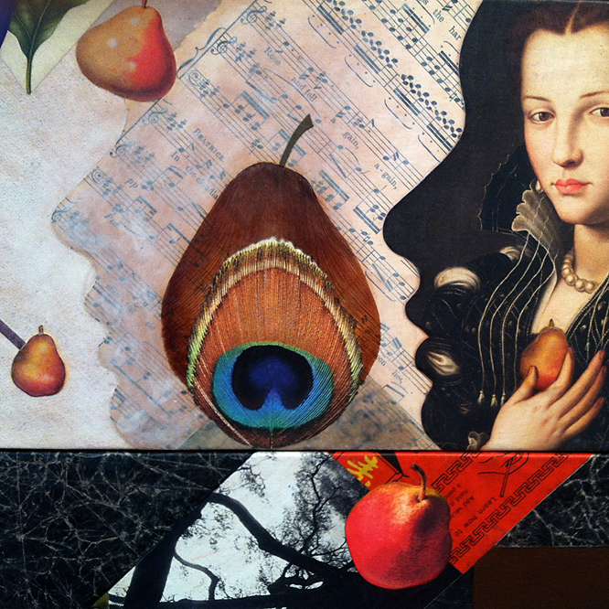
detail from Pearallelograms by John Andrew Dixon, Danville, Kentucky ~ internationally known as The Collage Miniaturist

My goal was to use many pears — as design elements,
for thematic rhythm, and as devices for a surreal touch.

detail from Pearallelograms by John Andrew Dixon, Danville, Kentucky ~ internationally known as The Collage Miniaturist

As elements, the chosen thematic objects should oscillate
between representation and abstraction.

detail from Pearallelograms by John Andrew Dixon, Danville, Kentucky ~ internationally known as The Collage Miniaturist

Diagonals with pears as “end points” were applied to
three negative areas that needed more spatial activation.

detail from Pearallelograms by John Andrew Dixon, Danville, Kentucky ~ internationally known as The Collage Miniaturist

The last pear image was positioned between profiles and
resonates with a more literal treatment at the very top.

detail from Pearallelograms by John Andrew Dixon, Danville, Kentucky ~ internationally known as The Collage Miniaturist

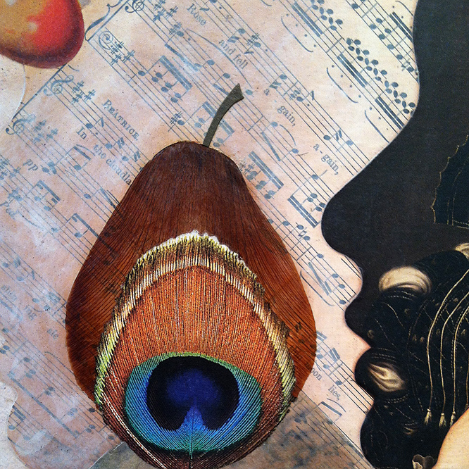
The final subject was “built” with an actual dried iris petal,
the torn image of a peacock feather, and a cut-paper stem.

Thanks for visiting! Forgive me if today’s entry is too verbose, because I generally try to avoid that. If, however, you don’t mind if I wax wordy, please register and comment here to let me know. I promise to reply.
selecting details . .

Thursday, July 16th, 2015

“We do have repeated patterns that arise, in differing ways for different people, every time we create. But how do you get excited by the downturns and turn this into a positive experience?”
— Lyne Marshall

After I finish a larger artwork and its temporary or permanent disposition is settled, I have this tendency to focus on the perceived flaws, the missed opportunities, or that appealing ingredient “left on the cutting room floor.” Diverting my observation to the areas that I prefer, I crop into the design, looking for interesting sub-compositions. I tell myself that I should create spin-off prints or note cards based of a series of details — it must be my built-in bias toward the miniature. In almost every case, I put market-driven notions aside and begin something new. Objective scrutiny usually becomes a catalyst to the creative process. The cycle continues.
 

detail from Selective Fusion ~ John Andrew Dixon


detail from Selective Fusion ~ John Andrew Dixon

two details from Selective Fusion
collage on structured panel by J A Dixon

more leaps . . .

Monday, June 15th, 2015

“Different themes inevitably require different methods of expression. This does not imply either evolution or progress; it is a matter of following the idea one wants to express and the way in which one wants to express it.”
— Pablo Picasso

The quick sale of Rhetorical Leap was among several factors that would cause me to create a slightly larger piece with similar themes. It was an interesting experience on multiple levels. I had the opportunity to revisit my original intuitive process in a more rational way. It is not for me to judge the relative “success” of either work. I prefer to focus on what it was like to make the journey a second time. Personally, I find the effort to recapture nearly any aspect of life to be a hit-or-miss proposition. For every time one scores the same enjoyment or sense of fulfillment, there is another that falls short of expectations. For this reason, I tend to resist variations on a theme or a defined series when approaching collage artwork. At any rate, that is my tendency, although the practice retains a special appeal that I have no reason to resist. Ideally, one’s entire body of work might be seen by others as an extended series of thematic variations. It is only natural for most observers to put emphasis on the end products, rather than the more obscure goings-on that make up the creative process.
 

detail from Rhetorical Leap ~ John Andrew Dixon  detail from Leap of Faith ~ John Andrew Dixon

left: Rhetorical Leap (detail)
right: Leap of Faith (detail)
two collage artworks on canvas by J A Dixon

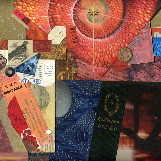
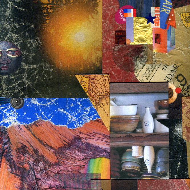
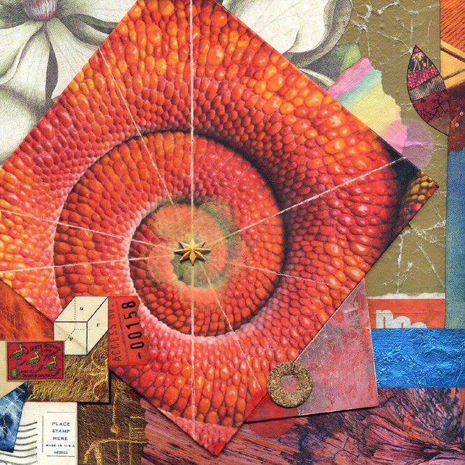
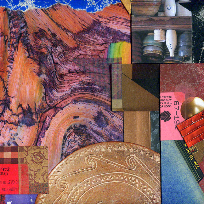
Contemplation Ajar ~ details

Monday, June 1st, 2015

“It’s the little details that are vital. Little things make big things happen.”
— John Wooden

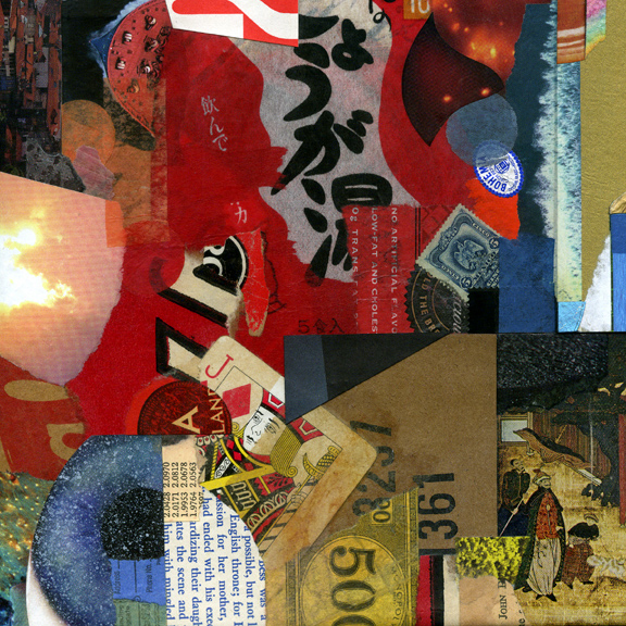
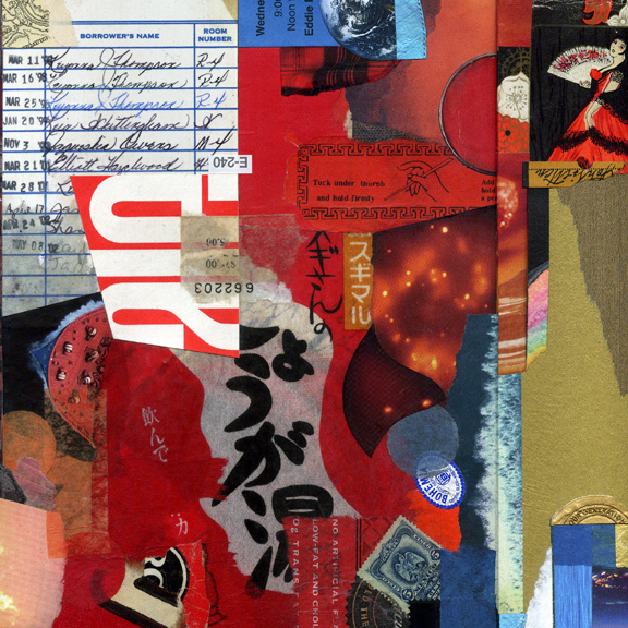
One of my favorite things to do with an image of a collage is to explore alternative compositions by cropping. We can never stop training the eye. Visual ingredients are always elements in context and their character can change with different design relationships. The more we do this, the more a sense of balance and spatial harmony are internalized. As a bonus, any ideas that emerge can become the basis for new investigations.
 

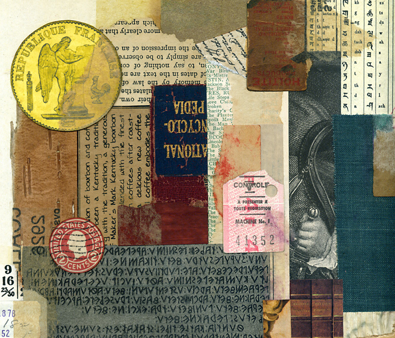
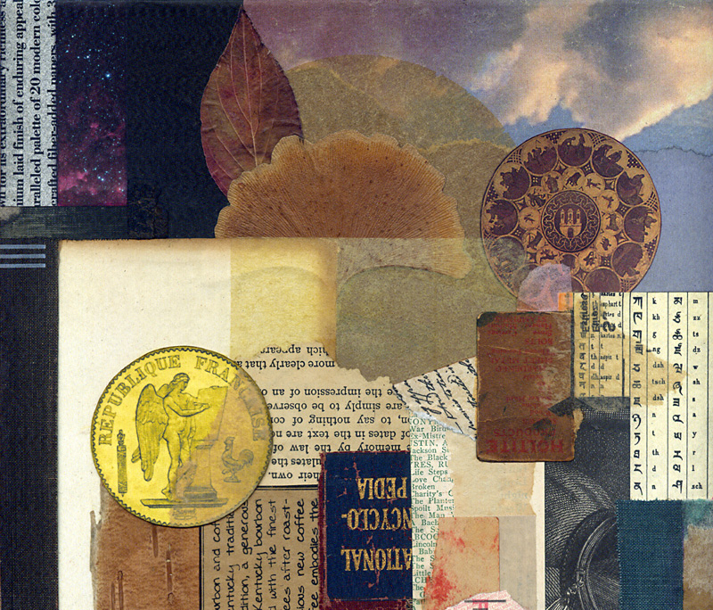
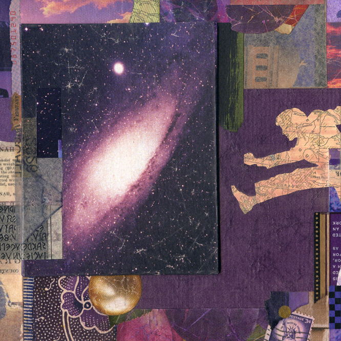
square crop ~ detail from Contemplation Ajar ~ John Andrew Dixon ~ The Collage Miniaturist


square crop ~ detail from Contemplation Ajar ~ John Andrew Dixon ~ The Collage Miniaturist


square crop ~ detail from Contemplation Ajar ~ John Andrew Dixon ~ The Collage Miniaturist


square crop ~ detail from Contemplation Ajar ~ John Andrew Dixon ~ The Collage Miniaturist

four squares from Contemplation Ajar
collage on structured panel by J A Dixon
collection of J Wood

“Oh, the Places You’ll Go”

Friday, June 20th, 2014

“Art is the only way to run away without leaving home.”
— Twyla Tharp

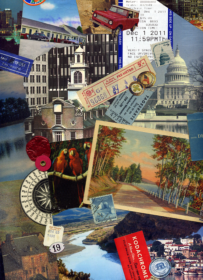
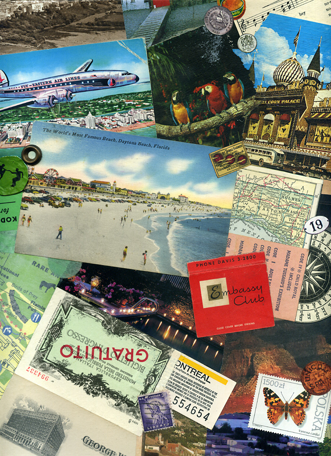
Places to go, ways to travel, and flights of fancy . . . A series of local exhibitions at the Boyle County Public Library’s Mahan Gallery has been an effective catalyst for me to create new pieces based on unifying themes. I have recently experienced mixed emotions about the ubiquity of vintage material in contemporary collage, but the topic of this show had me hunting through my morgue of old postcards and other relics to produce a pair of artworks on canvas. Yes, we all dig the instant “gravitas” of using old stuff, but will art historians say we copped out, if we do not accept the challenge of working with ingredients from our own present-day culture? I am just musing about the state of the medium, not any artist in particular. I see a hundred or more collage artworks posted online each week that rely exclusively on 20th-century material, and much of it seems stuck in a bygone avant-garde style. It is important for all of us to keep in mind that the Dada artists so widely emulated worked with material from their own time. Perhaps the opportune approach is to blend it all together, past and present. As post-centennial collage artists, we also owe each other a bit more constructive criticism than I currently observe. As the details below illustrate, I have absolutely nothing against using vintage material. I think that artists such as Hope Kroll or Fred Free or Matthew Rose (to offer only three examples) are creating some of the more exceptional work in the medium. On the other hand, there are many who seem to be using it as a crutch, over-relying on the antique impression of the ingredient material itself, rather than the juxtapositional synergy or overall aesthetic effect.

As the artworks for “Places” also demonstrate, I continue my effort to liberate a collage from the traditional glass barrier. To do so, it is necessary to find a proper level of protective sealant to balance visual appeal and durability. I prefer to avoid an overly polymerized impression with a finished surface. Because I primarily work with found material, I have had to learn which ingredients can handle direct exposure (for an effect similar to the painted surface). Nevertheless, some are simply too fragile and will always require a safe abode under glass.


left: Here and There (detail)
right: Now and Then (detail)
two collage artworks on canvas by J A Dixon
12 x 12 x 1.5 inches each
available for purchase

On collage derivations . . .

Sunday, November 17th, 2013

“I believe that it is better to be receptive to correction than to be satisfied with one’s own imperfection, and to think that one is oh so original!”
— Piet Mondrian

As I mentioned in a welcome statement from over a year ago (and perhaps more recently), I have nothing against digital collage, although I do maintain a bias in favor of conventional (so-called analogue) techniques, especially at this site, but don’t expect me to become “all blogmatic” about the topic, since I have been known to gratefully accept commissions for digital montage and affirm my respect for those who do collage illustration at a high level. The point I want to make today is that, so far, I have not generated much enthusiasm for manipulating or reproducing my “tear and glue” artworks as digital prints or “art merchandise.” Someone recently asked if I sold note-card versions of my miniatures, and I had to admit that “I have never quite gotten around to that.”

There are many reasons, both good and bad, to produce derivations of one’s own work for the marketplace. There are also many reasons, both good and bad, to restrain oneself. I would hope to be open-minded about the subject. Not everyone who enjoys collage can afford to collect originals. In addition, I often get ideas about how to combine separate works into a composite digital design, exploring in the process a distinctive aesthetic resonance that might not be discovered in other ways. I occasionally imagine how one of my miniatures would look as a super-enlargement, or I envision an exhibition of large canvases created from Giclée blow-ups of small works. No doubt, there is an appropriate place for digital technology in the medium, whether on the front- or back-end of the process. The digital image is, of course, the stock in trade of any artist with an active presence on the Internet. That comes with its own set of issues that I plan to cover in my next discussion. Meanwhile, I hope to preserve my emphasis on a traditional methodology and observe how other collage practitioners adopt emerging technology to enhance their fine-art investigations.
 

Microcosmic Moments
compilation of nine miniatures by J A Dixon
proposed digital concept, variable in dimensions

Modular Zowee
composite of collage details by J A Dixon
proposed digital concept, variable in dimensions

Mystery Solved (detail)
super-enlargement of collage detail by J A Dixon
proposed digital concept, variable in dimensions

Mystery Solved (set of four cards)
merchandise with collage details by J A Dixon
proposed digital reproductions, 5.75 x 4.5 inches

Broadband Access
digital montage by J A Dixon
editorial illustration for ACUTA Journal

Mystery Solved ~ details

Sunday, May 19th, 2013

For the full viewing experience, one can never get too close to a collage, but this opinion from a person so enamored with the miniature probably comes as no surprise. When I create a larger piece, lessons learned from the small format have a strong bearing on my approach. As a concluding exercise to hone compositional awareness, it is beneficial to discover croppings that can stand successfully on their own. Before Mystery Solved left the studio, it was interesting to visually isolate six square miniatures, just to see if they might capture in microcosm the essence of the parent design.
 

A ‘Jack of Diamonds’ was too visually outstanding
at first and had to be massaged into balance.

I enjoy creating a montage of linguistic symbols,
but “a-l-e” was accidental (or perhaps subliminal;
one never really knows with collage).

Integration through color: photo of butterfly
specimen + ticket stub + magazine scrap.

Juxtaposition: illustration from an exotic soap
wrapper + book engraving + photo of flower.

The interesting effect of a raised panel: the
illusion of depth versus actual dimensionality.

From diverse sources: combining ingredients
that seem to have always belonged together.

Thanks again for looking. Please share your thoughts, suggestions, or constructive criticism (frankly, our medium of collage always needs a healthy dose of it).

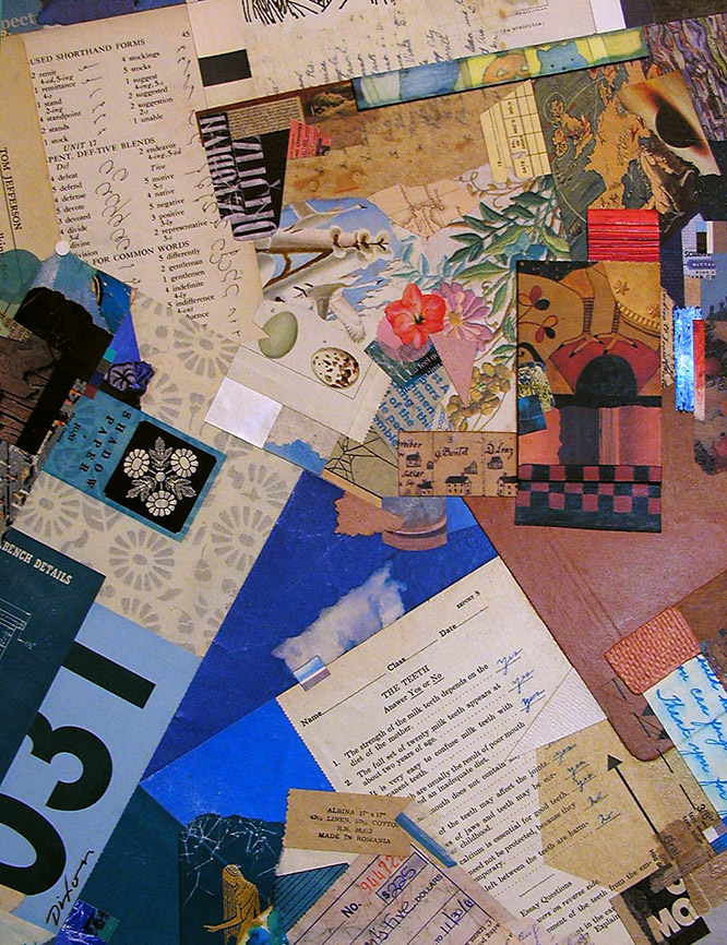
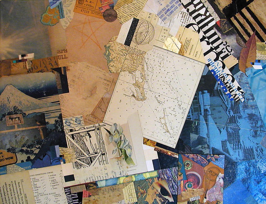
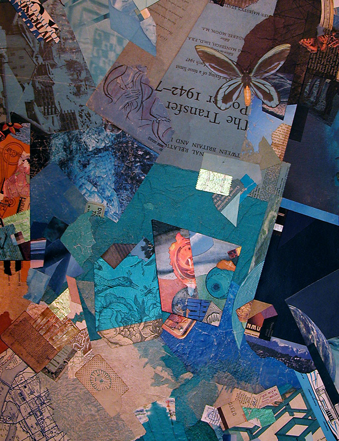
Diamonds in the Rough ~ details

Wednesday, January 9th, 2013

Collage for me is always an intimate viewing experience. You may find me with spectacles off and nose pressed near to the surface of any example within the medium. The scale of Diamonds in the Rough enhances the contrast between an up-close scrutiny and a step-back regard for the entire effect. With a large piece like this, I also enjoy visually cropping areas to create a series of virtual collage miniatures.
 

This micro view accentuates the ingredient elements, as in a collage miniature.
Visually, larger works are less ingredient centric, but still rely on their qualities.

I think my imagination would never tire of working with diagonals.
What is it about the diamond or the triangle that engages my mind’s eye?

This is one of my favorite areas within the total artwork.
Oddly, the legs and hands resonate with the Tapley drawing in the exhibition.

The composition’s focal center projects from the surrounding forms.
It differs energetically from the outer areas of structural perpendicularity.

To regularly bestow a new purpose on found material . . .
Without fear of contradiction, one could say that I am hooked.

The essence of collage is the contrast of the mundane and sublime.
At any rate, this is often how I perceive it.

WH—WHO’S THERE? (Look closely: Milt Caniff, that’s who.)
Somebody saw this as an homage to Roy, but Kurt used comics first.

A collage can rest divertingly upon layers of symbolic meaning.
Or it can be simply the harmonious resolution of aesthetic factors.

The dynamics of complementarity. (Is that a real word?)
More than one astute eye discovered my warm-cool “horizon.”

Composing with shape, color, contrast, rhythm, dimension.
At times, it need be about nothing more than that.

This image isolates a microcosm of the whole effect.
Are my larger works just a aggregation of collage miniatures?

Thanks for looking. Let me know what you think. Constructive criticism is encouraged at this site. To be honest, the medium of collage needs a bit more of it.