The ceiling of the bridge on the Enterprise 1701-D has not, I feel, had sufficient love bestowed upon it. I am very fond of all the purplish-gray, padded-upholstery, conference-hotel interior design elements of TNG, but their relationship with the progress of aesthetic trends in this century has not been entirely amicable or graceful. But the ceiling I’m talking about doesn’t seem dated or even retro, perhaps because it started as retro: I’m no expert, but to me this design reads as pretty much straight Art Nouveau.
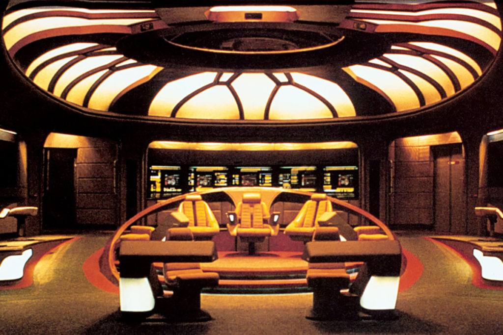
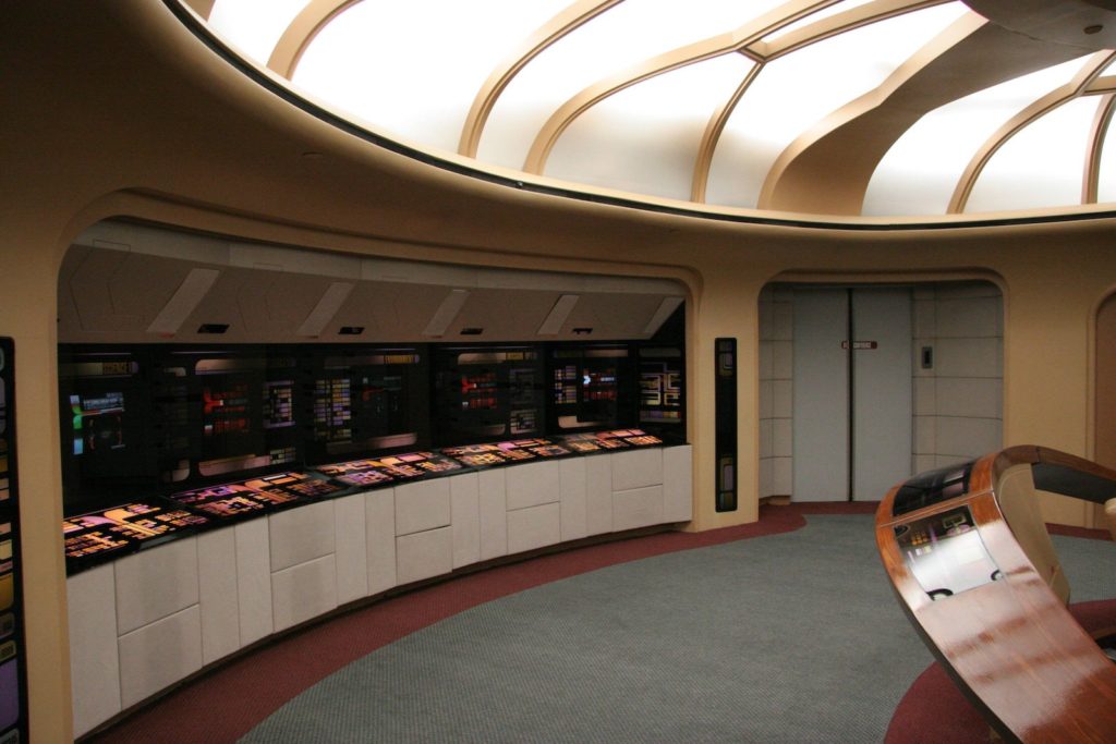
That’s actually from the rebuild they did for Generations (1994), but it’s the best view I can find from an actual photo. Most of what shows up in image searches now is from fan CGI recreations, but I think the quality of light and material you can see there are an important part of what I’m talking about. It’s of a piece with the rest of the set, but it also looks like something set apart. Here’s a partial perspective from an actual episode.
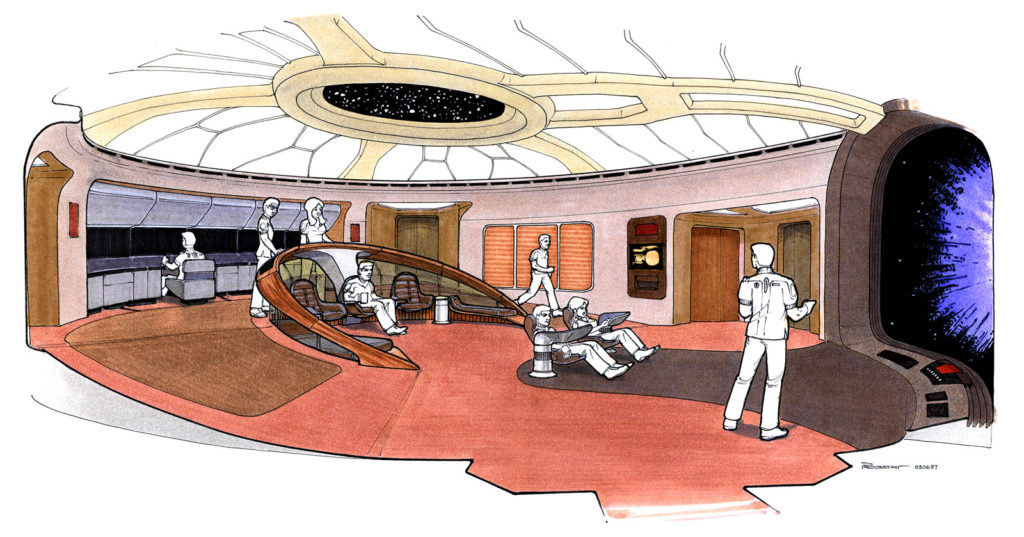
I noticed this angle while watching “Descent” with Kat, whose enjoyment of TNG is mild and reserved largely for the characters of Lore and Hugh. It was the first time I’d realized that the center of the ceiling is actually a porthole with stars in it. There’s a helpful writeup about the origins of the design on Forgotten Trek, but it focuses more on the production history than on concept artist Andrew Probert’s thought process.
It doesn’t address this either, but I suspect that the production function of the ceiling as a stage light was pretty helpful. While it looks like at least in the first season, they did set up lights for each individual shot the way one normally does on a soundstage, the show’s primary set also had a built-in hemispherical softbox! The crew could bounce flattering light on multiple sides of an actor’s face without having to do anything special or worry about lamp stands getting in the shot. Meanwhile, the science station alcoves in the back are shielded from that soft light by the overhang and can be lit by monitors, from underneath, for increased drama whenever Geordi tells the captain that teching the tech tech is worth a shot.
I really wonder if Ron Moore was thinking about the soft light of that design, two shows later, when they came up with the layout of the Battlestar Galactica CIC.
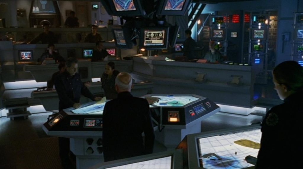
I say this with love: it is an inferior design, at least in terms of pure spatial reference. I watched every single episode and webisode of BSG, and I never had any idea what the horizontal axes of this room were supposed to be, or what most of the people on screen were doing. The nice thing about having all the chairs turned in the same direction as Picard when he points at his big tv-windshield and says “go” is that, as an audience member, you don’t have to guess whether that’s the front of the spaceship. Sure, maybe it makes military sense that the CIC would be buried in the deepest and most armored part of a battlestar, rather than having a big round window on top of it. But in effect it often felt more like they were sitting around somewhere underground, not charging into the fray or leaping through the fracking galaxy.
As pieces of functional stage go, though, the CIC poetically inverts the bridge in a way that works well. Its ceiling is a pit of darkness; almost every light on set faces upward or bounces off the floor, casting faces into shadow. Maximum drama at all times! In Star Trek, the captain can always look around and see the face of someone who’s going to give him a suggestion for the problem at hand. But in BSG, everyone keeps their eyes down, because they all know none of their answers are going to be good ones.