Archive for the ‘Creativity’ Category

Facing another March X challenge!

Thursday, February 29th, 2024

“Everyone has now seen that pandemics are another way for the military, intelligence, and public health services to expand their budgets and their power. In 2020, public health, defense, and intelligence agencies weaponized a [Covid-19] pandemic, resulting in unprecedented profits to Big Pharma and the dramatic expansion of the security/surveillance state, including a systemic abandonment of constitutional rights — effectively a coup d’état against liberal democracy globally.”

Robert F Kennedy, Jr / The Wuhan Cover-Up: And the Terrifying Bioweapons Arms Race (Kindle edition, p. 385)
 

I am recovered from an unnamed health ordeal that hit me the day after Christmas and lasted a month before I felt reasonably well. Then another month before I felt like myself. My recent article in Clandestiny will be all I say about it any time soon. So now it’s Leap Day and the eve of another March X. I won’t be recording regular notes about my heightened activity this time. Priorities to be confronted: 1) completing a “legacy collage” commission for a Dominican Sister of Peace: 2) building a greenhouse in the backyard of the Town House; 3) preparations for a new gardening season; 4) physical conditioning to ready myself for a decent bicycling program in 2024. Be seeing you in April!

The benefit of cropping exercises

Wednesday, December 20th, 2023

“Accepting the familiar is the enemy of seeing… Seeing takes work and patience and concentration and focus otherwise we are always walking around in a fog only seeing what we think we know but not actually seeing anything at all.”
— Cecil Touchon
 

Cropping exercises always offer some insights about internal composition and color relationships. The more I internalize spatial decisions and color judgments, the less reason there is to think about them when I seek spontaneity in pasting ingredients. Please take a look at the entire collection that I call LITTER-ALLY KENTUCKY.


Nine Details, LITTER-ALLY KENTUCKY
collage en plein air by J A Dixon
giclée prints of originals are available

The world without her remains a world full of Mombo.

Sunday, January 1st, 2023

This past month was dominated by the earthly departure of my mother. The role she played in my becoming an artist and the approach I bring to my practice cannot, and should not, be understated. What a debt I owe to her, and to pay it forward will require that I live as long as she! I might’ve started “giving back” much earlier, if it had been my basic nature. I can be a quick study for most things, but it often takes me far too long to learn the rest, especially when it involves stepping beyond my own creative urge. Her life was a lesson in putting others before self. In order to support her parents’ household in a world at war, she turned down a full scholarship to the same University of Cincinnati that I would eventually attend. Decades later, in a nest recently emptied of seven children, and just as she was about to explore her own personal interests, she followed her family to a remote part of a rural Kentucky county. As a widow, she built an ethical foundation for a land-based legacy that is now set to endure for generations. When she faced a grim medical prognosis that would break the spirit of others, she maintained a zest for life, an obvious concern for how it might affect others, and an astonishing diligence to push back against it. The world of my youth had shouted, “Be cynical, or pessimistic, or both,” but she would always be my reliable source of optimism, like a spring which never dries up. I could’ve become a quitter early on, but she helped me to overcome discouragement born of self-doubt and to fulfill commitments. If something is worth doing, it’s worth doing well. Why not always do your very best? And then you will automatically get better. Along with my siblings, everything was done to provide the care she needed to continue living at home, until it became no longer possible. Those years — what could be mistakenly judged as sacrificial — strengthened our family bond in a way that will last us for the duration. To separate that from my activity as an artist was unnecessary at the time and foolhardy in hindsight. Above and beyond the value of artisanship, she taught me that a creative life without love for others is devoid of meaning. Of all the souls I have intimately known, hers is the most worthy of imitation.

A ‘happy happy’ re-post from 2014

Saturday, September 3rd, 2022

“The shoe that fits one person pinches another;
there is no recipe for living that suits all cases.”
— Carl Jung

The distinctive singularity of an individual has been a profound feature of my awareness throughout life. Undoubtedly, it is the basis for much of what I have enjoyed doing most — from solving visual problems for unique entrepreneurs, or creating my own brand of illustrated portraits, and, of course, hand-crafting greeting cards with collage miniatures. I shall never tire of assembling a spontaneous composition with suitable ingredients to honor a particular person. Each collage, like every human being, is a one-of-a-kind creation, and the medium is ideal for personalized expressions. The artist has a remarkable opportunity to interpret the peculiar constellation of personality traits, proclivities, and associations that befit a fellow mortal. To put it simply: I love it!
 

Dwindling Nest
collage miniature by J A Dixon
collection of J Hellyer

Pretty darn good Saturday . . .

Saturday, July 30th, 2022

Training the trainers in Eastern Kentucky!


March Ex(clusion) — eighth day

Tuesday, March 8th, 2022

“Better to be alone than poorly accompanied.”
— Gad Saad
 

If the sole criteria are the metrics of my peculiar exercise, this could be not inappropriately described as a nearly perfect March day. Indoor and outdoor activity, creative studio time balanced by practical home improvements, and plenty of fitness items duly noted on the traditional handmade checklist. Nevertheless, the undercurrent of grief from Russia’s invasion of Ukraine is ever present. There is no single perspective that I can adopt, and it is almost beyond my capacities to forge a personal viewpoint that is not overly influenced by the agenda of some ideological bloc. But that won’t stop me from trying.

Today’s sight bite— Sky the shade of an old aluminum pot, —c-l-i-c-k— with the blurred sun like a cool white dwarf, hung all by itself on a curtain of gun nickel.

March Ex(clusion) — second day

Thursday, March 3rd, 2022

“After witnessing the extreme bias of mainstream media in covering the Canadian convoy over the past month, Children’s Health Defense decided to step in to offer people a truthful accounting of the progress of The People’s Convoy here in the United States.”
– Mary Holland
 

This entire annual winter project started as a time-oriented experiment, and I mustn’t forget that, nor the importance of the clock in boosting diligence. Circumstances cannot be the only driver. I made more progress on the backyard path. Not sure why that effort has taken an early front seat, but the mild weather is an undeniable catalyst. It’s good to have a daily reminder of concrete accomplishment, like last year’s miniature-each-day ritual. The evening closed with the Wayne White profile, Beauty is Embarrassing. His story makes me feel a bit lazy and unimaginative. Just the prompt I need to pick up the pace tomorrow!

Today’s sight bite— An obstreperous crow on the library window ledge, —c-l-i-c-k— validating or rebuking my belief in the augury of birds.

March Ex(clusion) — first day

Tuesday, March 1st, 2022

“Socrates rejected expediency, and the necessity for manipulation that accompanied it. He chose instead, under the direst of conditions, to maintain his pursuit of the meaningful and the true. Twenty-five hundred years later, we remember his decision and take comfort from it.”
– Jordan B Peterson
 

On the eve of another 31-day ritual that I’ve come to anticipate as the month of March, I had one of my deep conversations with Danny that ranged from Socrates to creativity to monasticism to Ukraine. With this go round, I look to exclude as well as include, day by day, and to allow for a dynamic metamorphosis of its own making. I want my process to evolve organically this time in contrast to a more deliberate agenda. The first thing to exclude is inactivity. To organize, dig, and walk. I cannot define what this regimen is meant to become until it unfolds. And so, it has begun. Let it take shape!

Today’s sight bite— Two doves on a power line, —c-l-i-c-k— golden-pink breasts glowing with the final light of a sun no longer visible to others below their urban tightrope.

March Ex(plosion) under way!

Saturday, March 20th, 2021

Follow my art-each-day ritual at The Collage Miniaturist.


The Need to Take Sides
collage miniature by J A Dixon
6.75 x 8.75 inches
from my Series of Rock

Glaser’s “Ten Things I Have Learned”

Sunday, June 28th, 2020

You can only work for people whom you like.

If you have a choice, never have a job.

Some people are toxic.
Avoid them.

The good is the enemy
of the great.

Less is not necessarily more.

Style is not to be trusted.

How you live changes
your brain.

Doubt is better than
certainty.

On aging: It doesn’t matter.

Tell the truth.

Milton Glaser
1929 – 2020

With a whole bunch o’ help from my friends . . .

Thursday, May 30th, 2019

Here’s an overview from The Collage Miniaturist about the
creative development of my tenth poster for the GABBF:

– – – – – – – – – – – – – – – – – – –

“While many modern-day album artworks tend to favor strict minimalism, The Beatles make a serious case for going bold and wacky without any type of restraint.”
— Nicole Singh
 

As promised, I’m devoting an entry to the project that kept me out of the collage studio for at least a dozen weeks. I shall beg your forgiveness at the outset for delving into the details of a digital process. Not only has this site kept a seven-year focus on traditional cut-and-glue techniques, but I haven’t indulged the applied-arts side of my multiple personality as a graphic artist. I’m going to depart from that now — perhaps just this once — because it’s been an extraordinary circumstance for me, and a few of you may find the description worthwhile. At any rate, I encourage everyone to read Patrick Roefflaer’s article for a story that is genuinely more interesting than mine!

Not so long ago, a prominent local musician and former brass band director took me aside at an exhibition opening. Based on her recognition of my fondness for collage, she asked me if I would take on a visual homage to the Sgt. Pepper’s album cover design. The purpose would be to mark the 30th production of the Great American Brass Band Festival, held each June in our hometown of Danville, Kentucky. It had always been her dream to link the announcement of her retirement at the annual weekend of concerts to the classic album, with a medley of tunes arranged for brass instruments. Sadly, a severe health crisis had forced her early retirement before that could happen, but she preserved hope that a multi-discipline Beatles tribute for the festival’s upcoming milestone might happen in 2019.

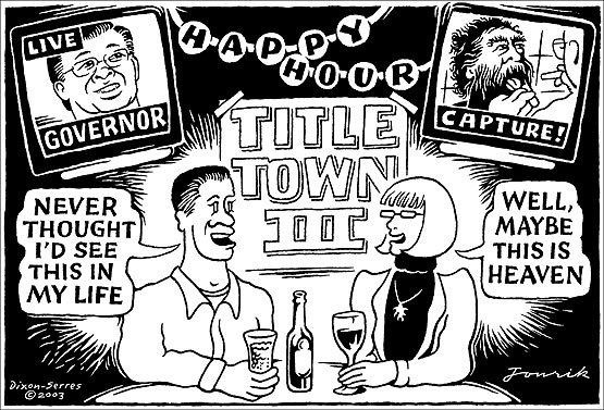
I’d already designed nine posters during the festival’s lifespan. To create a tenth was tempting, and this idea had a barbed hook. It really snagged me. My previous experience offered no sense of proportion about the magnitude of time to which I was committing myself when I said, “Sure.” The first obstacle was whether we were allowed to do it at all. we soon discovered that an enormous number of entities had made a visual salute to the famous image over the past fifty years, and that it had already become a ritual of pop culture, in spite of the complexities involved. There’s even a website that shows over a hundred previous parodies. Before long, we had mutually decided that it might as well be our local festival’s turn to pay homage.

The assignment was now in my lap, and I was overwhelmed with a desire to do it justice and exceed expectations. I found inspiration in filmmakers who I admired (like John Frankenheimer or Robert Altman), because their time-consuming approach would be required for what I’d bitten off. I wanted to bring the same passion, attention to detail, and collaborative leadership to my effort. I ended up shelving all other priorities and putting a ludicrous amount of time into the project, but not without the help of many partners. First and foremost was my wife, Dana, who jumped in head first to play a key part in nearly every aspect of the creative enterprise. After getting advice from an experienced model railroader, she began crafting a miniature flower garden to display the festival acronym for a mandatory foreground allusion. More than once, she would come back to the unfinished artifact to find that its spongy base had “spit out” some of the “flowers.”

The rest of it hinged on two important elements — whether we could pull together our own “Fab Four,” and then surround them with a crowd of numerous figures. It was determined that the Beatles would be “represented” by the previous directors of the Advocate Brass Band, a Golden-Age-style band associated with every festival. Their initial formation to color a political rally in 1989 was a direct influence on the organizing of the annual event itself. This made perfect sense because the foursome would include the festival’s pair of co-founders and their band uniform jackets, although not psychedelic, would be an effective visual reference point. We immediately knew that some digital sleight of hand would be called for, since only two of the four were locally present. One was near a university town many counties away, and the fourth had moved to a distant state. It took lots of coordination to solve that equation, and we pulled it off with the crucial participation of my friend, photography pro Bill Griffin, who took time away from his day job of wealth management. In keeping with the guiding theme of “a little help from our friends,” getting all the ingredients for the poster art to coalesce would demand the magnanimous assistance of others — furnishing space, props, and standing in at our photo shoot, plus image research and acquisition.

At a certain point, I began to focus on researching the background “crowd of fans,” to honor the countless performers, organizers, sponsors, staff, and volunteers who made three decades of festivals possible. It became a daunting, complicated task of culling and selection. I realized that the poster would be the size of a picnic table if everyone who deserved to be on it were included. The original setup by Jann Haworth and Peter Blake was peopled with life-size, hand-tinted cut-outs that imposed a certain physical limitation, and it was fabricated within two weeks. A virtual approach was too open-ended for comfort. There was a limit to how methodical I could become in choosing ingredients for the montage of faces. The solution was to approach it more intuitively, as I would any of my “maximalist” works.

All collage art worthy of the name is irrational at some level, and one of the reasons the original Beatles art is so iconic is the sheer illogic of it. And so, for us, that idea led to a few incongruous personalities, such as Carrie Nation and Howdy Doody. The final assembly was challenging, painstaking, rewarding, and fun, all at the same time. After refining the list of candidates and compiling the source files, each master image had to be sillouetted, retouched, color balanced, and optimized for inclusion. It seemed like the rearranging would never end before every element of the composition appeared to “belong.” I shall confess that I do not possess a powerhouse workstation. The increasing quantity of digital layers in Photoshop had to be continuously merged to prevent the composite file from paralyzing my Macintosh. Even so, it would often exceed 500 MB in size. I tried to save and back up as often as feasible without breaking stride, but there were periodic freezes that would result in “three steps forward and two steps back.”

There should be no misunderstanding, however. The marathon endeavor was punctuated by many fortunate, often astonishing developments. One of our “Fab Four” individuals made a vital connection with an outstanding photographer in Athens, Georgia, who went the extra yard in matching my parameters for an important superimposition of the black-suited Dr Foreman. He also shot an antique bass drum to add another convincing Sgt Pepper’s touch — the same one that appeared on the festival’s first poster in 1990, and it still had the original, hand-painted emblem! Dana took the lead in preparing the poster “mechanical” for offset production, as she always has done for Dixon Design. She also knocked one out of the park during the solicitation of bids. As a contribution to the landmark production, Mike Abbott of Thoroughbred Printing agreed to produce the job at cost, and spent an hour with the press operator, Dana, and me, making sure we were satisfied with the quality.

Our closing duty was to devise a printable key for identifying all the individuals and design elements. My original idea of including a longer “blurb” for each line item quickly became far-fetched when producing the abbreviated version dragged on. By the time we declared it done, the “labor of love” vibe had been exhausted. There wasn’t much love left in the air, and I just wanted all of it to hit the street, which it has, of course, and the positive response has been even more than I anticipated.

This post is already far too long, so I won’t get started on my Eva Marie Saint story, but I need to explain why we included a picture of the creators, and then I’ll finish up on an appropriate collage note. I was adamant that I would not fall prey to the Hitchcock Urge. I had no interest in, nor justification for, inserting myself, since I was making so many brutal choices to leave others on the cutting room floor. Dana was in total agreement, but the team of people who helped with the proofing process took an opposing viewpoint. Their collective drum beat was that the final rendition must include us! You can see that we eventually waved the white flag and stuck a small portrait on top of the Bourbon barrel.

A tiny figure seated at a kitchen table was provided by the Great American Dollhouse Museum as a nod to the Shirley Temple doll in the original composition, which also featured a Madame Tussauds wax figure of Sonny Liston on the opposite side. I knew there had to be a way to include Kentucky’s own Muhammed Ali in our version. Rather than take unavailable time to solicit permission to use a photograph that might get buried in the sea of faces, I turned to my friend Robert Hugh Hunt, who kindly let us insert the extraordinary collage portrait from his 20th Century Icons series!

Oh, I get by with a little help from my friends!
 

30th GABBF Poster
digital homage by Dana and John A Dixon
24 x 36 inches
Purchase one now! 
 
Online order page includes a printable key to identification, 
plus a ‘special thank you’ to all our essential collaborators!

Mar/X Four

Monday, March 4th, 2013

Concentrating on miniatures seems right to me at this time, but a shift to larger works will be appropriate when I eventually get a solo show somewhere. I’ll enter the best of my current crop of small pieces in the “NOT-2-BIG” exhibition and submit a “miniature miniature” in Sherryl’s event in Yellow Springs. The satisfaction of producing Diamonds in the Rough is a restless call to scale up, and my larger works will probably continue to be more calculated than in the past. I’ll use that approach with my donation to the “Art-full Raffle” this year— something planned and executed specifically for that occasion. This gets to the heart of refining my process, using miniatures as a creative gateway to bigger, more complex ideas that deserve the investment of more time, not to mention a substantial sticker price. The challenge is to arrive at a methodology that fuses a mastery of style and technique with an outlook, a perspective, a “voice,” that delivers more than a sense of spontaneity and aesthetic unity, but a way of conveying something worth saying.

Gardenshapes by Kathleen

Saturday, July 28th, 2012

“Beauty should be shared, for it enhances our joys.
To explore its mystery is to venture towards the sublime.”
―Joseph Cornell

I hesitate to use a sports term to begin this review, but, since the Summer Olympics opened last night, I’ll set my disinclination aside to state emphatically that artist Kathleen O’Brien is at the top of her game!

Gardenshapes —an exhibition of her mixed-media collage finishing its run in the main gallery of Danville’s Community Arts Center— has ample proof to support my claim. I made one more return visit yesterday to experience the diverse subtleties of her singular creations.

Inspired by birds and flowers, and exploring the garden as a metaphor, this collection of artworks represents everything that has captivated me for years about Kathleen’s approach. These works have clearly grown out of how she thoughtfully observes and attunes with nature. They also literally contain and preserve natural ingredients. But in contrast to collage that maintains its focus on formal or intellectual juxtapositions, Kathleen’s art always nudges one toward a deeper sense of wholeness and the inner complexity of our balanced existence as both organic and spiritual beings. Without question, she has made a personal commitment to creating art as a mystical practice, and, on a communal level, to providing nature-inspired beauty as a source of healing in a fractured world.

With the strong presence of these intangible dimensions, Kathleen’s art is always esoteric, and yet she manages to make the work accessible to all with her choice of subject matter and allegiance to traditional drawing. At the same time, she can delight the eye of a fellow artist with her methodology, aesthetic choices, and pictorial skill. I’m not ashamed to admit that much of Kathleen’s symbolic virtuosity is beyond my ken, but I appreciate that it’s all in play at the intuitive level. Being near the prolific output of her creative life is simply uplifting, and that’s because all the facets of her art —whether conscious or subliminal— unify as a total perception to nourish the mind, heart, and soul.

Getting back to the show, I was initially struck by the five largest pieces (28 x 36 inches), beautifully presented against white in deep gallery-style frames of natural wood. This “look” is familiar to those who know Kathleen’s art, and enhances the work’s identity as an unique artifact, preserved behind glass, like a rare botanical or zoological specimen. They are titled with reference to the garden theme. In contrast, a separate piece (24 x 30 inches) is presented with its surface exposed in the manner of an easel painting. It looks equally at home, released from behind the glass, expertly varnished in a way that does not distract. Its name is Heaven & Earth, Yin & Yang, Dark & Light, Birds & Trees, Flowers & Bees. My eyebrows lifted as I began to read the lengthy title, but was pleased with the closing rhyme as I finished. This artist always has a quiet surprise in store. Each of the large works is visually distinctive, but very much a cohesive part of a series unified by her long dedication to compositional abstraction, to a consistent theory of color, and to diligent mark making.

The large piece titled Garden for Queen Anne’s Lace is marked by a cellular pattern resembling microscopic tissue, which, while remaining highly abstract, transforms itself into a flower garden, with an interesting emphasis on each “drop of Queen’s blood” that, when closely examined, becomes a dance of circles, squares, and triangles —a dynamic that exemplifies Kathleen’s knack for taking the observer/participant through layers of meaning. The design also incorporates the application of illustrated postage stamps. Kathleen is never far removed from a devotion to cultural references and ephemera, and her Joseph Cornell influences are ever present. A fine example of this are four pieces dedicated to bird-species (16 x 20 inches) that combine found printed patterns with her typical labor of liquid media. Nests are created with random shards and colorful scraps. Dried and painted star-like blossoms effectively merge the organic, symbolic, and celestial. In Kathleen’s collage there are many allusions to language, both literal and archetypal, and here we discover many fragments of the printed word, as well as her “trademark” calligraphy. I was particularly drawn to Garden for Blue Grosbeaks, a strong arrangement of symmetrical and asymmetrical elements that carries out more of her evident investigation into fundamental shapes —circle, square, and triangle. These compositions are anything but static, a characteristic of Kathleen’s art built on a myriad of ways in which she provokes eye movement by simulating the dynamic patterns of nature, often with the application of actual plants and minerals. A perfect case in point is 9 Bird Eggs (30 x 30 inches), with its nimble use of botanicals most artists would overlook as raw material, through which she creates a variety of rhythms within a formal, 3×3 grid structure.

I should mention that Kathleen’s control of what I call “implied viewing distance” is masterful. Enjoying her watercolor effects and hidden treasures up close is inevitably a satisfying experience, as is true with much of current small-scale mixed media collage, but her pieces also can be savored at a distance. I found myself continually studying a work from across the room and then, taking off my eye-wear, sticking my nose near the glass to examine fine detail. Whether from this point of view or from half a block away, Kathleen’s distinctive impression is always recognizable, an enviable accomplishment for any artist. For example, both Royal Lily Garden and Staple Garden contain brushwork that only can be achieved by someone who is continuously handling liquid on a tool and is fully at ease with her surface. On the other hand, she uses this micro-fluency to create the intended multi-layered depth of her macro-composition, and yet I was constantly invited to step back into the intimacy of the picture plane, much as one feels when standing back to admire a flower garden, while being compelled to converge at hand’s length, only to spy a miniature surprise —a dutiful pollinator or tiny feat of nature’s diversity within repetition.

With my fixation on the bigger paintings, it was too easy to neglect the smaller items, so I had to instruct myself to visually isolate and appreciate several other works. Two of these were within squares, and each have treatments not as pronounced elsewhere in the exhibition. Feathers uses paper itself as a dimensional medium, and The Blessing of Rain features a darker atmospheric background —a shimmering chalk texture that makes me wish Kathleen would more intensively explore the potential of pastel effects. In addition, there are three bird portraits (9 x 12 inches), with coatings of what appeared to be beeswax, which recall for me the investigations of 19th-century naturalists. My favorite is Garden for Eastern Bluebirds, with its deft pencil work and luscious color palette. Kathleen pushes her highly capable layering beyond technique to create a sense of time distortion, an interplay of wildlife and cultural antiquity that makes certain the work is much more than a lovely rendering of birds. Throughout this outstanding show are many such allusions to natural and human-made cycles that fuse the worlds of growing things and a striving race that has always responded with symbolic culture to seek a balanced place in the scheme of life.

Indeed, Kathleen O’Brien has found her place. With a home studio close to nature, and a creative passion that distills her observations and meditations through heart, head, and hand, she is a gold-medal artist of the soul.

© 2012, John Andrew Dixon

Garden for Eastern Bluebirds and Garden for Scarlet Tanagers
by Kathleen O’Brien

Tribal Monday the First

Monday, May 7th, 2012

Kathleen and I inaugurated our two-person discussion group this afternoon. The first thing I noticed was how tranquil a space she has created as a “shrine” for her artistic dedication. One can truly listen to the heart in such a studio, and I appreciate her willingness to share it for a couple hours. For me the sense of place at Sunwise Farm is inseparable from Kathleen’s mixed media collage. The fullness of her artwork is about energy, and this energy—with the powerful intention it carries—is tied in some significant way to a field of Light that is carefully nurtured for optimum receptivity and intuition. I have long admired the way in which she maintains the uplifting focus of her art, an essence that is recognizable at fifty paces, and how her respect for the process is embodied in her bright, organized, efficient studio. What an inspiration for someone who seems caught in a perpetual struggle to concentrate, prioritize, and decisively press forward with a more streamlined vision.

bl171b.jpg

Book of Light, page 171 by Kathleen O’Brien
www.kathleen-obrien.com

2003 – 2011

Thursday, May 5th, 2011

Brendan concluded his micro-fiction project on Tuesday, after nearly eight years of creative ritual. Some new gigs are certain to fill the vacuum as he enters his fourth decade, and I expect to enjoy the product just as much. Anacrusis has been my Thunderbird home page for a long time. FortadoI don’t expect that to change at this point, but I’ll miss that daily curiosity until I finally get used to it, and yet I fully understand and appreciate his desire for resolution. Except for the rare Fred Rogers or Charles Schultz, few things are forever, and an artist really doesn’t need to explain each transition. Nevertheless, I appreciate the epilogue and accept his word of thanks. As for any debt, I’d say we’re more than even, after so many smiles, throat lumps, and catalytic jolts to my hair-trigger imagination. It’s an awesome body of work worthy of pride, NB, and I don’t doubt that others will be mining it for ideas well into the future. Good luck!

An Inner Calibration

Saturday, March 5th, 2011

books_strip.jpg

March Exercise —day five— I’ve used this log before to mention the elusive Max Organ. My perennial effort to categorize priorities and fashion an improved outline of unfinished projects takes on a new importance during the month of March. Some of these line items carry over from life’s earlier creative phases, but eventually they must be reconciled with short- and intermediate-term goals or be lost in the evolving mix of allocations. I’ve come to realize that old, festering objectives need to be “lanced” for psychological healing— either to resurrect them to some meaningful level of attention, or to commit them to hearth’s flame. Some deserve a restored impetus of creativity. More often, they’re just clogging the catalytic pipeline for new ideas.

Today’s sight bite— Enclosed by walls of book-packed shelves, —c-l-i-c-k— the familiar warmth of wood, brass and cork provide a framework for internal clarification.

Tomorrow— Make the transition from Dana’s current work station to a more powerful system . . .

Elusive speculations

Monday, December 27th, 2010

I need to do another entry about VT, now that my direct work with a therapist is over. I should have kept up a more regular account, since now it will be more difficult to reconstruct a coherent record of the experience. I was thinking about how, after a rough session, I had what seemed to be a moment of broad clarity. For me, these occurrences consist of distinct interconnections and apparent cause/effect relationships with respect to aspects of life not previously associated in my thinking. Sometimes these connections fade to the point where the entire insight can be called into question, and I’m left with a vague sense that my inner mental acuity is as unreliable as my memory. This time it was an electric thought that perhaps my vision dysfunction was directly related to a latent but powerful level of stress that has derived from my creativity having been held up to the continual scrutiny and subjective evaluation of others. “Well, of course,” one might say. How can one become a mature creative person, much less a professional resource, if one doesn’t learn to cope with either the legitimate opinions or capricious expectations of others? And so it becomes a matter of attitude or inner posture. If the inherent tension is not successfully mitigated at an unconscious level, it’s quite possible that there will be corrosive influences and negative consequences in the organism. I was left with a brief, troubling notion that “most of my creative life has been wasted,” because I hadn’t nourished a stance optimally detached from any sanction or disapproval from others. Has the failure to properly offset personal fulfillment with the satisfaction of others created a fundamental contradiction at the heart of what I do that induces and maintains deep internal stress? Am I the kind of individual with such a basic urge to follow my artistic impulse that a life of constraint based on the anticipation of external judgment has resulted in some form of rebellion by my body, mind, or spirit? And, if so, what in heaven’s name can be done about it now?

Someplace else

Tuesday, March 9th, 2010

March Exercise V —day nine— Even when nothing goes according to plan, good things can happen as a result. After vision therapy, I had to meet Dana in Nicholasville so that Marty’s car could be available for the appointment Joan scheduled at the Toyota dealer. My first notion was that I just wanted to get back to the studio and not lose my morning, but it was already obvious that Plan A wasn’t coming down, so I shifted gears accordingly. As it turned out, I spent some time at a Starbucks and captured some good ideas. Because Bruce still had his engine torn down, we had to drive him to dialysis and get the to-go food he wanted, before we could grab our own lunch. I wrote a draft for a radio spot while Dana was inside the McDonalds. I don’t know why I have to keep proving to myself that I can work anywhere, especially when I often find the ability to take a fresh look at things when I’m “someplace else.” It’s simply a matter of accepting that I’m always in the right place, that every environment can offer something to the creative process, or, if it honestly can’t, then at least the inner momentum can be preserved. When I finally did get back to my home base it was afternoon, but I was there in time to take two important calls. Gwen phoned to let me know that it was likely that the Kentucky Artisan Center would be displaying my wood engravings. And then I talked to a prospect about upgrading the online presence for a Lexington business. This looks like a job for Website Makeover™ Man!

Today’s sight bite— A geometric pattern of holes on the slowly revolving disk —c-l-i-c-k— challenging my eye-hand coordination.

Previously on M-Ex— Ideas and aspirations are always bubbling up in March. (3/9/09)

Tomorrow— A new project begins…

Someplace else

Renaissance man

Friday, March 5th, 2010

March Exercise V —day five— It began as a typical M-Ex day, feeling deprived of sleep, but eager to harness an elusive stream of motivation. The Shadow Trader was on his game, and by late morning I’d made some key portfolio adjustments before heading to the pool for a workout. In the afternoon, the ever-present tug-of-war between concentration and interruption presented itself when Bruce needed my help with his car repairs, just as I was hitting my stride with the bank campaign. For me the emotional challenge of capturing an idea is nothing compared to dealing with the threat of losing momentum in the midst of a successful creative process. I don’t work on cars. I’ve never worked on cars. I hate to work on cars. But there you have it—what the exercise is all about—because this is what every artistic individual has faced since that first cave-wall painter was furiously dragged by his hair to the mastodon-skinning site. Just think of all the distractions my Grandfather Seitz experienced as a father of eleven children (seven boys!) while he was involved in painting murals, organizing choirs, directing plays, or practicing the organ. I think of this now, after listening to Mombo give credit to her parents when we all gathered as a Clan to honor her as a truly exceptional mother. She measures herself against them in the same way we hold our own wisdom and maturity up to her example. How many more March rituals shall I require to meet that high standard?

Today’s sight bite— My mother in front of her birthday candles —c-l-i-c-k— as diminutive as her sisters before her.

Previously on M-Ex— Rest, focus, distraction, flexibility—some things don’t change. (3/5/07)

Tomorrow— Rest and regroup…

John “Pop” Seitz

Idea grinders

Thursday, March 4th, 2010

March Exercise V —day four— Sometimes I think that on any given day, there is one primary lesson that the universe is trying to drive home with me. At breakfast I was flipping through Twyla Tharp’s The Creative Habit, searching for her discussion about generating ideas. She explains her adherence to “the unshakable rule that you don’t have a really good idea until you combine two little ideas,” and goes on to say, “That is why you scratch for little ideas. Without the little ideas, there are no big ideas.” Later, during our typical tray lunch watching Charlie Rose, General David Patraeus said, “I wish that great ideas dropped from a tree like Newton’s apple, but it doesn’t work that way for me. We have to bang around a lot of small ideas to come up with the big idea.” So there you have it. It’s all about the grind.

Today’s sight bite— The dark-suited undertaker carefully placing a quilt on the rear seat —c-l-i-c-k— as a chill wind gusts from out of the north.

Previously on M-Ex— I am unexpectedly “in the pit” as Bruce regains some of his equilibrium. (3/4/09)

Tomorrow— A celebration for Grammo…

tt_dp.gif

“Jonrik” is no more . . .

Friday, January 8th, 2010

jonrik cartoon

This is the last image I created in a partially successful effort to provide “cartoons to the editor,” in partnership with my pal, Rick. It’s from 2003, when several improbable events converged: Kentucky elected the first Republican governor in a generation, Saddam was captured in Iraq, Boyle County and Danville football teams concurrently won state championships for the third time, and local voters passed a liquor-by-the-drink ballot measure. The cartoon was rejected for unknown reasons. In retrospect, it does seen to violate one of the basic rules of editorial drawing— focus on a single, easy-to-grasp idea. Oh well, I still like that style, but it was too much work to continue for free.

. . . and now this story can be told.

Tuesday, August 11th, 2009


“There is no substantial difference by which we can attribute a higher aesthetic value to one choice or the other. Our preference is a question of a personal, irrepressible urge.”

—Leo Lionni

D a n n y  D
at a recording studio
somewhere in Lexington

Danny D


After years of friendship built on untold hours of front porch discourse and coffee shop dialectic, Danny and I finally had the opportunity to work together on a creative project before his family’s chapter in Danville came to an end with the sale of their nearby house on West Broadway. However, it would be beneficial to back up and start my account at a more logical beginning:

The story begins at a typical sighting of our familiar Graybeard Prospector—a Chamber-sponsored networking event hosted by a newly organized bank. My pal David was in a conversation with the president of the bank when they looked my way and motioned me to join them. Within a few moments I was one of the first to learn about the imminent signing of a one-year endorsement contract with local football hero Jacob T, who had completed his NFL rookie year with the Colts after an accolade-studded career at UK. I gathered my wits as the short briefing came to a head. “We have to get a year’s worth of photographs and radio spots before he goes into training camp.”

A question flashed internally. “How would a true Ad Man reply?” With his stainless steel gaze fixed to observe my response, an imaginary Donald Draper was standing off to one side, a deftly balanced Lucky in hand. I heard myself say, “If I understand correctly, you need creative direction, and you need it fast.”

Before the impact registered, the project was in my lap and the countdown to Jacob’s departure had begun. The photo part almost felt easy. I had a solid list of pros in my head and the first one took the assignment when contacted. In a matter of days we were shooting Jacob at a personal appearance. On the other hand, it had been over a decade since Dana and I had produced any radio advertising. I felt rusty. Audio technology had moved to desktop digital since then, and there were other important factors, too. I knew the default setting would be to handle this at the hometown radio station, and my gut told me that I had to find a way to pull this into a slicker technical environment. I was confident our print advertising would look first-rate, but to stand apart on the radio would be a different kind of challenge.

The last thing I wanted was to generate “more of the same” junk so typical of local radio. If at all possible, I hoped to accomplish two things: a) create scripts that would promote the bank with words that rang true for Jacob’s personality, and b) grab the listener’s attention with music at the same level of production quality that motivated them to listen to the radio in the first place. Anything less might simply be brushed off as “some bank paying Jacob to read stuff on the air.” It made sense for me to consult someone who knew more than I did about this sort of thing. I needed to talk it over with Danny.

When I delicately raised these issues with him at the Hub one evening over a tall “haf-caf,” his response astonished me. Literally poking me in the shoulder, he mentally grabbed hold of my ideas and offered to write some music with lyrics that would help carry the campaign I envisioned. He gave me so much good advice that retaining barely a third of it enabled me to get a green light from the bank to book a recording studio and capture Danny’s work. He seemed delighted to do this favor for me, given the fact that he’d watched Jacob grow up and had a high regard for his family. I couldn’t believe my good fortune. Danny said all he wanted was to have the bank guys buy him a dinner, and I wasn’t sure whether he was joking about that part of it. I knew he was dead serious about the rest.

It took some digging, but I tracked down a sound pro named Kevin J that I’d met through Eric C in the 90s. He was the best in Lexington at the time, and, more importantly, he was worthy of my total trust. Our session together with Danny came off with flying colors and I walked out the door with everything I’d hoped for. It was exactly what I needed for the type of spots I wanted to produce. Kevin and I mixed a disc of various musical tracks at :60, :30, and :15 lengths. Now all I had to do was close the deal by winning the bank’s approval to combine Danny’s distinctive sound with Jacob’s natural voice.

Ideally suited to Jacob’s character and reputation, there was something powerfully authentic about Danny’s original words and music. Dana and I made a supreme effort to pitch those tracks to the CEO, but he fundamentally could not envision the effectiveness of my concept— to contrast a relaxed, down-home style against the typically phony-sounding chatter on the radio.

When I told Kevin that the head of the bank had thrown out Danny’s music as an element of the radio advertising, he didn’t seem surprised. Although understanding and supporting the approach I’d proposed, the experienced audio engineer and producer observed, “John, I have known people who tried to combine art with advertising, but it is rarely possible to convince the buyer. Clients have a tendency to play it too safe, do what every other similar business is doing, and then wonder why it doesn’t work better.”

Having failed to sell my idea of making the music be an equal partner in the message, the success of the production would now depend entirely on Jacob’s vocal sincerity. I pushed for the same Lexington studio we’d used to record Danny, arguing that to merely bring Jacob to the local radio station where he’d interned as a student would work against our effort to enhance his self-image as a professional. Having him rise to the challenge of his first major voice-over gig was the only hope of capturing the genuine personality on which we could hang the campaign, and I also needed Kevin’s technical expertise to produce high-quality, finished spots.

The “homework” I’d done to ensure that Dana’s scripting would naturally sync with Jacob’s values paid off with a smooth, comfortable recording session. He praised her scripts. His gifted ability to focus on task, along with his easy-going confidence, sense of humor, and considerable breath control, left us all rather impressed. After getting the go-ahead to use some appropriate background music I discovered on the Web, Dana, Kevin, and I brought the project in on budget with seven :30 spots, two :15 spots, and the ingredients for yet-to-be-written, Jacob-introduced spots that could rely on adjunct voice talent.

Much to our surprise and disappointment, a recommended introductory newspaper ad with Jacob’s image was drastically reduced without our knowledge. It looked terrible when published and put us into the position of explaining why it was not only illegible but also quite ignorable. This took place after Jacob’s sports agent endorsed our work when he saw the preliminary design. Playing catch-up, I adjusted the photo density to compensate for the poor reproduction, and we encouraged the bank to enlarge the ad for two follow-up insertions. The third time around it was printed well enough to look respectable, even though it was still significantly smaller than what we’d suggested was required to create a sufficient level of impact for an effective campaign kick-off.

Rebels Card AdFootball season is getting under way and we anticipate a bigger splash to draw the market’s attention to our new client bank. So far, people “in the know” have made positive remarks to me, but I await the first clear indication that we’re putting something out there that is doing the job. Over 70 banks have already failed in the USA since January 1st. Clearly, this isn’t the most advantageous time to open a financial institution, but I like to think of our situation this way: Here’s an enterprising group that wasn’t forced to think outside the box because it was never inside the box. Time will tell if the innovations they’ve brought to Danville will meet with consumer satisfaction. Hey, if they hired me, they’re obviously not stuck in the status quo. Let’s hope some good things start to happen!

So there’s my tale about how an exciting chance to compose a stand-out piece of promotion can turn into another missed opportunity. Nevertheless, we have an entire year to pull this campaign up a few notches, and our client has already expressed an interest in using the song Danny wrote for us to anchor some kind of Web video or podcast. To be honest, the main reason I put together this detailed account is so I can remember it myself as part of an unusually interesting summer. With everything going on, including the latest round of major abdominal surgery for Bruce, this e-log is undoubtedly the best memory chip I have going for me.