Sometimes I think that popular media’s fascination with counterintuitive propositions is a big contributor to what got us into this mess. I use the word “media” there to mean more than just major publications, but we’ll get to that later. Also, sometimes, I like to think up counterintuitive propositions myself, like software doesn’t mean “code,” it means “a system for consolidating control of the means of production.” Or maybe the Internet can be defined as “that which will promise you what you want.”
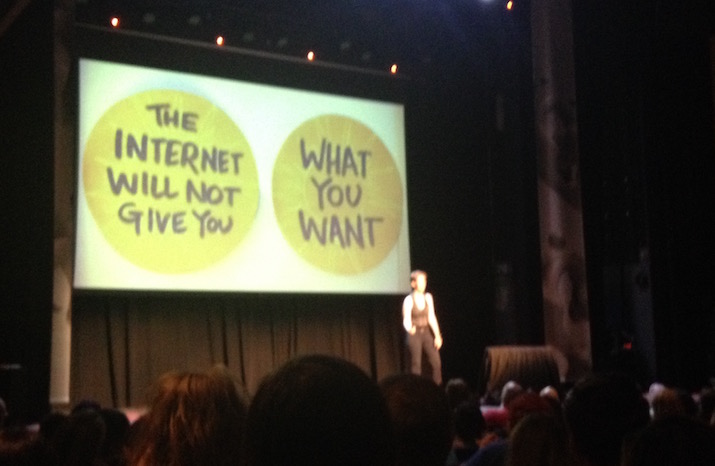 Photo by Stefan Shepherd from Lucy’s extraordinary September 2016 talk, which I think about at least every other day.
I don’t offer these takes with any intent to defend them. I just think they’re useful mental calisthenics, valuable as alternative modes of thought to the definitions that creep into common idiomatic use: things like the Internet can be defined as “the most active population of large social media platforms.” I certainly use that shorthand myself, often in a scornful tone, despite my own attempts to stretch the popular conception of the Internet around the deconglomerated approaches that people these days call “IndieWeb.” One of the writers I admire, and linked to back in March when talking about this stuff, is Derek Guy of Die, Workwear and Put This On. Sometimes I sneak onto Twitter to see his dorky fashion memes, and today I discovered this, one of his more popular tweets of late. It has, as of this writing, numbers underneath it that far exceed its author’s follower count.
This is a gentle proposition, almost to the point of being anodyne. Maybe you disagree with it. I happen to agree, myself, as someone who has spent a number of years enjoying such a lifestyle; I agree in particular that it is luxurious, which is to say a luxury. One way I define luxury is an ephemeral privilege not to be taken for granted. Many people are systematically deprived of the privilege of walkability by the way that capital and its frequent servant, municipal policy, prioritize car travel and inherited wealth to create housing insecurity and food deserts. To me, that understanding seems built into the way these two sentences are constructed.
Three days after it was posted, I can sit here and watch the retweet and quote numbers on the post tick upward every time I breathe. I don’t think that’s due to positive attention.
I’m not here to write about how Twitter Is Bad. Even Twitter, as a body, agrees that Twitter Is Bad. I’ve written variations on that theme for ten years as of next month, and I can’t declare myself piously abstemious from social media when I’m quoting social media posts in my post about social media. The interests of capital demand that Twitter makes its graph lines go up; the simplest mechanism to make them go up is to incentivize conflict; the capital circulates through organizations until the system’s design iterates toward conflict optimization. Primed for bickering, just as the man says. The story of social media is the story of how billionaires made other people figure out how they could extract money from the late-twentieth-century invention of the real-time flame war.
I just feel bad for Guy because I like his work and have a bit of a parasocial relationship with him: he is, more or less, the person who taught me how to enjoy shopping and wearing clothes. (I know many other people are subject to worse for less online, every day. I mean it when I say it’s Bad out there.) If not for Die, Workwear, I don’t think I would ever have chosen to take this series of self-portraits, a couple years back, wearing things I bought and liked just for myself.

I posted those photos on Flickr, even though I have my own IndieWeb site where I can host as many photos as I want. Flickr is a social media platform. It’s a rarity, not in that it did not generate for its acquiring capitalists the graph numbers they wanted, but in that it was then left to molder in neglect instead of being defenestrated for its failure. I have strong disagreements about some recent choices by its current owners, whatever their best intentions. But at least it’s not Instagram. Flickr has, for many years, retained an interface bent toward the humane and curious, instead of capitulating to the wind-tunnel abrasion of those who value human life less than the ascendance of the line on the graph.
Another thing I posted on Flickr, back in 2018, was the set of photos I took with Kat on our trip to Budapest together. One of the places we visited was Szimpla Kert, a romkocsma or “ruin bar,” built almost twenty years ago in what was once the city’s Jewish quarter by people in its neighborhood who wanted to make something new out of something old. It was once a condemned shell of a building; now it’s a huge draw, with thousands of visitors on a given night, most of whom are tourists like us. Locals might disagree, but I did not find that its charm was diminished by the crowd. It was idiosyncratic, vibrant, complex, and unique. Hungary—like my country, and like the Internet—is a more worrisome place to live than it was a few years ago. But Szimpla seems to be thriving, in large part because it is knit tightly into its local community.
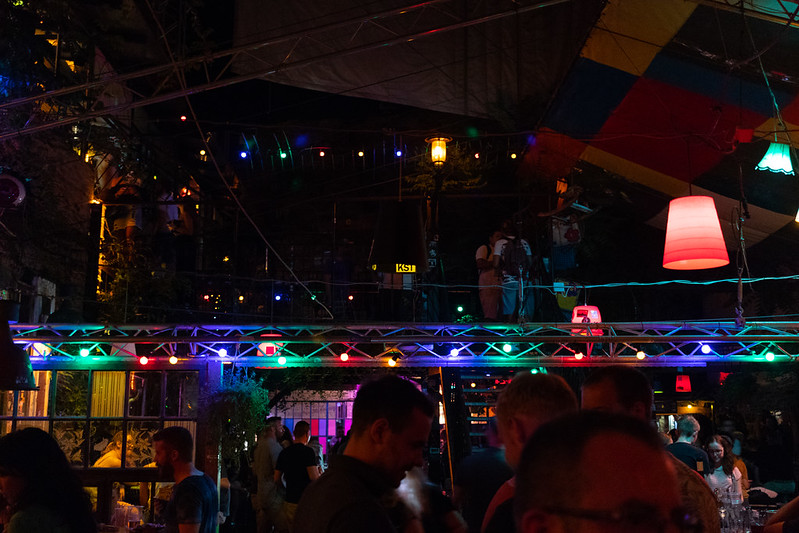
“Szimpla Kert” translates to “simple garden.” I have a little experience with the allure of gardening, and also how much work a garden takes to maintain; I’m sure the people running Szimpla work very hard. But an interesting way of looking at a garden, to me, is a space for growth that you can only attempt to control.
In the middle of drafting this increasingly long post, Kat asked me if I wanted to take a walk up to her garden bed, which is part of a community plot a ways to the north of us. I was glad to agree. I helped water the tomatoes and the kale, and ate a sugar snap pea Kat grew herself right off its vine, and on the way back I picked up dinner from our favorite tiny takeout noodle place. It took over an hour to make the full loop and return home, and I was grateful for every step. An unhurried walk was exactly what my summer evening needed. I luxuriated in its languidness, because I could.
When you put something in a wind tunnel, you’re not doing so because you value the languid. I am far from the first person to say that maybe we could use a little more friction in the paths we take to interact with each other online. Friction can be hindering or even damaging, and certainly annoying; I’m not talking about the way we’ve somehow reinvented popup ads as newsletter bugboxes and notification requests. I just want to point out that friction is also how our feet (or assistive devices) interact with the ground. We can’t move ourselves forward without it.
It’s a privilege to have the skills, money, time and wherewithal to garden. You need all those kinds of privilege to run your own website, too. I think social media platforms sold us on the idea that they were making that privilege more equitable—that reducing friction was the same thing as increasing access. I don’t buy that anymore. I don’t want the path between my house and the noodle restaurant to be a conveyor belt or a water slide; I just want an urban design that means it’s not too far from me, with level pavement and curb cuts and some streets closed to cars on the way. I want a neighborhood that values its residents and itself.
This is why I’m as just interested in edifices like Szimpla Kert and Flickr as I am in the tildeverse and social CMS plugins and building the IndieWeb anew. Portland is the most walkable city I’ve lived in, and it ended up that way kind of by accident: the founders optimized for extra corner lots out of capitalist greed, but the emergent effect was a porous grid that leaves more space for walkers and wheelchairs and buses and bikes. The street finds its own uses for things, and people find their own uses for the street. Sometimes people close a street to traffic, at least for a little while. And sometimes people grow things there.
I don’t expect the Internet we know will ever stop pumping out accelerants for flame wars directed at people who just felt like saying something nice about a walk to the grocery store. That paradigm is working for the owners of the means of production, for now, though it’s also unsustainable in a frightening way. (I will never again look at a seething crowd, online or off, without thinking twice about the word “viral.”) But if someone who lives in Chicago can’t entirely ignore what suburban white people get up to in the Loop on St. Patrick’s Day, then one doesn’t have to go out of one’s way to join in, either.
I’m ready to move on from the Information Superhighway. I don’t even like regular superhighways. The Internet where I want to spend my time and attention is one that considers the pedestrian and unscaled, with well-knit links between the old and the new, with exploration and reclamation of disused spaces, and with affordances built to serve our digital neighbors. I’m willing to walk to get there.
A front-end developer and former colleague I admire once said, in a meeting, “I believe my first responsibility is to the network.” It was a striking statement, and one I have thought about often in the years since. That mode of thought has some solid reasoning behind it, including a finite drag-reduction plan I can support: winnowing redundant HTTP requests increases accessibility for people with limited bandwidth. But it’s also a useful mental calisthenic when applied to one’s own community, physical or digital. Each of us is a knot tying others together. The maintenance of those bonds is a job we can use machines to help with, but it is not a job I think we should cede to any platform whose interests are not our own.
The Internet will promise you what you want, and the Internet will not give it to you. Here I am, on the Internet, promising you that people wielding picnics have put a stop to superhighways before.
 Photo by Diego Jimenez; all rights reserved.
Fifteen years ago this summer, I was exercising a tremendous privilege by living and working in London, in the spare room of an apartment that belonged to friends I met online. They were part of a group that met regularly to walk between subway stations, tracing the tunnel route overground, which they called Tube Walks. There was no purpose to the trips except to get some fresh air, see some things one might not otherwise have seen, and post the photos one took on Flickr.
My five months south of the Thames were my first real experience of a walkable life. I grew up in suburbs, struggled without a car in Louisville, and then, for the first time, discovered a place where I could amble fifteen minutes to the little library, or the great big park, or the neighborhood market, which would sell me just enough groceries for a single dinner. Battersea is not a bourgeois neighborhood, but it’s rich in growth and in history. It changed what I wanted from my life.
London, like Budapest, like Chicago, is a city that has burned down before. People built it back up again, and they didn’t always improve things when they did. But it’s still there, still made up of neighborhoods, still full of old things and new things you could spend a lifetime discovering. And small things, too, growing out of the cracks, just to see how far they can get.

Daniel Burnham, who bears responsibility for much of the shape of post-fire Chicago, claimed inspiration from the city’s motto of Urbs in Horto: that is, City in a Garden. (Which I didn’t even know, myself, until Kat gently pointed it out to me while proofreading this post.) Burnham was also posthumously accorded the famous imperative to “make no little plans.” But I like little plans, defined as the plans I can see myself actually following.
I didn’t know where this post was going where I started it, and now it’s the longest thing I’ve ever published on this blog. If you read the whole thing, then please take a moment of your day and write me to tell me about a website that you make, or that you like, or that you want to exist. I’ll write back. More than ever, I want to reclaim my friendships from the machinery of media, and acknowledge directly the value that you give to my days.


