Archive for the ‘Technique’ Category

The “Collagesmith” as Artisan

Saturday, March 24th, 2018

“Even in the absence of inspiration and talent, I think that through sheer craft you can actually create extremely good work, all the time, reliably. Great work is something else. I think for great work you also need a lot of luck. You can only aspire to really good work. The great work either happens or it doesn’t.”
— Christoph Niemann
 

Sloppy collage artwork has never held much appeal for me. Individuals might define “sloppy” differently, so I’ll rephrase that. I have always found well-crafted collage artwork to be the most appealing. In practice, I have aspired to the highest level of artisanship to which I am capable. According to my peculiar notions, the very nature of collage as a “mash-up” of visual ingredients suggests that one resist all the inherent temptations to condone careless techniques. To do anything less is a disservice to the medium, and strikes me as being a bit lazy.

I have been at this long enough to contrast current activity with a study of my “early” work. I perceive it now as more crisp and aligned with my long stint as a designer and illustrator. I remain proud of craftsmanship that continues to challenge my present hand skills. Like everyone who sticks around, I have moved relentlessly toward a period of life when manual dexterity and vision are unlikely to improve. At any rate, clean, precise work is more about attitude and personal commitment than it is about facility. Lately, on the other hand, I have sought a more organic, less contrived look — the impression that a piece is naturally the way it should be, rather than appear too obviously composed and belabored. As I work, I try not to permit the goal of a somewhat softer and cohesive whole to suggest a relaxation of craft. In fact, I have gradually introduced steps in the process that demand extra time and attention: sanding the reverse side of ingredients for adhesive-saturated compression and eliminating white edges on printed scrap to enhance a seamless effect. I combine that with ample burnishing and some hair-dryer prep before curing time under weight, followed by multiple light-touch coats of matte sealant. I would rather be thinking about practical methodology or a musical playlist than what is literally evolving on the surface before me, allowing that to be as intuitive as possible.

And perhaps (just maybe), Lady Luck will smile.
 
Cosmic Crucifixion ~ J A Dixon

Cosmic Crucifixion
mixed-media collage by J A Dixon
2006, 16 x 16 inches
available for purchase

Wetland

Monday, January 15th, 2018

“When you take risks you learn that there will be times when you succeed and there will be times when you fail, and both are equally important.”
— Ellen DeGeneres
 

Although it was created in the studio, my new collage landscape titled ‘Wetland’ benefits from a summer of plein-air activity. My “painting with paper” out of doors has opened a rewarding area of investigation for my work as a collage artist. I’m pleased to share this piece with the art-viewing community at my first invitational exhibition of the year, the annual New Year New Art show at our Community Arts Center, just a biscuit toss from my home base in downtown Danville, Kentucky. This event has been a fortifying tradition for regional artists, because we can complete our year of work at a risk-taking level, and still know that the result will get a prominent public display. An artist working outside a metropolitan center could not ask for greater support from a local institution.

Based on an excellent photograph by a longtime pal, this artwork was created as an entry for a contemporary landscape show, but the juror rejected it for unknown reasons. I kept it handy for a pair of upcoming open studio events (my participation in the Central Kentucky ARTTOUR and Gallery Hop Stop). Plenty of praise ensued, but nobody took it home, so I decided to make additional refinements, leading up to the deadline for the January exhibition. A full makeover was unnecessary, as the in-process image above indicates. However, I was not entirely pleased with the vegetation at the waterline, above the dark shadow that spans the composition. In this case, less was not more. Additional ‘foliage’ was needed. I also thought that the lower right corner was too abstract. The desired sense of realism would profit from a more detailed foreground. Late-season ironweed, a favorite of mine, seemed a suitable choice. That led intuitively to a few closing decisions in the sky reflection and distant terrain. stash of premium paper samplesNearly all of the ingredients were infused with wheat paste and press firmly onto the evolving surface with polymer gel. After thorough drying, selected areas were lightly sanded and the total surface evenly daubed with a flat sealant.

It is very satisfying to work with a palette of elegant papers, and I am fortunate to have them. Some of you may remember (especially those with a background connected in some way to the graphic arts) the pre-internet days of a more diversified paper industry. Numerous mills and distributors slugged it out in a highly competitive market. Inkjet printing was still on the horizon and multi-color offset printing was expensive. Printing on colored stock was a cost-effective way to get more color into published material. Paper producers went out of their way to demonstrate creative ways to use colored paper and many of us who specified paper for printing projects were lavished with promotional samples. Decades later, I still have a stash from that era, and I rely on it now for my plein-air miniatures and studio landscapes. A piece such as ‘Wetland’ puts this hoard to good use; it would not look the same with scrapbook or construction paper. The richness of premium papers manufactured for fine printing were accented with fragments of dulled foil, tissue, scraps of found packaging, and fragments of typography. After all, it’s meant to be a collage artwork!

The opening reception for NYNA is this Friday evening, 5 to 8 pm. Perhaps I shall see you there to discuss ‘Wetland’ in person.
 
Wetland ~ collage landscape by John Andrew Dixon, Danville, Kentucky

Wetland
collage landscape by J A Dixon
21.25 x 19.25 inches
on structured panel, framed
available for purchase

Creating collage artwork on a book cover

Saturday, August 19th, 2017

“A cold start is a hard start.”
— Stephen King
 

There must be a lot of ruined publications out there, because the “collage on book cover” has become a staple of the medium in recent years. I happen to live across the street from a public library, and I’ve been known to peek into their recycling bins from time to time. If the decisions of libraries are any indication, cast-off books will supply the needs of artists for quite a while, and I’m not talking about just covers. Perhaps the societal move from print to digital has in some measure fueled the explosion of collage worldwide. Much could be said about that alone, but let’s stay focused on the book cover.

As a substrate, it has all the aspects for which a collage artist is looking — strength, durability, unusual textures, and it often provides other desirable features, such as embossing, foil stamping, plus interesting typography that need not be superimposed. I will generally wrap my collage ingredients around the dimensions of the working surface, and this adds an “artifact” quality to the creation, because it takes on the perceptual properties of an actual object. Book covers can lend themselves to this effect.

For me, the book cover also triggers its own unique intuitive responses — unconscious associations that will “jump-start” the process in a more experimental way than the typical “blank canvas,” which invites more initial calculation. Any component of a publication has the vestiges of an anonymous designer’s preexisting sensibility. There is already a context, perhaps a pictorial or narrative allusion, but, at minimum, a tactile or color stimulus. It is not a cold origin.

There are times when a collage at the scale of a book cover will capture a microcosm of “the moment,” whether or not we can interpret all the elements at a rational level, whether or not we can ascribe “meaning” to it. I see many collage artworks that communicate little beyond “disorganization” or “chaos.” But there are others that probe deeper to the heart of something more significant, and are the result of an artistic intent at some level of mindfulness, even if it has not derived from a series of choices that involve an outer, deliberative awareness. Then again, it is dangerous for me to generalize about anything. Each creative process is distinctive. Discover yours!
 
Threshold Of Control ~ J A Dixon

Threshold Of Control
collage miniature on book cover by J A Dixon
7 x 10 inches
 
Purchase this artwork!

This Side of Recklessness ~ J A Dixon

This Side of Recklessness
collage miniature on book cover by J A Dixon
7 x 10 inches
 
Purchase this artwork!

Star of Commonwealth ~ through the glass

Saturday, August 12th, 2017

“Impossible is just a big word thrown around by small men who find it easier to live in the world they’ve been given than to explore the power they have to change it. Impossible is not a fact. It’s an opinion. Impossible is not a declaration. It’s a dare. Impossible is potential. Impossible is temporary. Impossible is nothing.”
— Muhammad Ali
 

Let us take “our telescope” and look more closely at the Star. My strong appreciation of fine-art collage is second to none, but there is something equally as satisfying when one is called upon to create an “artifact” that pays tribute to a unique historical or personal legacy. I think that I managed to compile enough ingredients to do justice to the theme of the current exhibition — Kentucky’s 225th birthday celebration.

If anyone asks, “Where is he or she? Why did you not include this or that?” the answer might be as simple as an absence of “stuff.” The reason for that is my firm reluctance to use anything but original source material that would otherwise be destined for the recycling bin or landfill. I cannot bring myself to go online to search for, print, and use digital imagery, even though nearly anything can be “acquired” in that format these days. For me, art is always about constraint. Or, as the late Martin Landau put it, “It’s not about comfort, it’s about discovery.”

Please click on the images below to zoom in on Star of Commonwealth.
 

detail from ‘Star of Commonwealth’ by John Andrew Dixon, Danville, Kentucky

How can a collage artist go wrong, relying on images of
Kentucky’s two most widely recognized and revered native sons?
For me, Frederick Douglass is the figure who links them best.

detail from ‘Star of Commonwealth’ by John Andrew Dixon, Danville, Kentucky

One of my organizing factors was to confine the more intense colors to the
‘floating’ star and to use the plank surfaces to carry a more historical tone.

detail from ‘Star of Commonwealth’ by John Andrew Dixon, Danville, Kentucky

Kentucky has one of the greatest multitude of counties for any state in the union.
Woefully inefficient, or one of the better examples of self-government close to
the people? You can decide. I just like how colorful it makes an antique map.
At any rate, the frontier’s exploding population pushed Dan’l toward the sunset.

detail from ‘Star of Commonwealth’ by John Andrew Dixon, Danville, Kentucky

One of my favorite zones involves a visual juxtaposition of worship, whiskey,
constitution, thoroughbreds, coal mining, confederate leader, battle flag, and a
reference to human slavery. Only the history of Kentucky could contain all that.

Collage En Plein Air ~ second chapter

Wednesday, July 19th, 2017

“Detached from judgement, hesitation, fear of failure or imitation, one embraces the moment and the place, as revealed in value, color, and shape — the impossible can happen and the spirit of the place appears as if by magic.”
—Dean Taylor Drewyer
 

I joined the Plein Air Artists of Central Kentucky on one of their regular “art-outs” with a totally different system than I used in my first venture. Louis Degni is marketing an outdoor kit for collage artists that he calls the “St Hilaire System” (named for artist Elizabeth St Hilaire). John Andrew Dixon ~ plein air collage artistHis design may work fine, but the idea of using cups to control available source paper did not appeal to me, so I put together a different configuration based on a re-purposed plastic dish drainer. Using custom-cut folders fitted to the 14 dish slots, I have an array of potential ingredients that are fully protected from the wind. Needless to say, even a mild breeze can play the devil with small scraps of paper. After I got to the site and picked my location, I sorted through a spectrum of colors to choose a palette. John Andrew Dixon ~ plein air collage artist A central compartment between the little folders provides storage for this selected material under the large clipboard that secures my working surface. Bottles with two different adhesives fit handily into what was originally meant to hold kitchen flatware. The scale is ideal for a collage miniature. Additional refinements are anticipated, especially if I decide to increase the working dimensions, but I now have a solid approach that allows me to concentrate on capturing the essence of the scene.

The hospitality extended by our hosts for the day was remarkable. I was free to roam the property and found a grape arbor that had seen better days, but still looked handsome in a patch of sunlight. My subject may have been too complex for the time slot, or, more likely, the process remains slow, since my layering method is still inefficient. I wasn’t able to complete all the foliage on site, so I had to spend some studio time the following day to finish up. I’ll admit to being pleased with the results, although I hadn’t expected to be satisfied with my early attempts. I have no idea where this is heading, but I’m happy to follow my enthusiasm to the next phase!
 

Margo’s Arbor ~ plein air collage miniature by J A Dixon

Margo’s Arbor
plein air collage miniature by J A Dixon
4.625 x 4.625 inches
available for purchase

Local Art-A-Thon successfully concludes

Sunday, May 14th, 2017

I am convinced that supporting the arts makes for a more livable community, and calls for generosity, so I took part in the local Community Arts Center’s Art-A-Thon campaign this spring.Art-A-Thon ~ Danville, Kentucky The CAC funds summer art-camps for young people, plus many worthwhile programs to nurture personal creativity in every segment of a diverse community. As part of the Art-A-Thon, I demonstrated my technique during a full day of arts activities in downtown Danville, working on collage miniatures and putting the finishing touches on my contribution to the Art-full Affair (the other big fundraising event this month, sponsored by the Arts Commission of Danville / Boyle County). More thoughts to come about To Peach Is Owed, my newest collage on structured panel.

My sincere “thank you” to everyone who helped me reach my Art-A-Thon goal. Your generosity is an inspiration! The last time I looked, the Arts Center had exceeded its target by nearly 50%, and my “team” landed in seventh place with $526 raised. Special appreciation to Katie Blake, who sent a generous donation all the way from Alaska!

I kept my nose to the collage grindstone all afternoon
at the local
Art-A-Thon event on Saturday, May 13th,
and put some final touches on To Peach Is Owed, my
donation to the Art-full Affair drawing for art scholarships.
(photo by Kendra Peek)

I Must Have Kentucky ~ all the details

Sunday, April 2nd, 2017

“I think to lose Kentucky is nearly the same as to lose the whole game. Kentucky gone, we cannot hold Missouri, nor Maryland. These all against us, and the job on our hands is too large for us. We would as well consent to separation at once, including the surrender of this capitol.”
— Abraham Lincoln, 1861
 

I am constantly experimenting, because I find it difficult to pluck a coherent idea from a “cold start,” and so I cultivate a habit of collage experimentation to preserve a state of receptivity and to invite the uncanny “synchronicities” from which a more rational concept can be refined. More often than not, there are no distinct memories associated with the genesis of an idea. It is unusual, therefore, to have a clear recollection of the creative lineage for I Must Have Kentucky, currently on display as part of 225: Artists Celebrate Kentucky’s History.

I was stumped about how to respond when a call to artists from curator Gwen Heffner announced an exhibition to observe Kentucky’s 225th birthday. I thought about the history of my own town (Danville, the first capital of the state), about the The Kentucky Documentary Photographic Project, about the story of tobacco growing families in Kentucky, and about the great Kentucky abolitionists. There were so many fascinating subjects, but none of them sparked a visual flame in my imagination. When I shared my befuddlement with Dana, my “partner in all things,” she suggested I consider doing something with Star of Abraham, an artifact I made in 2009 for the bicentennial of the 16th president’s birth. Star of Abraham ~ John Andrew DixonThe bulk of my collected Lincoln images had been exploited to cover a salvaged metal star. To produce a collage tribute to the martyred leader with a folk-art quality seemed a technique appropriate to the occasion, and it was still in my studio, generating little interest from visitors. I liked the notion of using it as a “found object” in a larger assemblage, but there needed to be more to it than that. The solution finally hit me on a drive to our family farm, when I turned off the radio and focused on the rolling “knobs” that surrounded me: Lincoln’s famous declaration about his home state during the Civil War!

I got down a flurry of thumbnail concepts in my journal when I arrived at my destination. It was barely necessary to ever look at them again, because the development toward a final idea took on a momentum of its own. I realized I could enlarge my Lincoln theme with additional artisanship to include the importance of Kentucky in his strategic thinking. A design took shape in my sketches, and I searched my stash for images that would do justice to the “brother against brother, family against family” character of the conflict in a state that gave birth to the presidents of each warring side.

The expanded mixed-media construction is created from recycled materials — found ingredients include salvaged wood and metal, plus discarded books, magazines, maps, and mailed promotions. My lettering is hand painted with acrylics. John Andrew Dixon at the Kentucky Artisan Center, Berea, KentuckyObviously, the dimensional star represents Abraham Lincoln. The five horizontal bands signify the final years of his life and the impact his decisions had on Kentucky and the United States during that time. Among the individuals featured are Kentucky native Jefferson Davis, Lincoln’s rival in war, and Senator Stephen A. Douglas, his rival in peace, plus Lexington native Mary Todd, her sons Willie and Robert, Munfordville native Simon B. Buckner, Frederick Douglass, U.S. Grant, Clara Barton, John Hunt Morgan, and others. Also represented: soldiers, their ladies, Kentucky coal miners, and the decisive Battle of Perryville.

The artwork commemorates our Commonwealth during 1860 to 1864, the most tumultuous period in its history. At the center of those pivotal years is the towering figure of its most illustrious native son, who encapsulated the significance of the border state to the cause of national unity when he reputedly declared:

“I hope to have God on my side, but I must have Kentucky”.
 

detail from ‘I Must Have Kentucky’ by John Andrew Dixon, Danville, Kentucky

I secured the existing ‘Star of Abraham’ to a construction of five salvaged
wood planks, which alternates hand-painted lettering with my typical collage
treatment. My Lincoln artifact had finally found a fitting context.

detail from ‘I Must Have Kentucky’ by John Andrew Dixon, Danville, Kentucky

I long have found interesting that Kentucky had given birth to both
presidential leaders in the national conflict, and I devoted a section of my
composition to that inexplicable fact.

detail from ‘I Must Have Kentucky’ by John Andrew Dixon, Danville, Kentucky

Border-state Kentuckians were divided when war broke out. Munfordville
native Simon B. Buckner attempted to enforce its neutrality before accepting
a Confederate commission. He led troops at the strategic Battle of Perryville
in 1862, and later became a scandal-plagued governor of the Commonwealth.

detail from ‘I Must Have Kentucky’ by John Andrew Dixon, Danville, Kentucky

One of my favorite spots in the piece: Lincoln’s boy Willie, U.S. Grant, a young
Frederick Douglass as a free man next to a slaveholder’s advertisement,
a superb wood engraving of combat, Clara Barton, Samuel Colt, and an image
of the Commander in Chief that indicates his unusual height.

Thanks for reading such a long entry. I invite you to register and comment here. Let me know what you think. If anything bugs you, constructive criticism is encouraged!

Another worthy collaborative alliance

Sunday, January 22nd, 2017

“Behold, how good and pleasant it is when
brothers dwell in unity!”
— Psalms 133:1
 

Collage collaboration is thriving in the Bluegrass. Robert Hugh Hunt and I began to think about a new project earlier last year, to follow our double-piece venture of 2015 (unveiled at the Kentucky Artisan Center’s It Takes Two show, featured at JUXTAPOSED, and also recognized in the state capitol rotunda as part of the 2016 Governor’s Derby Exhibit). Based on a thumbnail sketch in my journal that suggested a pair of interlocking shapes, we each took a 16×20 canvas-on-wood construction and worked independently on a solution to our “puzzle.” As we shared images online, a color scheme evolved as visual ideas echoed. Out of the gate, a found drawing of lupine eyes would demand a lower face with grinning mouth. Before long, we had exchanged a digital simulation of how the pieces would configure. Robert responded with a television element after I pasted the face of Fidel into a vintage TV set. (Strangely enough, this was a few weeks before the dictator’s demise.) When my partner, known for his mixed-media roosters, drew a chicken head, I added a corresponding game fowl to further the red-black theme. Did my fragment of a playing card spark his array of floating club symbols? His hand-drawn kissers certainly inspired my pencil and acrylic rendering of the “photo-booth” Kennedys.


Finishing touches were made after we had shared our final interim images. When our halves converged for the culminating “intercourse,” we thought it desirable for me to install a clamping device, so that the components might stand alone in the future. I explored possibilities and tried some ideas at my workbench, but, alas, I have never been an engineer. Fortunately, my kind collaborator was comfortable with a decision to join them permanently and declare victory.

‘Dreams Aligned’ (a collaborative collage construction by John Andrew Dixon and Robert Hugh Hunt) at the 2017 NEW YEAR NEW ART exhibition ~ Community Arts Center, Danville, KentuckyAll in all, I found our creative teamwork to be an immensely satisfying collaboration. The result was selected to be part of the local NEW YEAR NEW ART winter exhibition. Even though the interlocking feature of the artwork is probably more discernible when viewing it in person, it makes for a provocative online impression, and we were pleased that it was designated as the promotional poster for the show. the 2017 NEW YEAR NEW ART exhibition ~ Community Arts Center, Danville, KentuckyAfter I had sorted through dozens of potential titles with a lack of conviction, Robert coined the phrase that stuck. He wrote this to me when he summed up our experimental process:

“Well, this collaboration was unlike any I had done. Most art collaborations have multiple artists working one at a time on a single piece until it is finished. As the artist, you are either ‘starting’ the collaborative piece or ‘finishing’ it, and, in cases with more than two collaborators, you could be working the ‘middle’ of the piece. But with Dreams Aligned, we took a different approach — creating two pieces, which I felt should stand on their own, and merging the two into one piece that not only worked as a whole, but made a stronger piece than the two works alone. And the fact that we had worked together successfully before, and understood each other’s artistic language, and that we kept a visual dialogue ongoing, showing each other the progress on their ‘half,’ following each other’s visual cues on medium, color, composition, etc. — in this way we were able to create a collaboration with two distinct artistic halves. It wasn’t a merging as much as an alignment of our artistic styles and languages, hence the title.”
 
Dreams Aligned ~ a collaborative collage construction ~ Kentucky artists John Andrew Dixon and Robert Hugh Hunt

Dreams Aligned
a collage collaboration by J A Dixon and R H Hunt
mixed-media construction, 26.75 x 26.5 inches
(left component by Dixon, right component by Hunt)
available for purchase

a mini-tutorial for gel transfers

Tuesday, September 27th, 2016

“Self-education is, I firmly believe, the only kind of education there is.”
― Isaac Asimov

A growing number of people will now agree that most emerging social networks are not what they’re cracked up to be. For an artist who spends a lot of time in solitary activities, it can be a beneficial connection to a larger body of peers. I concur with Cal Newport that it can also be a habit-forming distraction that pulls one into a more shallow mode than the deep concentration necessary to produce exceptional creative work. There are times, however, when a Facebook interaction is so good that I have to marvel at the way people can quickly exchange valuable information across continents. Case in point: a recent back-and-forth between Peter Dowker (Lac-Brome, Quebec) and Matthew Rose (Paris, France) about image transfers for collage assembly. When Susanna Lakner (Stuttgart, Germany) and Melinda Tidwell (Santa Fe, New Mexico) jumped in, it developed into one of the best step-by-step descriptions of gel-medium transfer that I have seen. Here is my summary of Dowker’s technique—

“First of all, stay away from the hard stuff, like the toxic chemical cleaner trichlorethylene. Instead, use a gel-medium method to achieve an effective transfer. Apply a healthy coat of liquid acrylic medium to the image side of an ingredient and adhere it face down. GLOSS medium sticks better than matte. Rub with a brayer, or burnish gently with a soup spoon, and let it dry. Using a bit of water, gently rub off the paper backing with your finger or a piece of cloth. Don’t use too much water and slowly move over the surface, removing a bit at a time. Use oil varnish or vegetable oil to bring up the image. A minute amount of paper will always remain behind, giving it a cloudy appearance when dry. The oil varnish or vegetable oil will make that disappear and enhance the transparency. I formerly used matte oil-based varnish, which works okay. The vegetable oil idea comes from Allan Beally. There will be hardly any build up at all — probably less than any of the collaged pieces next to it. When making a transfer onto vintage papers, I find it’s better to seal them first before you begin — 1 or 2 coats of matte gel medium — the water involved to rub off the back of the transfer can destroy the substrate. Keep in mind that different papers react in different ways. Sealing is only necessary if the base is fragile. Be patient after gluing down the transfer. Letting it TOTALLY dry before rubbing off the paper is essential. If you’re not patient and start rubbing too soon, the image can start to break down. Wait a minimum of 2 hours (overnight is best) before removing the paper backing. If I know I’m going to be using a transfer from the outset, I start the piece on heavy card, to keep the substrate from becoming wrinkly in one spot from the water. The method works with original elements or copies. When I do use a laser print, it’s on thin, cheap office paper. Removing the paper backing can take ten minutes or more, because I go slow, not wanting to damage the image — not really that long at all. I’ve had the most luck since I began sealing the receiving surface with matte medium and waiting longer for it to dry. And the oil works wonders!”

My thanks to Mr. Dowker for allowing me to share this description here. Some of us have also used a variation that involves removing the paper backing independently, in a basin of water, before adding it to the collage surface. When doing that, one ends up working with a collage element that is essentially a veneer of acrylic medium, which introduces a size limitation and other aspects of craftsmanship. Peter calls this the “gel-skin method.” Although he has used it many times, a drawback for him is the need to build up 4 to 5 layers of medium — so it’s not too fragile for the rubbing stage — which makes for a thicker transfer. According to Peter, “not very appealing to the fussier ones among us.” The gel-skin method does allow for a right-reading image (if that’s important), otherwise the previous method will result in a flopped image (unless it can be photomechanically or digitally reversed prior to transfer). Each collage artist will refine an individual methodology, and, not surprisingly, new discoveries and “fortunate accidents” occasionally can result. As Peter reminds us, “Don’t be shy!”

Take a few minutes to savor a few of his extraordinary artworks below—
 

CUTTERS
collage with image transfer by P Dowker

ACORN
collage with image transfer by P Dowker

VAAVING
collage with image transfer by P Dowker

TOYS
collage with image transfer by P Dowker

Much more about JUXTAPOSE . . .

Monday, February 29th, 2016

Friend and fellow collage artist Kathleen O’Brien is in the midst of her countdown to a big solo show in April. She asked me to do a favor and share a guest review as part of her final promotions for JUXTAPOSE before Drawn to the Earth requires her full concentration. As excited as I am about the group exhibition in Danville, it was a tougher post to write than I first anticipated. Collage is not the easiest art form on which to expound, perhaps because it relies on the “logic” of irrational choices.

At any rate, my dedicating a blogsite to that very topic was nobody else’s idea, so I best not complain to those of you kind enough to visit here. Would I rather be making art? Of course. Even so, I cannot constrain my enthusiasm for all things collage. Here’s my take on a great show. Be forewarned: If you’re looking for some criticism, you won’t find it!


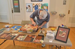
I’ll admit it. I can’t get enough of JUXTAPOSE. The current exhibition of collage and assemblage is at the Community Arts Center until April 2nd. That’s not exactly the most humble thing to say, considering it features a dozen works by yours truly, so I won’t pretend that I can offer an unbiased review. Program director Brandon Long has organized a finely curated, must-see destination that brings together over a thousand examples of the two associated mediums (literally, but I’ll explain that in a moment). This is an unprecedented group show for the Bluegrass-based artists involved, and I am thrilled to be exhibiting side-by-side with Kathleen O’Brien, Teri Dryden, Robert Hugh Hunt, Meg Higgins, Connie Beale, Cynthia Carr, and many others. No doubt my enthusiasm has something to do with its location less than a city block from my studio, which bestows the luxury of repeated immersions, and there is over a month left in the duration!

There are more participants than I can profile individually, and far too many artworks to highlight. The best example of this is a room devoted to three complete year-long series of collage-a-day works by O’Brien, Long, and Nan Martindale. Combined with almost one hundred seventy of Robert Hugh Hunt’s provocative collage collaborations, the magnitude of miniature artworks presented in a single space could be overwhelming. As an exhibition designer, Long uses geometric grids, browsing boxes, and two flat-screen displays to make the huge collection comprehensible for viewers. O’Brien’s sensitive, meticulously layered collection of daily two-sided postcards is a journey to which I surrender with pleasure each time I visit, but only after a jolting romp through Hunt’s rarely exhibited Hillbilly Voodoo series with T R Flowers.

An opportunity to view works by six outstanding Louisville-based artists is worth the trip to Danville. Several major works by Meg Higgins captured my first impression. Two enormous pieces composed with transparent elements sandwiched between Plexiglas are suspended between the vestibule and grand gallery. I was equally impressed by a smaller collage on wood panel, Japanese Peony Goes to Italy, with its exquisite East-West flavor. Brad Devlin’s solid but clever exploitation of found objects yields bold abstractions that simultaneously maintain a strong environmental essence. His Open Sunday is also physically more complex than it first appears, and this allows the artisanship of his assemblage to become a secondary experience deserving of scrutiny. Masters of juxtaposition who reinforce the theme of the exhibition as well as anyone taking part, Patrick Donley, Lisa Austin and Brandon Bass each define a distinctive individual style. Approach to composition, color considerations, and a playful choice of ingredients form undercurrents that tie their pieces together, and Long knows how to modulate the walls in a way that makes groupings of their work satisfying to study. Although she has recently gained attention for her paintings, there are at least seven panels by Teri Dryden from a handsome body of work created from discarded books. Her Monteith’s Marrakesh exemplifies how her investigation successfully transcended the source material. Personally, I hope she rotates to collage again for another dynamic round of re-purposing cast-off items.

detail from Reliquia ~ collage on framed panel by John A. DixonIn addition to displaying a pair of shadow boxes, my only surrealist assemblage, and six favorite collage miniatures, JUXTAPOSE provides an opportunity to exhibit Bull’s-eye Nosegay for the first time, which I created for the Target Practice Project initiated by L T Holmes. Also, I did two larger collage artworks especially for this show. Each makes more than a fleeting nod to artists who I admire. What is it about Cherry Balm that causes me to think I just might be “tipping my beret” to the inimitable Matthew Rose? Reliquia is my tribute to the late Fred Otnes, a giant within the medium who has been a force in my consciousness since adolescence. Pearallelograms was held over from the previous exhibition at the institution, but the crowning delight for me may well be the presence of Kentucky Madonna, last year’s “finish” by Robert Hugh Hunt to my “start.” The collaborative piece is a companion to one currently hanging with the IT TAKES TWO exhibition of collaborations at the Kentucky Artisan Center in Berea. Robert and I can’t ask for more than to know that both are now available for public observation (unless someone wants to give them a good home).

I am no art historian, but I can’t help but be mindful of the pioneering artists who laid a hundred-year foundation for the sweeping diversity of this exhibition. The creative innovations of Picasso, Braque, Duchamp, Schwitters, Höch, Cornell, Johnson, and Kolář reverberate throughout the building. In many respects, all contemporary collage/assemblage is a tacit homage to these seminal influences, but that is never the only thing at work nor the only phenomena to be perceived when one indulges an exhibition of this scope. Most artists are striving for a personal means of expression informed by those who have made their enduring mark on a medium. I am convinced, more than ever, that what distinguishes contemporary collage/assemblage artists is their keen connection to the mundane “stuff” of culture and the inner need to bring a measure of order and harmony from the sheer volume of material produced by our throw-away society, with its chaotic effect on our sensibilities — to create value where none exists, or to find wonder, meaning, significance, and beauty where none can be expected.
 

Japanese Peony Goes to Italy ~ Meg Higgins, Louisville, Kentucky

Japanese Peony Goes to Italy
Meg Higgins
collage on wood panel

Open Sunday ~ B Devlin

Open Sunday
Brad Devlin
assemblage, found objects

Strength ~ P Donley

Strength
Patrick Donley
mixed-media on wood

Bird’s Eye View ~ L Austin

Bird’s Eye View
Lisa Austin
collage

Monteith’s Marrakesh ~ T Dryden

Monteith’s Marrakesh
Teri Dryden
collage from discarded books on panel

Cherry Balm ~ John Andrew Dixon, collage artist, Danville, Kentucky

Cherry Balm
John Andrew Dixon
collage on canvas
available for purchase

Reliquia ~ John Andrew Dixon, collage artist, Danville, Kentucky

Reliquia
John Andrew Dixon
collage on framed panel

•  S O L D

Tender and Wild

Wednesday, December 23rd, 2015

“Art, in itself, is an attempt to bring order out of chaos.”
– Stephen Sondhiem

I was in the “Seasonal Zone,” listening to music and making a batch of hand-made greetings and collage miniatures. I began to recycle Christmas cards from previous years, and I had the idea of trying to visually merge two different but similar images. Nothing seemed to go right as my technique played out. One cannot anticipate nor contrive the “fortunate accidents” inherent in the medium. The resulting effect reminds me of an aging fresco, as if an artist had painted a Madonna and Child over another, with the decay of time and weather taking over. I rarely think too much about these things in process, with reflection arriving later. I especially enjoy when others make observations and symbolic associations of their own. Overall, I think my sweet obsession with collage may be about trying to bring some kind of harmony out of the sense of disorder that pervades much of modern perception, although I should hesitate to generalize about my personal state of being and apply it to the world.

a Christmas collage experiment by John Andrew Dixon

Tender and Wild
collage miniature by J A Dixon
7 x 9.5 inches
private collection